In my article about how to construct calibration plots for logistic regression models in SAS, I mentioned that there are several popular variations of the calibration plot. The previous article showed how to construct a loess-based calibration curve. Austin and Steyerberg (2013) recommend the loess-based curve on the basis of an extensive simulation study. However, some practitioners prefer to use a decile calibration plot. This article shows how to construct a decile-based calibration curve in SAS.
The decile calibration plot
The decile calibration plot is a graphical analog of the Hosmer-Lemeshow goodness-of-fit test for logistic regression models. The subjects are divided into 10 groups by using the deciles of the predicted probability of the fitted logistic model. Within each group, you compute the mean predicted probability and the mean of the empirical binary response. A calibration plot is a scatter plot of these 10 ordered pairs, although most calibration plots also include the 95% confidence interval for the proportion of the binary responses within each group. Many calibration plots connect the 10 ordered pairs with piecewise line segments, others use a loess curve or a least squares line to smooth the points.
Create the decile calibration plot in SAS
The previous article simulated 500 observations from a logistic regression model logit(p) = b0 + b1*x + b2*x2 where x ~ U(-3, 3). The following call to PROC LOGISTIC fits a linear model to these simulated data. That is, the model is intentionally misspecified. A call to PROC RANK creates a new variable (Decile) that identifies the deciles of the predicted probabilities for the model. This variable is used to compute the means of the predicted probabilities and the empirical proportions (and 95% confidence intervals) for each decile:
/* Use PROC LOGISTIC and output the predicted probabilities. Intentionally MISSPECIFY the model as linear. */ proc logistic data=LogiSim noprint; model Y(event='1') = x; output out=LogiOut predicted=PredProb; /* save predicted probabilities in data set */ run; /* To construct the decile calibration plot, identify deciles of the predicted prob. */ proc rank data=LogiOut out=LogiDecile groups=10; var PredProb; ranks Decile; run; /* Then compute the mean predicted prob and the empirical proportions (and CI) for each decile */ proc means data=LogiDecile noprint; class Decile; types Decile; var y PredProb; output out=LogiDecileOut mean=yMean PredProbMean lclm=yLower uclm=yUpper; run; title "Calibration Plot for Misspecified Model"; title2 "True Model Is Quadratic; Fit Is Linear"; proc sgplot data=LogiDecileOut noautolegend aspect=1; lineparm x=0 y=0 slope=1 / lineattrs=(color=grey pattern=dash); *loess x=PredProbMean y=yMean; /* if you want a smoother based on deciles */ series x=PredProbMean y=yMean; /* if you to connect the deciles */ scatter x=PredProbMean y=yMean / yerrorlower=yLower yerrorupper=yUpper; yaxis label="Observed Probability of Outcome"; xaxis label="Predicted Probability of Outcome"; run; |
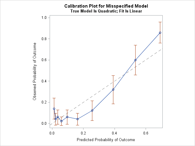
The diagonal line is the line of perfect calibration. In a well-calibrated model, the 10 markers should lie close to the diagonal line. For this example, the graph indicates that the linear model does not fit the data well. For the first decile of the predicted probability (the lowest predicted-risk group), the observed probability of the event is much higher than the mean predicted probability. For the fourth, sixth, and seventh deciles, the observed probability is much lower than the mean predicted probability. For the tenth decile (the highest predicted-risk group), the observed probability is higher than predicted. By the way, this kind of calibration is sometimes called internal calibration because the same observations are used to fit and assess the model.
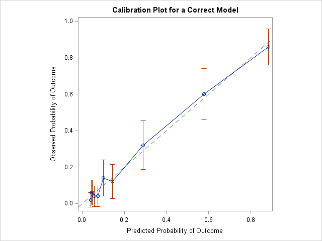
The decile calibration plot for a correctly specified model
You can fit a quadratic model to the data to see how the calibration plot changes for a correctly specified model. The results are shown below. In this graph, all markers are close to the diagonal line, which indicates a very close agreement between the predicted and observed probabilities of the event.
Should you use the decile calibration curve?
The decile-based calibration plot is popular, perhaps because it is so simple that it can be constructed by hand. Nevertheless, Austin and Steyerberg (2013) suggest using the loess-based calibration plot instead of the decile-based plot. Reasons include the following:
- The use of deciles results in estimates that "display greater variability than is evident in the loess-based method" (p. 524).
- Several researchers have argued that the use of 10 deciles is arbitrary. Why not use five? Or 15? In fact, the results of the Hosmer-Lemeshow test "can depend markedly on the number of groups, and there's no theory to guide the choice of that number." (P. Allison, 2013. "Why I Don’t Trust the Hosmer-Lemeshow Test for Logistic Regression")
Many leading researchers in logistic regression do not recommend the Hosmer-Lemeshow test for these reasons. The decile-based calibration curve shares the same drawbacks. Since SAS can easily create the loess-based calibration curve (see the previous article), there seems to be little reason to prefer the decile-based version.

14 Comments
Rick, thanks for the two excellent and useful articles on calibration plots. I totally agree with your recommendation when assessing model validity during model build. I do use the n-group calibration curve for a different purpose, and I'm interesting in your opinion.
After building an acceptable model, we put it into automated production and produce predictions of the future on a regular schedule. We also put in place the complementary production performance tracking process which produces both discriminatory metrics (KS, ROC, GINI) and the n-group calibration curve/table, this allows us to monitor them over time and take appropriate corrective action as needed. Sometimes we see the calibration curve is (constant * diagonal), it is either under-predicting or over-predicting the probabilities for all groups, it doesn't criss-cross the calibration curve if you will. This can happen when the overall base-rate of the process is drifting relative to model build for various reasons such as seasonality, competitor activity, our own promotion,... etc.
And we need accurate point-estimate of model probability for expected benefit calculation of the form (probability x sales value), either to decide economic cut-off or to compare expected value of multiple actions. This is where, provided the model isn't badly off-the-rails and need a full re-build, we would use the observed n-group calibration table to re-calibrate the probabilities via linear interpolation back to diagonal (a simple SAS macro). When we have hundreds of models to watch over, this n-group re-calibration saves us time and resource while maintaining acceptable overall capability. I should have a look at whether loess would provide better recalibration than n-group linear recalibration, that would be an interesting small project.
I think this sounds like a reasonable method. I have two thoughts.
1. Presumably, you are avoiding refitting the model because your training sample is very large. In that case, why not use more than 10 deciles? For example, you could use the 100 centiles.
2. I think what you are doing here is adjusting the link function, not the linear predictor. As you know, the logistic model can fail to be correct in two ways. (A) The linear prediction can be wrong because it fails to account for nonlinearities or interactions. That is the situation that I addressed in these posts. (B) The link function can be different than the logit. For example, the true link function might be probit, complementary log-log, heavy tailed, asymmetric, and so forth. Your adjustment seems to adjust the link function.
Yes, I certainly use more than 10 groups as the datasets are typically quite large. Recalibration is less than ideal compared to rebuild, the management justification for it is it's quicker to do. I have not thought about time-varying response rate from the link function perspective, I will investigate. Thank you for your valuable insights as always.
Hi. What does the 'y' indicate?
Y is the name of a binary response variable.
Thanks a lot for the great posts. I wonder if you can help me with this question: is there any way to do Hosmer Lemeshow test in proc logistic score statement? I know that I can get it with the option lackfit in the model statement, but I need to do it for my validation data set in score statement. I will appreciate any help.
I do not know.
Pingback: Decile plots in SAS - The DO Loop
Thank you for your great posts. Would you know a way to derive the intercept and slope for this plot and the loess plot from the previous post? Thank you very much.
"Intercept and slope" only make sense for linear functions. The decile plot and the loess plot are not linear, so the question does not make sense. The only line in these plots is the diagonal reference line, which has slope = 1 and y-intercept = 0.
Thank you for getting back to me, Rick. I was actually referring to the intercept and slope for calibration of a prediction model. I guess I have to use a linear function then to derive these coefficients. Best regards.
Pingback: Calibration plots in SAS - The DO Loop
Hello Rick,
I'm curious about your choice to put the predicted probabilities on the x-axis in these calibration plots. I suppose it's just convention, but typically I would put the independent variable on the x-axis and the dependent variable on the y-axis, and it seems to me that predicted and observed match up better as dependent and independent, respectively, than the other way around. If you consciously assigned those the way you did, I'd love to understand why. Thanks for all your great content!
There is a long history of using the predicted response for the X axis in a diagnostic plot. Even for linear models with a continuous response, several diagnostic plots use predicted response as X, including the observed-by-predicted plot and the residual-by-predicted plot. See "An overview of regression diagnostic plots in SAS" for examples. I don't know who first started drawing them like this, but it is used by Belsley, Kuh, and Welsch ("Regression Diagnostics," 1980) and almost certainly by researchers before them. It is a convenient way to visualize models that have multiple explanatory variables. It is also independent of the order of the observations in the data, so doesn't change if you sort the data. Lastly, if you plot observed values as Y and predicted values as X, then the vertical distance between the observed values and the diagonal of the plot is the magnitude of the residual. The graph shows the familiar geometry of least-squares regression.
In a similar way, logistic regression use predicted probability as the X axis for many diagnostic plots. Austin and Steyerberg (2013) have references going back the the 1980s.