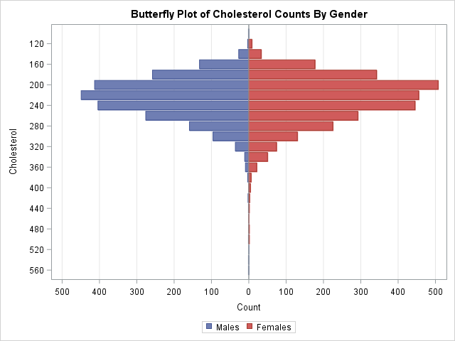
This article shows how to construct a butterfly plot in SAS. A butterfly plot (also called a butterfly chart) is a comparative bar chart or histogram that displays the distribution of a variable for two subpopulations. A butterfly plot for the cholesterol readings of 5,057 patients in a medical study is shown to the right, where the distribution for the males is shown on the left side of the plot and the distribution for females is displayed on the right. (Click to enlarge.) The main contribution of this article is showing how to bin a continuous variable in SAS to form a butterfly chart.
The butterfly plot is similar to a comparative histogram because both enable you to compare the distribution of a continuous variable for subpopulations. The comparative histogram uses a panel to visualize several subpopulations in a panel, where each row represents a level of a classification variable. In contrast, the butterfly plot is limited to two levels and displays the distributions back-to-back.
Bin a continuous variable for each classification level
In a previous blog post, I constructed a butterfly chart that compares voice versus text usage by decade of age for cell phones. Similarly, there is a SAS Sample that shows how to create a butterfly chart for types of cancers by gender. In both of these examples, the butterfly chart is a comparative bar chart because the distribution shown is for a discrete variable ("decade of age" or "type of cancer"). This section shows how to start with a continuous variable (cholesterol) and bin it into intervals. You can then use the previous techniques to visualize the counts in each interval for each gender.
You can bin a continuous variable by using the BIN and TABULATE functions in SAS/IML or by using the OUTHIST= option on the HISTOGRAM statement in PROC UNIVARIATE. The following statements create an output data set (OutHist) that contains the counts of males and females that have cholesterol reading within bins of width 20. The bin width and the centers of the intervals are chosen automatically by PROC UNIVARIATE, but you can use the MIDPOINTS= option (shown in the comments) to control the placement of the intervals.
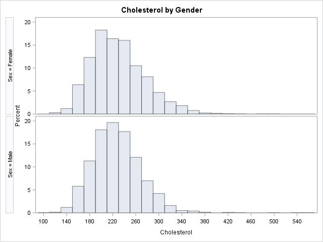
proc univariate data=Sashelp.Heart; class Sex; var Cholesterol; histogram cholesterol / nrows=2 outhist=OutHist /* midpoints=(80 to 560 by 40) */ /* control bin widths and locations */ odstitle="Cholesterol by Gender"; ods select histogram; run; |
Create a butterfly plot in SAS
The OutHist data set is in "long form." You need to convert it to "wide form" in order to construct a butterfly plot. The SAS code performs the following tasks:
- Use a DATA step and WHERE clauses to convert the data from long to wide format.
- Multiply the counts for the males by -1. The negative counts will be plotted on the left side of the butterfly plot.
- Define a format that will display the absolute values of the counts. The axis for the formatted variables contains zero in the middle and increases in both directions.
- Use the HBAR statements to plot the back-to-back bar charts for males and females.
/* convert data from long format to wide format */ data Butterfly; keep Cholesterol Males Females; label Males= Females= Cholesterol=; /* remove labels */ merge OutHist(where=(sex="Female") rename=(_COUNT_=Females _MIDPT_=Cholesterol)) OutHist(where=(sex="Male") rename=(_COUNT_=Males _MIDPT_=Cholesterol)); by Cholesterol; Males = -Males; /* trick: reverse the direction of male counts */ run; /* define format that displays the absolute value of a number */ proc format; picture positive low-<0="000,000" 0<-high="000,000"; run; ods graphics / reset; title "Butterfly Plot of Cholesterol Counts By Gender"; proc sgplot data=Butterfly; format Males Females positive.; hbar Cholesterol / response=Males legendlabel="Males"; hbar Cholesterol / response=Females legendlabel="Females"; xaxis label="Count" grid min=-520 max=520 values=(-500 to 500 by 100) valueshint; yaxis label="Cholesterol" discreteorder=data; run; |
The graph is shown at the top of this article. You can see that the mode of the distribution is higher for males, and the distribution for males also has a longer tail.
A butterfly fringe plot
The butterfly plot is usually displayed with horizontal bars, as shown. However, you could use the VBAR statement to get a rotated version of the butterfly plot. As mentioned earlier, you can also use the MIDPOINTS= option on the HISTOGRAM statement to change the width of the histogram bins.
One useful variation in the butterfly plot is to use a very small bin width and replace the bar chart with a high-low plot. This creates a graph that I call a butterfly fringe plot. Recall that the usual fringe plot (also called a "rug plot") places a tick mark on an axis to show the distribution of data values. A fringe plot can suffer from overplotting when more than one observation has the same value. With a butterfly fringe plot, some ticks are higher than others (to represent repeated values) and bars that point up represent one binary value whereas bars that point down represent the other. The butterfly fringe plot provides a more complete visualization of the distribution of data for two levels of a response or classification variable.
ods graphics / width=640px height=180; title "Butterfly Fringe Plot: Cholesterol Counts By Gender"; proc sgplot data=Butterfly; format Males Females positive.; highlow x=Cholesterol low=Males high=Females; refline 0 / axis=y; inset "Males" / position=BottomLeft; inset "Females" / position=TopLeft; yaxis label="Count" grid; xaxis label="Cholesterol" discreteorder=data; run; |
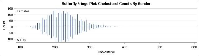
The butterfly fringe plot was created by using a bin width of 5 for the cholesterol variable. That is, midpoints=(50 to 560 by 5).
In summary, this article shows how to create a butterfly plot for a continuous variable and a binary classification variable. When you bin the continuous variable, you obtain counts for each interval. You can then graph the counts back-to-back to form the butterfly chart. An interesting variation is the butterfly fringe plot, which combines a butterfly chart and a fringe plot.
