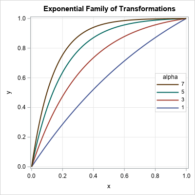
A family of curves is generated by an equation that has one or more parameters. To visualize the family, you might want to display a graph that overlays four of five curves that have different parameter values, as shown to the right.
The graph shows members of a family of exponential transformations of the form
f(x; α) = (1 – exp(-α x)) / (1 – exp(-α))
for α > 0 and x ∈ [0, 1].
This graph enables you to see how the parameter affects the shape of the curve.
For example,
for small values of the parameter, α, the transformation is close to the identity transformation. For larger values of α, the nonlinear transformation stretches intervals near x=0 and compresses intervals near x=1.
Here's a tip for creating a graph like this in SAS. Generate the data in "long format" and use the GROUP= option on the SERIES statement in PROC SGPLOT to plot the curves and control their attributes. The long format and the GROUP= option make it easy to visualize the family of curves.
A family of exponential transformations
I recently read a technical article that used the exponential family given above. The authors introduced the family and stated that they would use α = 8 in their paper. Although I could determine in my head that the function is monotonically increasing on [0, 1] and f(0)=0 and f(1)=1, I had no idea what the transformation looked like for α = 8. However, it is easy to use SAS to generate members of the family for different values of α and overlay the curves:
data ExpTransform; do alpha = 1 to 7 by 2; /* parameters in the outer loop */ do x = 0 to 1 by 0.01; /* domain of function */ y = (1-exp(-alpha*x)) / (1 - exp(-alpha)); /* f(x; alpha) on domain */ output; end; end; run; /* Use ODS GRAPHICS / ATTRPRIORITY=NONE if you want to force the line attributes to vary in the HTML destination. */ ods graphics / width=400px height=400px; title "Exponential Family of Transformations"; proc sgplot data=ExpTransform; series x=x y=y / group=alpha lineattrs=(thickness=2); keylegend / location=inside position=E across=1 opaque sortorder=reverseauto; xaxis grid; yaxis grid; run; |
The graph is shown at the top of this article. The best way to create this graph is to generate the points in the long-data format because:
- The outer loop controls the values of the parameters and how many curves are drawn. You can use a DO loop to generate evenly spaced parameters or specify an arbitrary sequence of parameters by using the syntax
DO alpha = 1, 3, 6, 10; - The domain of the curve might depend on the parameter value. As shown in the next section, you might want to use a different set of points for each curve.
- You can use the GROUP= option and the KEYLEGEND statement in PROC SGPLOT to visualize the family of curves.
Visualize a two-parameter family of curves
You can use the same ideas and syntax to plot a two-parameter family of curves. For example, you might want to visualize the density of the Beta distribution for representative values of the shape parameters, a and b. The Wikipedia article about the Beta distribution uses five pairs of (a, b) values; I've used the same values in the following SAS program:
data BetaDist; array alpha[5] _temporary_ (0.5 5 1 2 2); array beta [5] _temporary_ (0.5 1 3 2 5); do i = 1 to dim(alpha); /* parameters in the outer loop */ a = alpha[i]; b = beta[i]; Params = catt("a=", a, "; b=", b); /* concatenate parameters */ do x = 0 to 0.99 by 0.01; pdf = pdf("Beta", x, a, b); /* evaluate the Beta(x; a, b) density */ if pdf < 2.5 then output; /* exclude large values */ end; end; run; ods graphics / reset; title "Probability Density of the Beta(a, b) Distribution"; proc sgplot data=BetaDist; label pdf="Density"; series x=x y=pdf / group=Params lineattrs=(thickness=2); keylegend / position=right; xaxis grid; yaxis grid; run; |
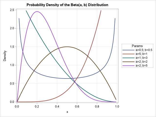
The resulting graph gives a good overview of how the parameters in the Beta distribution affect the shape of the probability density function. The program uses a few tricks:
- The parameters are stored in arrays. The program loops over the number of parameters.
- A SAS concatenation functions concatenate the parameters into a string that identifies each curve. The CAT, CATS, CATT, and CATX functions are powerful and useful!
- For this family, several curves are unbounded. The program caps the maximum vertical value of the graph at 2.5.
- Although it is not obvious, some of the curves are drawn by using 100 points whereas others use fewer points. This is an advantage of using the long format.
In summary, you can use PROC SGPLOT to visualize a family of curves. The task is easiest when you generate the points along each curve in the "long format." The long format is easier to work with than the "wide format" in which each curve is stored in a separate Y variable. When the curve values are in long form, you can use the GROUP= option on the SERIES statement to create an effective visualization by using a small number of statements.

2 Comments
Very nice, plus a nice bit of a reminder for me on how to code arrays.
I'm sneaky like that! :-)