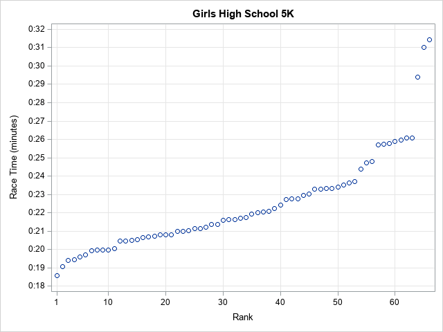
Math and statistics are everywhere, and I always rejoice when I spot a rather sophisticated statistical idea "in the wild." For example, I am always pleased when I see a graph that shows the distribution of race times in a typical race (such as a 5K), as shown to the right. The finishing times are plotted against the order in which runners crossed the finish line. This is a great visualization because you can see the times for each participant, the range of times between the top finishers and the laggards, and how close each runner's time was to the time of the person who placed ahead of her.
What amazes me is that this graph essentially shows the cumulative distribution of race times. The cumulative distribution is not generally used outside of scientific publications. Yet here it is, easily understood and with no accompanying explanation! Graphs like this are often used to visualize race times for triathlons, marathons, 5Ks, and more.
The distribution of race times
The graph is noteworthy for what it is and also for what it isn't. It isn't a histogram. If you give a statistician a set of measurements and ask for the distribution, you are likely to get a histogram. For small data sets, you might also get a fringe plot below the histogram, as shown below:
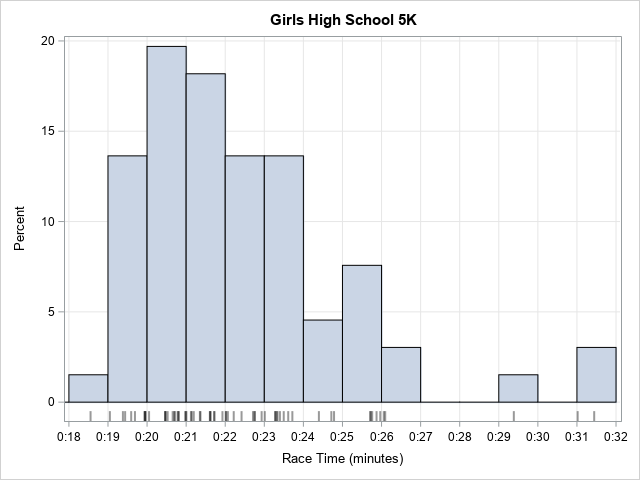
The graph shows the distribution of race time for the same race. The histogram bins the times into one-minute intervals. You can easily see that a small percentage of runners (about 2%) finished the race under 19 minutes and that about 40% of the runners finished between 20 and 22 minutes. You can see that only a few runners exceeded 26 minutes.
Since the histogram is such a standard plot, you would think it would be the "best" graph to use, but the time-versus-rank graph has several advantages:
- The time-versus-rank graph connects the times to the place. What was the time for the 20th runner? It's easy to determine. How many runners finished under 22 minutes? Also easy to find.
- You can see every runner's time. In a race, there might be a tenth of a second between times. The fringe plot suffers from overplotting. The histogram bins many times into a single bar. The time-versus-rank graph displays one marker per runner and the markers do not overlap unless there are hundreds of runners.
- The time-versus-rank graph shows packs of runners. In long-distance races, there is often a "lead pack," a "trailing pack," and other clumps of runners of equal abilities. On the time-versus-rank graph, these packs show ups as groups of nearly horizontal markers. In the fringe plot, the vertical lines overlap and are harder to see.
- Leaders and laggards stand out in the time-versus-rank graph because the markers are isolated. If someone wins a race by 20 seconds (a huge lead!), you can see that clearly in the first graph. In contrast, the histogram lumps together all the leaders into one bar.
The cumulative distribution of race times
The time-versus-rank graph is not exactly equal to the standard graph of the empirical cumulative distribution, but it's close. You can use PROC UNIVARIATE to create the following graph of the cumulative distribution of race times. The graph is known as a CDF plot.
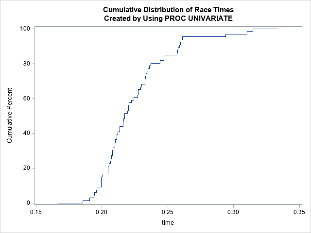
The CDF plot has the same shape as the time-versus-rank graph, but you need to flip the axes. (Geometrically, flip the CDF plot across its diagonal.) The CDF plot differs in three minor ways:
- The ECDF is plotted as a step function. The time-versus-rank graph is plotted as a scatter plot.
- The ECDF has its axes reversed: the times are on the horizontal axis and the order is plotted vertically.
- The ECDF standardizes the "order statistic" into a percentage, rather than using a rank. The runner who finishes 20th out of 66 runners is plotted at the 30.3 percentage point.
So, yes, there are minor differences. But I still smile whenever I see the time-versus-rank graph. Although the racers might not know or care, the plot contains the same information as a plot of the cumulative distribution of the race times.
You can download the SAS program that contains the data and creates all the graphs in this article.

10 Comments
Cool graphs. Rick! I'm glad to see you cover this topic -- as we both have kids who run cross-country races (occasionally competing). And I learned about the FRINGE plot, which is new to me.
Yes, the fringe plot has several nice applications. Its main weakness is that it suffers from overplotting when the sample size is more than a few hundred observations. However, using partial transparency can partially mitigate that problem.
Also, that girl who finished at 18:30 is killing it..
Yes. At the NC State championships, she placed third with a time of 18:05.71!
Yes, The 2 graphs offer the same information, although the ECDF Graph is somehow confusing. Is it the overplotting or overcrowding that makes the ECDF a bit confusing (as we add more data/info it becomes overcrowded), Dr Wicklin? I will consult if I have IML/Interactive Matrix Language problems. Yeah, I had problems with the Invertible matrics and finding the diagonal row\values during my Mathematical Modelling studies.
There is no overplotting. Some people find the ECDF confusing because they are not used to viewing cumulative probability distributions. In most introductory statistics courses, students see estimates of densities (histograms) instead of estimates of the cumulative distribution. Also, the ECDF is a (discontinuous) step function, which can also be a source of confusion.
Hi Rick, I am happy I found your race results plot and histogram. I have plotted the same type of data in the same formats using excel. Rather than actual time I used gaps from the winner. I plotted 3 classes of boys and girls, athletes competing in the Minnesota State High School Cross Country Championship. All of the curves revealed the same shapes, but the slope of the large middle groups were slightly flatter in the more competitive “big school” races than the smalls. And, oddly, the most competitive race was the girls’ AA, as that group had the least dispersion and smallest SD. The ranking of the top 20 boys included kids from all 3 classes but the best times were all from AAA. Is there an equation that describe the results that you posted?
Good for you. Thanks for sharing. There are some equations that describe the shape if the cumulative distribution for certain distributions (most famously, the normal distribution). But, no, in general, there isn't a single equation that describes these shapes. The curve shapes for a very competitive races (many runners in packs) will differ from the shapes of less competitive races (a few leaders and lots of stragglers).
Ok. Thanks for the reply. Best wishes.
Look at y = [(ln(x/100)/(e^-(x/100)^2] + ln(x) + 10 between 1 and 160 (# of runners in each race). The denominators of each fraction scale and adjust the curve and are likely related to dispersion and other variables related to the quality of the field, etc. thanks,