The SGPLOT procedure in SAS makes it easy to create graphs that overlay various groups in the data. Many statements support the GROUP= option, which specifies that the graph should overlay group information. For example, you can create side-by-side bar charts and box plots, and you can overlay multiple scatter plots and series plots in the same graph. However, the GROUP= option takes only a single grouping variable! What can you do if you need to visualize combinations of two (or even three!) categorical variables? This article shows how to construct a new group variable that combines the levels of two or more existing categorical variables.
For concreteness, I will show how to overlay multiple series plots (line plots), as shown to the right. (Click to enlarge.) By using this technique, you can overlay curves that describe combinations of gender and race. Or you can plot response curves for control-vs-experimental groups and the severity of a disease. You can use this technique for other plot types, such as creating box plots that visualize a two-way ANOVA.
What is the problem? Why can't you use the GROUP= option?
To motivate the discussion, let's first see why the GROUP= option in the SERIES statement does not work for overlaying two categorical variables. The following DATA step creates two categorical variables. The G1 variable has the values 1, 2, and 3. The G2 variable has the values 'A' and 'B'. For each of the six combinations of (G1, G2), the DATA step creates a curve (actually a line) of (X, Y) values. Let's see what happens if you try to plot the lines by using a SERIES statement with the GROUP=G1 option:
data TwoGroups; do G1=1 to 3; do G2='A', 'B'; do X = 1 to 10; Y = 10 + G1 + 0.5*(G2='A') + G1*X/20; output; end; end; end; run; title "First Attempt: Does Not Work"; proc sgplot data=TwoGroups; series x=x y=y / group=G1 curvelabel; run; |
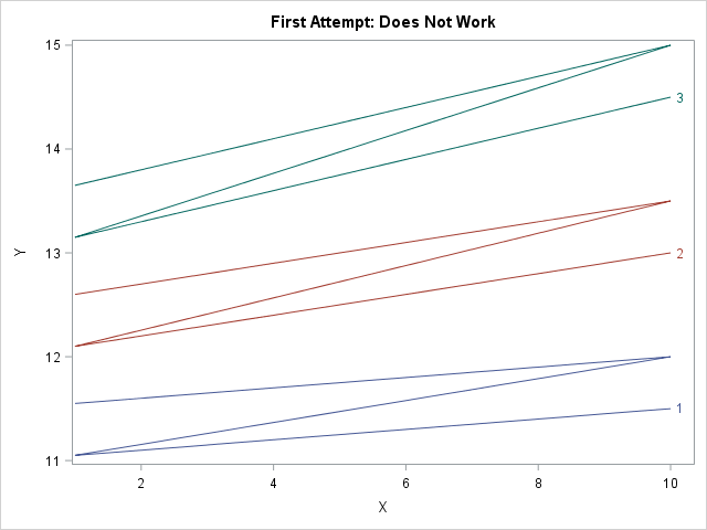
The attempt is a failure. The graph does not show six individual curves. Instead, it shows three curves (the number of categories in the G1 variables) and each "curve" is Z-shaped because the graph traces the curve for G2='A' on the range [1, 10] and then draws the curve for G2='B' without "picking up the pen." This happens because the data are sorted by G1, then by G2, then by X.
There are two ways to handle this situation. One way is to try to convert the data from "long form" to "wide form." For these data, which have identical X values for every curve, you can create two new variables Y_A and Y_B that contain the coordinates of the three curves for G2='A' and G2='B', respectively. You can then use two SERIES statements, each using the GROUP=G1 option. Each statement will draw three curves for a total of six. You can use the NOCYCLEATTRS option to make sure that each statement uses the same line colors and patterns. However, this approach becomes complicated if each curve is evaluated at a different set of X values. In that case, it is better to keep the data in long form.
Forming a new group variable by concatenation
The problem would be solved if there were one categorical variable that had six levels instead of two categorical variables that have six joint levels, so let's write some SAS code to make that happen. First sort the data by the categorical variables and then by the X variable. (For the current example, the data are already sorted correctly.) Then write a DATA step that does either of the following options:
- Option 1: Use the CATT (or CATX) function to concatenate the values of the existing group variables. The new categorical variable will have values that derived from the original variables.
- Option 2: Use the FIRST.variable syntax to create a new group variable that has the values 1–6. Then use PROC FORMAT to assign a meaningful value to each level of the new categorical variable.
The first option (the CATT function) is automated and less prone to error, but for the sake of completeness both options are shown below:
/* create a new group variable by concatenating the two existing variables */ proc sort data=TwoGroups; by G1 G2 X; run; data Make2Groups; set TwoGroups; by G1 G2; /* Option 1: automatically create joint levels from original levels */ Label = catt("G1=", G1) || "; " || catt("G2=", G2); /* Option 2: create new categorical variable and use PROC FORMAT to assign values */ if first.G2 then GroupID + 1; /* GroupID = 1, 2, 3, ... numGroups */ run; /* For Option 2: use PROC FORMAT to form labels that encode the two groups. See https://blogs.sas.com/content/iml/2017/04/24/two-way-anova-viz.html */ proc format; value GroupFmt 1 = "G1=1; G2='A'" 2 = "G1=1; G2='B'" 3 = "G1=2; G2='A'" 4 = "G1=2; G2='B'" 5 = "G1=3; G2='A'" 6 = "G1=3; G2='B'"; run; |
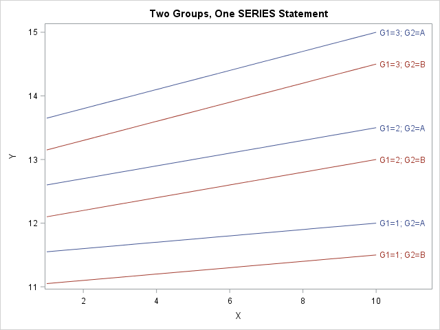
The following call to PROC SGPLOT creates a series plot for the Label variable, which corresponds to the joint levels of the original grouping variables. The GROUPLC= option (supported in SAS 9.4M2) colors the lines according to the value of the G2 variable.
title "Two Groups, One SERIES Statement"; proc sgplot data=Make2Groups; /* format GroupID GroupFmt.; */ /* for Option 2 */ series x=x y=y / group=Label grouplc=G2 /* or group=GroupID for Option 2 */ lineattrs=(pattern=solid) curvelabel; run; |
The graph is shown at the top of this article. The new categorical variable has values that correspond to joint levels of the original two variables. The GROUP= option creates six curves when you specify the Label variable. The GROUPLC= option sets the colors of the lines according to the values of the G2 variable.
This technique generalizes to three categorical variables, but I will leave the details to the reader. You might want to use the GROUPLP= option to set the line patterns according to the value of a third categorical variable. Beyond three variables the display will begin to resemble a spaghetti plot. For many categorical variables, you might want to use panels and BY groups to visualize the curves.
This technique also generalizes to other plot types, such as box plots and scatter plots.
