When you overlay two series in PROC SGPLOT, you can either plot both series on the same axis or you can assign one series to the main axis (Y) and another to a secondary axis (Y2). If you use the Y and Y2 axes, they are scaled independently by default, which is usually what you want. However, if the measurements for the two series are linearly related to each other, then you might want to specify the tick values for the Y2 axis so that they align with the corresponding tick marks for the Y axis. This article shows how to align the Y and Y2 axes in PROC SGPLOT in SAS for two common situations.
Different scales for one set of measurements
The simplest situation is a single set of data that you want to display in two different units. For example, you might use one axis to display the data in imperial units (pounds, gallons, degrees Fahrenheit, etc.) and the other axis to display the data in metric units (kilograms, liters, degrees Celsius, etc.).
To plot the data, define one variable for each unit. For example, the Sashelp.Class data records the weight for 19 students in pounds. The following DATA view creates a new variable that records the same data in kilograms. The subsequent call to PROC SGPLOT plots the pounds on the Y axis (left axis) and the kilograms on the Y2 axis (right axis). However, as you will see, there is a problem with the default scaling of the two axes:
data PoundsKilos / view=PoundsKilos; set Sashelp.Class(rename=(Weight=Pounds)); Kilograms = 0.453592 * Pounds; /* convert pounds to kilos */ run; title "Independent Axes"; title2 "Markers Do Not Align Correctly!"; /* the tick marks on each axis are independent */ proc sgplot data=PoundsKilos; scatter x=Height y=Pounds; scatter x=Height y=Kilograms / Y2Axis; run; |
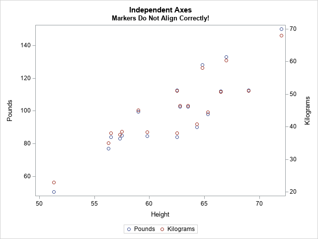
The markers for the kilogram measurements should exactly overlap the markers for pounds, but they don't. The Y and Y2 axes are independently scaled because PROC SGPLOT does not know that pounds and kilograms are linearly related. The SGPLOT procedure displays each variable by using a range of round numbers (multiples of 10 or 20). The range for the Y2 axis is [20, 70] kilograms, which corresponds to a range of [44.1, 154.3] pounds. However, the range for the Y axis is approximately [50, 150] pounds. Because the axes display different ranges, the markers do not overlap.
To improve this graph, use the VALUES= and VALUESDISPLAY= options on the YAXIS statement (or Y2AXIS statement) to force the ticks marks on one axis to align with the corresponding tick marks on the other axis. In the following DATA step, I use the kilogram scale as the standard and compute the corresponding pounds.
data Ticks; do Kilograms = 20 to 70 by 10; /* for each Y2 tick */ Pounds = Kilograms / 0.453592; /* convert kilos to pounds */ Approx = round(Pounds, 0.1); /* use rounded values to display tick values */ output; end; run; proc print; run; |
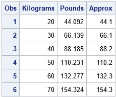
You can use the Pounds column in the table to set the VALUES= list on the YAXIS statement. You can use the Approx column to set the VALUESDISPLAY= list, as follows:
/* align tick marks on each axis */ title "Both Axes Use the Same Scale"; proc sgplot data=PoundsKilos noautolegend; scatter x=Height y=Pounds; /* Make sure the plots overlay exactly! Then you can set SIZE=0 */ scatter x=Height y=Kilograms / markerattrs=(size=0) Y2Axis; yaxis grid values=(44.092 66.139 88.185 110.231 132.277 154.324) valuesdisplay=('44.1' '66.1' '88.2' '110.2' '132.3' '154.3'); run; |
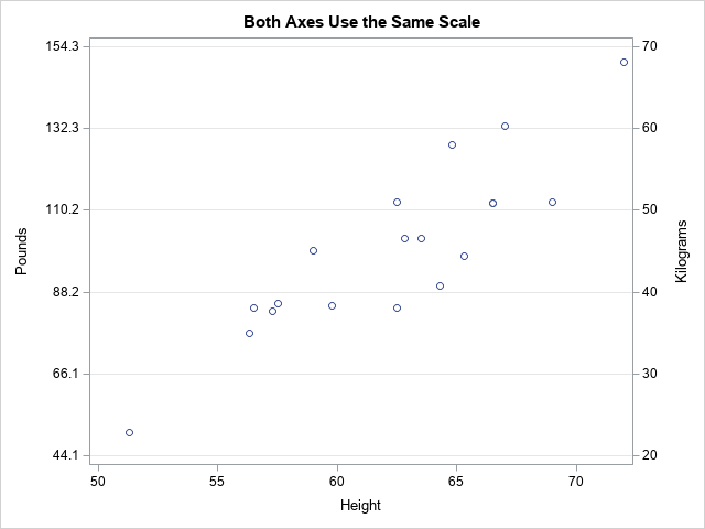
Success! The markers for the two variables align exactly. After verifying that they align, you can use the MARKERATTRS=(SIZE=0) option to suppress the display of one of the markers.
Notice that the Y axis (pounds) no longer displays "nice numbers" because I put the tick marks at the same vertical heights on both axes. A different way to solve the misalignment problem is to use the MIN=, MAX=, THRESHOLDMIN=, and THRESHOLDMAX= options on both axes. This will enable both axes to use "nice numbers" while still aligning the data. If you want to try this approach, here are the YAXIS and Y2AXIS statements:
/* set the axes ranges to coresponding values */ yaxis grid thresholdmin=0 thresholdmax=0 min=44.1 max=154.3; y2axis grid thresholdmin=0 thresholdmax=0 min=20 max=70; |
Different scales for different measurements
Another situation that requires two Y axes is the case of two series that use different units. For example, you might want to plot the revenue for a US company (in dollars) and the revenue for a Japanese company (in yen) for a certain time period. You can use the conversion rate between yen and dollars to align the values on the axes. Of course, the conversion from Japanese yen to the US dollars changes each day, but you can use an average conversion rate to set the correspondence between the axes.
This situation also occurs when two devices use different methods to measure the same quantity. The following example shows measurements for a patient who receives a certain treatment. The quantity of a substance in the patient's blood is measured at baseline and for every hour thereafter. The quantity is measured in two ways: by using a traditional blood test and by using a new noninvasive device that measures electrical impedance. The following statements define and plot the data. The two axes are scaled by using the default method:
data BloodTest1; label t="Hours after Medication" x="micrograms per deciliter" y="kiloOhms"; input x y @@; t = _N_ - 1; datalines; 169.0 45.5 130.8 33.4 109.0 23.8 94.1 19.8 86.3 20.4 78.4 18.7 76.1 16.1 72.2 16.7 70.0 11.9 69.8 14.6 69.5 10.6 68.7 12.7 67.3 16.9 ; title "Overlay Measurements for Two Medical Devices"; title2 "Default Scaling"; proc sgplot data=BloodTest1; series x=t y=x / markers legendlabel="Standard Lab Value"; series x=t y=y / markers Y2Axis legendlabel="New Device"; xaxis values=(0 to 12 by 2); yaxis grid label="micrograms per deciliter"; y2axis grid label="kiloOhms"; run; |
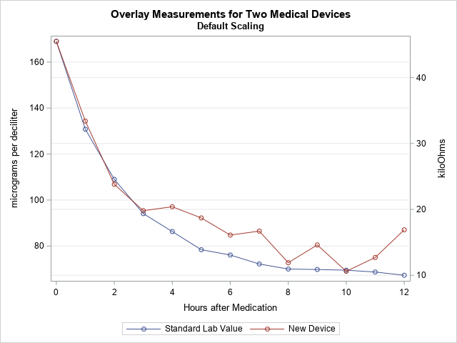
In this graph, the Y axes are scaled independently. However, the company that manufactures the device used Deming regression to establish that the measurements from the two devices are linearly related by the equation Y = –10.56415 + 0.354463*X, where X is the measurement from the blood test. You can use this linear equation to set the scales for the two axes.
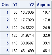
The following DATA step uses the Deming regression estimates to convert the tick marks on the Y axis into values for the Y2 axis. (Click here for the PROC PRINT output.) The call to PROC SGPLOT creates a graph in which the Y2 axis is aligned with the Y axis according to the Deming regression estimates.
data Ticks; do Y1 = 60 to 160 by 20; /* use Deming regression to find one set of ticks in terms of the other */ Y2 = -10.56415 + 0.354463 * Y1; /* kiloOhms as a function of micrograms/dL */ Approx = round(Y2, 0.1); output; end; run; proc print; run; title "Align Y Axes for Different Series"; title2 "Measurements are Linearly Related"; proc sgplot data=BloodTest1; series x=t y=x / markers legendlabel="Standard Lab Value"; series x=t y=y / markers Y2Axis legendlabel="New Device"; xaxis values=(0 to 12 by 2); yaxis grid label="micrograms per deciliter" offsetmax=0.1 values=(60 to 160 by 20); /* the same offsets must be used in both YAXIS and Y2AXIS stmts */ y2axis grid label="kiloOhms" offsetmax=0.1 values=(10.7036 17.7929 24.8822 31.9714 39.0607 46.1499) valuesdisplay=('10.7' '17.8' '24.9' '32.0' '39.1' '46.1'); run; |
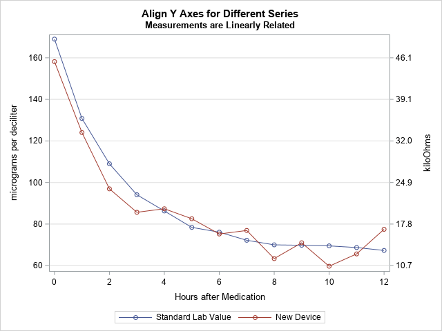
In this new graph, the measurements are displayed on compatible scales and the reference lines connect round numbers on one axis to the corresponding values on the other axis.

2 Comments
Interesting. Thanks. Is there a simple way to avoid the copy-paste from the DATA step output to the PROC SGPLOT Y2AXIS statement? I'm guessing using the DATA step to write the code fragment into a macro variable would do it.
Thanks for writing. Yes, I didn't want the example to look too complicated, but you can automate this process by using PROC SQL to read the tick marks into a macro variable. See the section "Read values into a SAS macro variable" in the article "Create a SAS macro variable that contains a list of values."