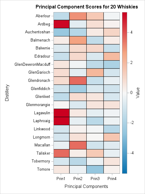
Tag: Statistical Graphics

Programming Tips
Rick Wicklin 0
The wind chill chart

In cold and blustery conditions, the weather forecast often includes two temperatures: the actual air temperature and the wind chill temperature. The wind chill temperature conveys the cumulative effect of air temperature and wind on the human body. The goal of the wind-chill scale is to communicate the effect of

Analytics | Data Visualization
Rick Wicklin 0
Decile plots in SAS

I previously showed how to create a decile calibration plot for a logistic regression model in SAS. A decile calibration plot (or "decile plot," for short) is used in some fields to visualize agreement between the data and a regression model. It can be used to diagnose an incorrectly specified

Programming Tips
Rick Wicklin 0
Bilinear interpolation in SAS

This article shows how to perform two-dimensional bilinear interpolation in SAS by using a SAS/IML function. It is assumed that you have observed the values of a response variable on a regular grid of locations. A previous article showed how to interpolate inside one rectangular cell. When you have a

Programming Tips
Rick Wicklin 0
What is bilinear interpolation?

I've previously written about linear interpolation in one dimension. Bilinear interpolation is a method for two-dimensional interpolation on a rectangle. If the value of a function is known at the four corners of a rectangle, an interpolation scheme gives you a way to estimate the function at any point in

Analytics | Data Visualization
SAS Japan 0
指数関数的成長の倍加時間を推計する

この記事はSAS Institute Japanが翻訳および編集したもので、もともとはRick Wicklinによって執筆されました。元記事はこちらです(英語)。 2020年における新型コロナウイルスの世界的流行のようなエピデミック状況下では、各国の感染確認者の累計数を示すグラフがメディアによって頻繁に示されます。多くの場合、これらのグラフは縦軸に対数スケール(対数目盛)を使います。このタイプのグラフにおける直線は、新たなケースが指数関数的ペースで急増していることを示します。直線の勾配はケースがどれほど急速に倍加するかの程度を示し、急勾配の直線ほど倍加時間が短いことを示します。ここでの「倍加時間」とは、「関連状況が何も変わらないと仮定した場合に、累計の感染確認者数が倍増するまでに要する時間の長さ」のことです。 本稿では、直近のデータを用いて倍加時間を推計する一つの方法を紹介します。この手法は、線形回帰を用いて曲線の勾配(m)を推計し、その後、倍加時間を log(2) / m として推計します。 本稿で使用しているデータは、2020年3月3日~3月27日の間の、4つの国(イタリア、米国、カナダ、韓国)における新型コロナウイルス感染症(以下、COVID-19)の感染確認者の累計数です。読者の皆さんは、本稿で使用しているデータとSASプログラムをダウンロードすることができます。 累計感染者数の対数スケール・ビジュアライゼーション このデータセットには4つの変数が含まれています。 変数Region: 国を示します。 変数Day: 2020年3月3日からの経過日数を示します。 変数Cumul: COVID-19の感染確認者の累計数を示します。 変数Log10Cumul: 感染確認累計数の「10を底とする対数」(=常用対数)を示します。SASでは、LOG10関数を用いて常用対数を計算することができます。 これらのデータをビジュアル化する目的には、PROC SGPLOTを使用できます。下図のグラフは感染確認者の総数をプロットしていますが、総数の縦軸に常用対数を指定するために「type=LOG」と「logbase=10」というオプションを使用しています。 title "Cumulative Counts (log scale)"; proc sgplot data=Virus; where Cumul > 0; series x=Day y=Cumul / group=Region curvelabel; xaxis grid; yaxis type=LOG logbase=10 grid values=(100 500 1000

1 2 3 4 5 10