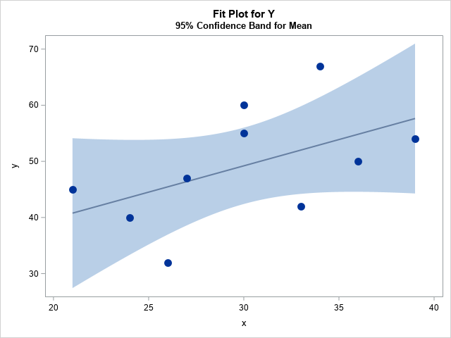
You've probably seen many graphs that are similar to the one at the right. This plot shows a regression line overlaid on a scatter plot of some data. Given a value for the independent variable (x), the regression line gives the best prediction for the mean of the response variable (y). The light blue band shows a 95% confidence band for the conditional mean.
This article is about how to understand the confidence band. The band conveys uncertainty in the location of the conditional mean. You can think of the confidence band as being a bunch of vertical confidence intervals, one at each possible value of x. For example, when x=30, the graph predicts 49.2 for the conditional mean of y and shows that the confidence interval for the mean of y at x=30 is [42.4, 56.0]. The confidence intervals for x=21 and x=39 are wider, which indicates that there is more uncertainty in the prediction when x is extreme than when x is near the center of the data. (The confidence interval of the conditional mean is sometimes called the confidence interval of the prediction. No matter what you call it, the intervals in this article are for the MEAN, not for individual responses.)
Statistics have uncertainty because they are based on a random sample from the population. If you were to choose a different random sample of (x,y) values from the same population, you would get a different regression line. If you choose a third random sample, you would get yet another regression line. In this article, I discuss some intuitive ways to think about the confidence band without using any formulas. I show that the confidence band is related to repeatedly choosing a random sample and fitting many regression lines. I show a couple of alternative ways to visualize uncertainty in the predicted values.
Fit the example data
You can use a simulation to demonstrate the relationship between a confidence interval and repeated random sampling. The best way is to use a (known) model to repeatedly generate the random sample. However, I am going to use a slightly different approach, which is discussed in Section 13.3 of Simulating Data with SAS, Wicklin (2013). When you deal with real data, you don't know the real underlying relationship between the response and explanatory variables, but you can always simulate from the fitted regression model. This means that you fit the data and then using the parameters estimates as if they were the true values of the parameters.
Let's see how this works. The following DATA step defines a toy example that has 10 observations. The call to PROC REG fits a linear model to the data.
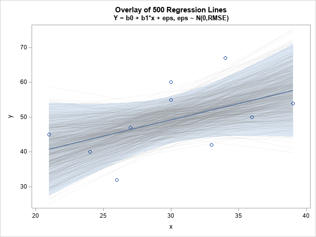
data Have; input x y; datalines; 21 45 24 40 26 32 27 47 30 55 30 60 33 42 34 67 36 50 39 54 ; proc reg data=Have outest=PE alpha=0.05 plots(only)=fitplot(nocli); model y = x; quit; proc print data=PE noobs label; label Intercept="b0" x="b1" _RMSE_="s"; var Intercept x _RMSE_; run; |
The REG procedure creates a fit plot that is similar to the one at the top of this article. The model is Y = b0 + b1*x + eps, where eps ~ N(0, s). The call to PROC PRINT shows the three parameter estimates: the intercept term (b0), the coefficient of the linear term (b1), and the "root mean square error," which is the estimate of the standard deviation of the error term (s).
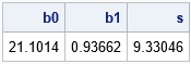
Visualizing uncertainty by using graded confidence bands
The conditional mean is assumed to be normally distributed inside the confidence band. For a particular value of x, the probability of the conditional mean is high near the regression line and lower near the upper and lower limits. You can visualize the distribution by overlaying confidence bands for various confidence levels. If you make the bands semi-transparent, the union of the bands is darkest near the regression line and lightest far away from the line.
In SAS, you can use the REG statement (with the CLM option) in PROC SGPLOT to overlay several semi-transparent confidence bands that have different levels of confidence. The following graph overlays the 95%, 90%, 80%, 70% and 50% confidence bands. To save typing, I use a SAS macro to create each REG statement.
%macro CLM(alpha=, thickness=); reg x=x y=y / nomarkers alpha=&alpha lineattrs=GraphFit(thickness=&thickness) clm clmattrs=(clmfillattrs=(color=gray transparency=0.8)); %mend; title "Graded Confidence Band Plot"; title2 "alpha = 0.05, 0.1, 0.2, 0.3, 0.5"; proc sgplot data=Have noautolegend; %CLM(alpha=0.05, thickness=0); %CLM(alpha=0.10, thickness=0); %CLM(alpha=0.20, thickness=0); %CLM(alpha=0.30, thickness=0); %CLM(alpha=0.50, thickness=2); scatter x=x y=y/ markerattrs=(symbol=CircleFilled size=12); run; |
Claus O. Wilke calls this a "graded confidence band plot" in his book _Fundamentals of Data Visualization_ (Section 16.3). It communicates that the location of the conditional mean is uncertain, but it is most likely to be found near the regression line.
The careful reader will notice that the graded band plot is created by using multiple REG statements. This implies that the same regression model is fit multiple times, which is not efficient. You can use PROC PLM or PROC IML if you want to fit the model once and then produce many confidence bands.
Simulate from the fitted model
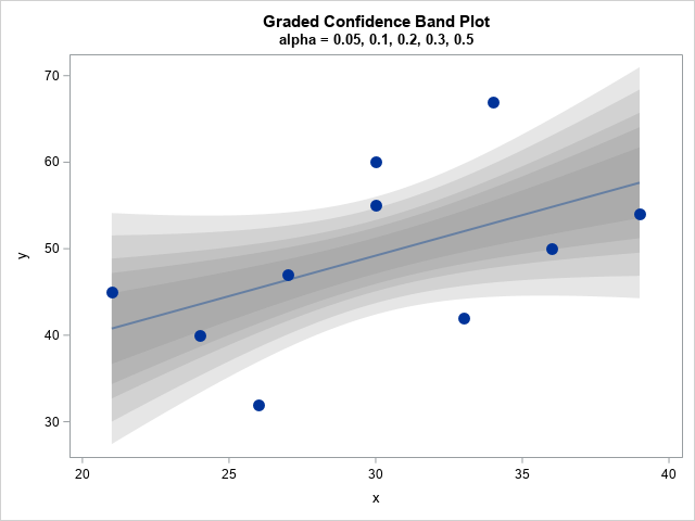
The confidence band visualizes the uncertainty in the prediction due to the fact that the data are a random sample from some unknown population. Although we don't know the underlying true relationship between the (x,y) pairs, we can simulate random samples from the fitted linear model by using the parameter estimates as if they were the true parameters. The following SAS DATA step simulates 500 random samples from the regression model. The x values are fixed. The y values are simulated according to Y = b0 + b1*x + eps, where eps ~ N(0, s).
/* simulate many times from model, using parameter estimates as the true model */ %let numSim = 500; data RegSim; call streaminit(1234); b0 = 21.1014; b1 = 0.93662; RMSE = 9.33046; set Have; /* for each X value in the original data */ do SampleID = 1 to &numSim; /* simulate Y = b0 + b1*x + eps, eps ~ N(0,RMSE) */ YSim = b0 + b1*x + rand("Normal", 0, RMSE); output; end; run; /* use BY-group processing to fit a regression model to each simulated data */ proc sort data=RegSim; by SampleID; run; proc reg data=RegSim outest=PESim alpha=0.05 noprint; by SampleID; model YSim = x; quit; |
The output from PROC REG is 500 pairs of parameter estimates (b0 and b1). Each estimate represents a regression line for a random sample from the same linear model. Let's see what happens if you overlay all those regression lines on a single plot:
/* two points determine a line, so score regression on [min(x), max(x)] */ data Viz; set PESim(rename=(Intercept=b0 x=b1)); /* min(x)=21; max(x)=39. Evaluate fit b0 + b1*x for each simulated sample */ xx = 21; yy = b0 + b1*xx; output; xx = 39; yy = b0 + b1*xx; output; keep SampleID xx yy; run; /* overlay the fits on the original data */ data Combine; set Have Viz; run; title "Overlay of &numSim Regression Lines"; title2 "Y = b0 + b1*x + eps, eps ~ N(0,RMSE)"; ods graphics / antialias=off GROUPMAX=10000; proc sgplot data=Combine noautolegend; reg x=x y=y / nomarkers alpha=0.05 clm clmattrs=(clmfillattrs=(transparency=0.5)); series x=xx y=yy / group=SampleId lineattrs=(color=gray pattern=solid) transparency=0.9; scatter x=x y=y; reg x=x y=y / nomarkers; run; |
Notice that most of the regression lines are in the interior of the confidence band. In fact, if you fix a value of x (such as x=30) and evaluate all the regression lines at x, then about 95% of the conditional means will be contained within the original confidence band.
This is the intuitive meaning of the confidence band. If you imagine obtaining a different random sample from the same population and fitting a regression line, the conditional mean will be contained in the band for 95% of the random samples.
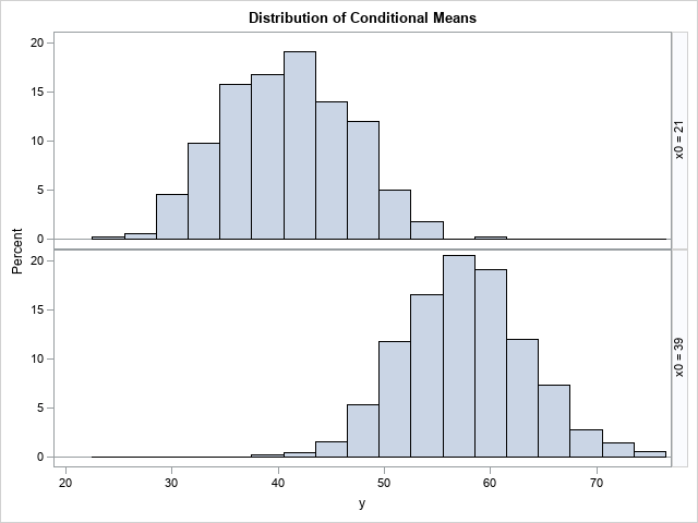
The distribution of the conditional mean
As I said earlier, you should think of the confidence bands as a bunch of vertical confidence intervals. The distribution of the conditional mean within each vertical slice is assumed to be normally distributed with mean b0 + b1*x. The following histograms show the distribution of the predicted means for x=21 and x=39 (respectively) over all 500 regression lines. You should compare the 2.5th and 97.5th percentiles for these histograms to the vertical limits (at the same x values) of the confidence band in the graph at the top of this article.
title "Distribution of Conditional Means"; proc sgpanel data=Combine(where=(xx^=.)); label yy="y" xx="x0"; panelby xx / layout=rowlattice columns=1; histogram yy; run; |
Summary
In summary, this article visualizes a few facts about the confidence band for a regression line. The confidence band conveys uncertainty about the location of the conditional mean. The visualization can be improved by overlaying several semi-transparent bands, a graph that Wilke calls a "graded confidence band plot." You can use simulation to relate the confidence band to sampling variability. If you simulate many random samples and overlay the regression lines, they form a confidence band. The limits of the confidence band are related to the quantiles of the conditional distribution of the means.

1 Comment
Pingback: A continuous band plot for visualizing uncertainty in regression predictions - The DO Loop