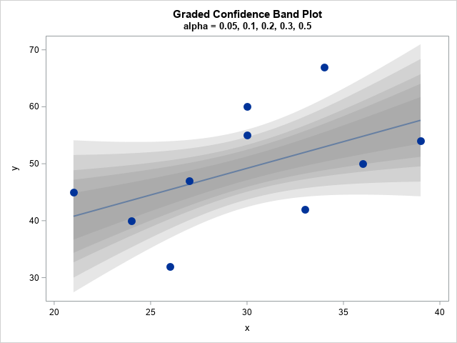
A previous article discusses the confidence band for the mean predicted value in a regression model. The article shows a "graded confidence band plot," which I saw in Claus O. Wilke's online book, Fundamentals of Data Visualization (Section 16.3). It communicates uncertainty in the predictions. A graded band plot is shown to the right for the 95% (outermost), 90%, 80%, 70% and 50% (innermost) confidence levels.
The graded band plot to the right has five confidence levels, but that was an arbitrary choice. Why not use 10 levels? Or 100?
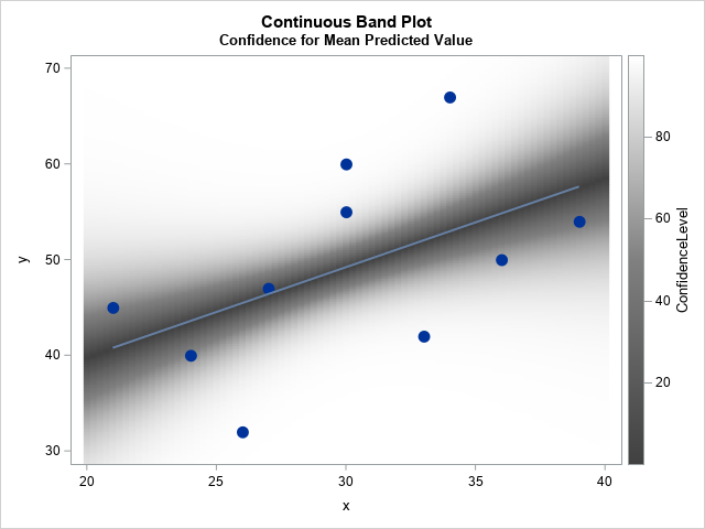
When you start using many levels, it is no longer feasible to identify the individual confidence bands. However, you can use a heat map to visualize the uncertainty in the mean. Given any (x,y) value in the graph, you can find the value of α such that the 100(1-α)% confidence limit passes through (x,y). You can then color the point (x,y) by the value of α and use a gradient legend to indicate the α values (or, equivalently, the confidence levels). An example is shown below. In this article, I show how to create this visualization, which I call a continuous band plot. This article was inspired by a question and graph that Michael Friendly posted on Twitter.
A review: The formula for confidence limits for the mean predicted value
Most statistics textbooks provide a formula for the 100(1-α)% confidence limits for the predicted mean of a regression model. You can see the formula in the SAS documentation.
To keep the math simple, I will restrict the discussion to one-dimensional linear regression of the form Y = b0 + b1*x + ε, where ε ~ N(0, σ).
Suppose that the sample contains n observations.
Given a significance level (α) and values for the explanatory variable (x), the upper and lower confidence limits are given by
CLM(x) = pred(x) ± tα SEM(x)
where
- tα = quantile("t", 1-α/2, n-2) is a quantile of the t distribution with n-2 degrees of freedom
- SEM(x) = sqrt(MSE * h(x)) is the standard error of the predicted mean at x
- MSE is the mean squared error, which is the sum of the squared residuals divided by n-2.
- h(x) is the leverage statistic at x. The SAS documentation provides a matrix equation for the leverage statistic at x in terms of a quadratic form that involves the inverse of the crossproduct matrix. For a one-variable regression, you can explicitly write the leverage in terms of the elements of the inverse matrix. If M = (X`X)-1 is the inverse matrix, then the leverage is h(x) = M[1,1] + 2*M[1,2]*x + M[2,2]*x2.
The SAS/IML documentation includes a Getting Started example about computing statistics for linear regression. The following program computes these quantities for α=0.05 and for a sequence of x values:
data Have; input x y; datalines; 21 45 24 40 26 32 27 47 30 55 30 60 33 42 34 67 36 50 39 54 ; proc iml; /* Use IML to produce regression estimates */ use Have; read all var {x y}; close; X = j(nrow(x),1,1) || x; /* add intercept col to design matrix */ n = nrow(x); /* sample size */ xpxi = inv(X`*X); /* inverse of X'X */ b = xpxi * (X`*y); /* parameter estimates of coeffcients */ yHat = X*b; /* predicted values for data */ dfe = n - ncol(X); /* error DF */ mse = ssq(y-yHat)/dfe; /* MSE = SSQ(resid)/dfe */ /* Given M = inv(X`*X), compute leverage at x. In general, the leverage is h = vecdiag(x*M*x`), but for a single regressor this simplifies. */ start leverage(x, M); return ( M[1,1] + 2*M[1,2]*x + M[2,2]*x##2 ); finish; alpha = 0.05; t_a= quantile("t", 1-alpha/2, dfe); /* evaluate CLM for a sequence of x values */ z = T(do(20,40,1)); /* sequence of x values in [20,40] */ h = leverage(z, xpxi); /* evaluate h(x) */ SEM = sqrt(mse * h); /* SEM(x) = standard error of predicted mean */ Pred = b[1] + b[2]*z; /* evaluate pred(x) */ LowerCLM = Pred - t_a * SEM; UpperCLM = Pred + t_a * SEM; print z Pred LowerCLM UpperCLM; |
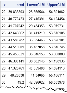
The program computes the predicted values and the lower and upper 95% confidence limits for the mean for a sequence of x values in the interval [20, 40]. If you overlay these curves on a scatter plot of the data, you obtain the usual regression fit plot that is produced automatically by regression procedures in SAS.
Invert the confidence limit formula
The previous section implements formulas that are typically presented in a first course on linear regression. Given α and x, the formulas enable you to find the upper and lower CLM at x. But here is a cool thing that I haven't seen before: You can INVERT that formula. That is, given a value for the explanatory variable (x) and the response (y), you can find the significance level (α) such that the 100(1-α) confidence limit passes through (x, y). This enables you to compute a heat map that visualizes the uncertainty in the predicted mean.
It is not hard to invert the CLM formula. You can use algebra to find
tα = |y - pred(x)| / SEM(x)
You can then apply the CDF function to both sides to find
1 - α/2 = CDF("t", |y - pred(x)| / SEM(x), n-2)
which you can solve for α(x,y).
The following program carries out these computations:
/* Given (x,y), find alpha(x,y) so that the 100(1-alpha)% confidence limit passes through (x,y). */ /* Vectorize this process and compute alpha(x,y) for a grid of (x,y) values */ xx = do(20, 40, 0.25); /* x in [20,40] */ yy = do(26, 73, 0.2); /* y in [26,73] */ xy = ExpandGrid(yy, xx); /* generate (x,y) pairs where x changes fastest */ x = xy[,2]; y = xy[,1]; /* vectors of x & y */ h = leverage(x, xpxi); /* h(x) */ SEM = sqrt(mse * h); /* SEM(x) = standard error of predicted mean */ Pred = b[1] + b[2]*x; /* best predition of mean at x */ LHS = abs(y - Pred)/SEM; p = cdf("t", LHS, dfe); /* = 1 - alpha/2 */ alpha = 2*(1 - p); ConfidenceLevel = 100*(1-alpha); /* write the data to a SAS data set */ create Heat var{'x' 'y' 'alpha' 'ConfidenceLevel'}; append; close; QUIT; |
For each (x,y) value in a grid, the program computes the α value such that the 100(1-α)% confidence limit passes through (x,y). These values are written to a SAS data set and are used in the next section.
A continuous band plot
The following statements visualize the uncertainty in the predicted value by creating a heat map of the confidence bands for a range of confidence values:
data ContBand; set Have Heat(rename=(x=xx y=yy)); /* concatenate with orig data */ label xx="x" yy="y"; run; title 'Continuous Band Plot'; title2 'Confidence for Mean Predicted Value'; proc sgplot data=ContBand noautolegend; heatmapparm x=xx y=yy colorresponse=ConfidenceLevel / colormodel=(VeryDarkGray Gray White) name="prob"; reg x=x y=y/ markerattrs=(symbol=CircleFilled size=12); gradlegend "prob"; yaxis min=30 max=68; run; |
The graph is shown in the first section of this article. The graph is similar to Wilke's graded confidence band plot. However, instead of overlaying a small number of confidence bands, it visualizes "infinitely many" confidence bands. Basically, it inverts the usual process (limits as a function of confidence level) to produce confidence as a function of y, for each x.
The gradient legend associates a color to a confidence level. In theory, you can associate each (x,y) point with a confidence level. In practice, it is hard to visually distinguish grey scales. If it is important to distinguish, say, the 80% confidence region, you can replace the color ramp for the COLORMODEL= option. For example, you could use colormodel=(black red yellow cyan white) if you are looking for vibrant colors that emphasize the 25%, 50%, and 75% levels.
A profile plot for the confidence band
It is enlightening to take a vertical slice of the continuous band plot. A vertical slice provides a "profile plot," which shows how the confidence level changes as a function of y for a fixed value of x. Here is the profile plot at x=30:
title 'Profile Plot of Confidence Level'; title2 'x = 30'; proc sgplot data=Heat noautolegend; where x = 30; series x=ConfidenceLevel y=y; refline 49.2 / axis=y; yaxis min=30 max=68 grid; xaxis grid; run; |
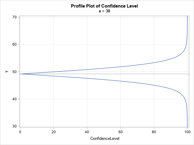
When x=30, the predicted mean is 49.2, which is marked by a horizontal reference line. That point prediction is the "0% confidence interval," since it does not account for sampling variability. For ConfidenceLevel > 0, the curves give the width of the confidence interval for the predicted mean. The width is small and increases almost linearly with the confidence level until about the 70% level. The lower and upper 80% CLMs are 45.1 and 53.3, respectively. The lower and upper 95% CLMs are much bigger at 42.4 and 56.0, respectively. The 99% CLMs are 39.3 and 59.1. As the confidence level approaches 100%, the width of the interval increases without bound.
Summary
In summary, this article shows formulas for the lower and upper 100(1-α)% confidence limits for the predicted mean at a point x. You can invert the formulas: for any (x,y), you can find the value of α for which the 100(1-α)% confidence limits pass through the point (x,y). You can use a heat map to visualize the resulting surface, which is a continuous version of the graded confidence band plot. The continuous band plot is one way to visualize the uncertainty of the predicted mean in a regression model.

1 Comment
I'm catching up on my reading, so coming late to this.
Many of us prefer estimation to significance testing, but the conventional 95% confidence limits are a sneaky way for significance testing to creep back in. This graphic is exactly what we need! I have from time to time mused why with modern computing and graphics power we do not have such a thing. Well, now we do.
SAS has been criticized in the past for inadequate graphics. Here's a chance really to shine. Please build it into PROC PLM. One simple option is all it takes.