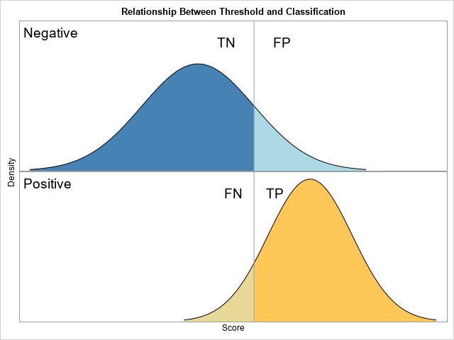
The purpose of this article is to show how to use SAS to create a graph that illustrates a basic idea in a binary classification analysis, such as discriminant analysis and logistic regression. The graph, shown at right, shows two populations. Subjects in the "negative" population do not have some disease (or characteristic) whereas individuals in the "positive" population do have it. There is a function (a statistical model) that associates a score with each individual, and the distribution of the scores is shown. A researcher wants to use a threshold value (the vertical line) to classify individuals. An individual is predicted to be negative (does not have the disease) or positive (does have the disease) according to whether the individual's score is lower than or higher than the cutoff threshold, respectively.
Unless the threshold value perfectly discriminates between the populations, some individuals will be classified correctly, and others will be classified incorrectly. There are four possibilities:
- A subject that belongs to the negative population might be classified as "negative." This is a correct classification, so this case is called a "true negative" (TN).
- A subject that belongs to the negative population might be classified as "positive." This is a wrong classification, so this case is called a "false positive" (FP).
- A subject that belongs to the positive population might be classified as "negative." This is a wrong classification, so this case is called a "false negative" (FN).
- A subject that belongs to the positive population might be classified as "positive." This is a wrong classification, so this case is called a "true positive" (TP).
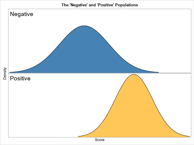
Typically, these concepts are visualized by using a panel of histograms based on a finite sample of data. However, this visualization uses the populations themselves, rather than data. In particular, this visualization assumes two normal populations, a situation that is called the binormal model for binary discrimination (Krzandowski and Hand, ROC Curves for Continuous Data, 2009, p. 31-35).
A graph of the populations
In building up any complex graph, it is best to start with a simpler version. A simple version enables you to develop and debug your program and to experiment with various visualizations. This section creates a version of the graph that does not have the threshold line or the four categories (TN, FP, FN, and TP).
The following DATA step uses the PDF function to generate the density curves for two populations. For this graph, the negative population is chosen to be N(0, 1) whereas the positive population is N(2, 0.75). By convention, the mean of the negative population is chosen to be less than the mean of the positive population. I could have used two separate DO loops to iterate over the X values for the distributions, but instead I used (temporary) arrays to store the parameters for each population.
/* 1. Create data for the negative and positive populations by using a binormal model. The data are in "long form." An indicator variable (Class) has the values "Negative" and "Positive." */ %let mu_N = 0; /* mean of Negative population */ %let sigma_N = 1; /* std dev of Negative population */ %let mu_P = 2; /* mean of Positive population */ %let sigma_P = 0.75; /* std dev of Positive population */ data Binormal(drop=i); array mu[2] _temporary_ (&mu_N, &mu_P); array sigma[2] _temporary_ (&sigma_N, &sigma_P); array c[2] $ _temporary_ ("Negative", "Positive"); do i = 1 to 2; Class = c[i]; do x = mu[i] - 3*sigma[i] to mu[i] + 3*sigma[i] by 0.05; pdf = pdf("Normal", x, mu[i], sigma[i]); output; end; end; run; |
The first few observations are shown below:
                       Class        x             pdf
                      Negative    -3.00    .004431848
                      Negative    -2.95    .005142641
Negative -2.90 .005952532 |
Because the data are in "long form," you can use PROC SGPANEL to create a basic graph. You need to use PANELBY Class to display the negative population in one graph and the positive population in another. Here are a few design decisions that I made for the visualization:
- SAS will assign default colors to the two populations, but you can use the STYLEATTRS statement to assign specific colors to each population curve.
- You can use the BAND statement to fill in the area under the population density curves.
- The SGPANEL procedure will display row headers or column headers to identify the positive and negative populations, but I used the NOHEADER option to suppress these headers and used the INSET statement to add the information in the upper left corner of each graph.
- Since this graph is a schematic diagram, I suppress the ticks and values on the axes by using the DISPLAY=(noticks novalues) option on the ROWAXIS and COLAXIS statements.
ods graphics / width=480px height=360px; title "The 'Negative' and 'Positive' Populations"; proc sgpanel data=Binormal noautolegend; styleattrs datacolors=(SteelBlue LightBrown); panelby Class / layout=rowlattice onepanel noheader; inset Class / position=topleft textattrs=(size=14) nolabel; band x=x upper=pdf lower=0 / group=Class; series x=x y=pdf / lineattrs=(color=black); rowaxis offsetmin=0 display=(noticks novalues) label="Density"; colaxis display=(noticks novalues) label="Score"; run; |
Adding regions for true and false classifications
The previous section graphs the populations. To add the regions that are correctly and incorrectly classified by a given threshold value, you need to modify the DATA step that creates the density curves. In addition to the Class indicator variable (which has the values "Negative" and "Positive"), you need to add an indicator variable that has four values: "TN", "FP", "FN", and "TP". This second indicator variable will be used to assign colors for each region. The four regions depend on the value of the threshold parameter, which means that the DO loop that iterates over the X values should be split into two parts: the part less than the threshold and the part greater than the threshold. This is shown by the following:
%let cutoff = 1; /* value of the threshold parameter */ data Binormal2(drop=i); array mu[2] _temporary_ (&mu_N, &mu_P); array sigma[2] _temporary_ (&sigma_N, &sigma_P); array c[2] $ _temporary_ ("Negative", "Positive"); array T[2, 2] $ _temporary_ ("TN", "FP", "FN", "TP"); do i = 1 to 2; Class = c[i]; Type = T[i, 1]; do x = mu[i] - 3*sigma[i] to &cutoff by 0.01; pdf = pdf("Normal", x, mu[i], sigma[i]); output; end; Type = T[i, 2]; do x = &cutoff to mu[i] + 3*sigma[i] by 0.01; pdf = pdf("Normal", x, mu[i], sigma[i]); output; end; end; run; |
The first few observations are shown below:
                   Class      Type      x             pdf
                  Negative     TN     -3.00    .004431848
                  Negative     TN     -2.99    .004566590
Negative TN -2.98 .004704958 |
The graph should display labels for the four regions. I will use the TEXT statement to place the labels. For the height of the labels, I will use 90% of the maximum height of the density curves. For the horizontal positions, I will offset the text by +/-50% of the standard deviation of the distribution. I use the STYLEATTRS statement to assign the colors to the four regions.
/* find the maximum height of the graph */ proc means data=Binormal2 max noprint; var pdf; output out=OutLab max=Max; run; /* use +/- s*StdDev to space the labels */ data label(drop=Max); set OutLab(keep=Max); y = 0.9 * Max; /* 90% of the maximum height */ Class = "Negative"; x = &cutoff - 0.5*&sigma_N; Text = "TN"; output; x = &cutoff + 0.5*&sigma_N; Text = "FP"; output; Class = "Positive"; x = &cutoff - 0.5*&sigma_P; Text = "FN"; output; x = &cutoff + 0.5*&sigma_P; Text = "TP"; output; run; data All; set Binormal2 label; /* merge the two data sets */ run; ods graphics / width=480px height=360px; title "Relationship Between Threshold and Classification"; proc sgpanel data=All noautolegend; styleattrs datacolors=(SteelBlue LightBlue Cream LightBrown); panelby Class / layout=rowlattice onepanel noheader; inset Class / position=topleft textattrs=(size=14) nolabel; band x=x upper=pdf lower=0 / group=Type; series x=x y=pdf / lineattrs=(color=black); refline &cutoff / axis=X; text x=x y=y text=Text / textattrs=(size=14); rowaxis offsetmin=0 display=(noticks novalues) label="Density"; colaxis display=(noticks novalues) label="Score"; run; |
The graph is shown at the top of this article.
In summary, this article shows how to create a graph that illustrates a fundamental relationship in the binary classification problem.

5 Comments
This is a very interesting view of classifier performance.
For my own personal use, I'd junk it up with some percentages, or perhaps it'd be better to make a complementary table that displays some stats.When I look at the chart, I try to estimate a number of ratios by eye, and since my brain is going to automatically wonder about those, might as well automate the answers.
Thanks for sharing !
Doug D
Thanks for writing. I agree that a table of TN, FP, FP, and TN would make a nice addition. I did this in a second article, "The binormal model for ROC curves." The follow-up uses graphs, but you can print the data sets it you want to see a table of values.
Thanks for the article. When we say data is in "long form" what does that mean?
For data in a wide form, each subject is represented by one row and many variables. You use wide form data for ANOVA, GLM, and most multivariate analyses.
For data in a long form, each subject spans multiple rows. This is common in mixed models, graphing, and other applications. See "Reshaping data from wide to long format."
Pingback: Blog posts from 2020 that deserve a second look - The DO Loop