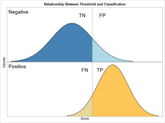
The ROC curve is a graphical method that summarizes how well a binary classifier can discriminate between two populations, often called the "negative" population (individuals who do not have a disease or characteristic) and the "positive" population (individuals who do have it). As shown in a previous article, there is a theoretical model, called the binormal model, that describes the fundamental features in binary classification. The model assumes a set of scores that are normally distributed for each population, and the mean of the scores for the negative population is less than the mean of scores for the positive population. The figure to the right (which was discussed in the previous article) shows a threshold value (the vertical line) that a researcher can use to classify an individual as belonging to the positive or negative population, according to whether his score is greater than or less than the threshold, respectively.
In most applications, any reasonable choice of the threshold will misclassify some individuals. Members of the negative population can be misclassified, which results in a false positive (FP). Members of the positive population can be misclassified, which results in a false negative (FP). Correctly classified individuals are true negatives (TN) and true positives (TP).
Vizualize the binary classification method
One way to assess the predictive accuracy of the classifier is to use the proportions of the populations that are classified correctly or are misclassified. Because the total area under a normal curve is 1, the threshold parameter divides the area into two proportions. It is instructive to look at how the proportions change as the threshold value ranges. The proportions are usually called "rates." The four regions correspond to the True Negative Rate (TNR), False Positive Rate (FPR), False Negative Rate (FNR), and True Positive Rate (TPR).
For the binormal model, you can use the standard deviations of the populations to choose a suitable range for the threshold parameter. The following SAS DATA step uses the normal cumulative distribution function (CDF) to compute the proportion of each population that lies to the left and to the right of the threshold parameter for a range of values. These proportions are then plotted against the threshold parameters.
%let mu_N = 0; /* mean of Negative population */ %let sigma_N = 1; /* std dev of Negative population */ %let mu_P = 2; /* mean of Positive population */ %let sigma_P = 0.75; /* std dev of Positive population */ /* TNR = True Negative Rate (TNR) = area to the left of the threshold for the Negative pop FPR = False Positive Rate (FPR) = area to the right of the threshold for the Negative pop FNR = False Negative Rate (FNR) = area to the left of the threshold for the Positive pop TPR = True Positive Rate (TPR) = area to the right of the threshold for the Positive pop */ data ClassRates; do t = -3 to 4 by 0.1; /* threshold cutoff value (could use mean +/- 3*StdDev) */ TNR = cdf("Normal", t, &mu_N, &sigma_N); FPR = 1 - TNR; FNR = cdf("Normal", t, &mu_P, &sigma_P); TPR = 1 - FNR; output; end; run; title "Classification Rates as a Function of the Threshold"; %macro opt(lab); name="&lab" legendlabel="&lab" lineattrs=(thickness=3); %mend; proc sgplot data=ClassRates; series x=t y=TNR / %opt(TNR); series x=t y=FPR / %opt(FPR); series x=t y=FNR / %opt(FNR); series x=t y=TPR / %opt(TPR); keylegend "TNR" "FNR" / position=NE location=inside across=1; keylegend "TPR" "FPR" / position=SE location=inside across=1; xaxis offsetmax=0.2 label="Threshold"; yaxis label="Classification Rates"; run; |
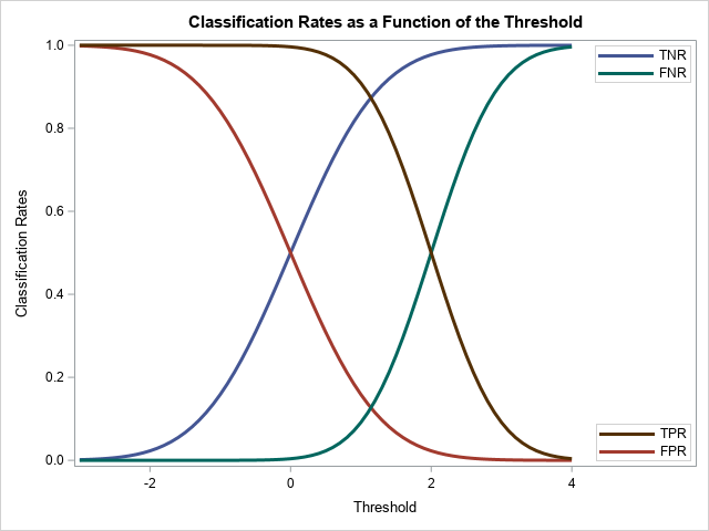
The graph shows how the classification and misclassification rates vary as you change the threshold parameter. A few facts are evident:
- Two of the curves are redundant because FPR = 1 – TNR and TPR = 1 – FNR. Thus, it suffices to plot only two curves. A common choice is to display only the FPR and TPR curves.
- When the threshold parameter is much less than the population means, essentially all individuals are predicted to belong to the positive population. Thus, the FPR and the TPR are both essentially 1.
- As the parameter increases, both rates decrease monotonically.
- When the threshold parameter is much greater than the population means, essentially no individuals are predicted to belong to the positive population. Thus, the FPR and TPR are both essentially 0.
The ROC curve
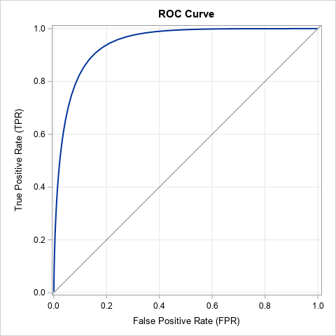
The graph in the previous section shows the FPR and TPR as functions of t, the threshold parameter. Alternatively, you can plot the parametric curve ROC(t) = (FPR(t), TPR(t)), for t ∈ (-∞, ∞). Because the FPR and TPR quantities are proportions, the curve (called the ROC curve) is always contained in the unit square [0, 1] x [0, 1]. As discussed previously, as the parameter t → -∞, the curve ROC(t) → (1, 1). As the parameter t → ∞, the curve ROC(t) → (0, 0). The main advantage of the ROC curve is that the ROC curve is independent of the scale of the population scores. In fact, the standard ROC curve does not display the threshold parameter. This means that you can compare the ROC curves from different models that might use different scores to classify the negative and positive populations.
The following call to PROC SGPLOT creates an ROC curve for the binormal model by plotting the TPR (on the vertical axis) against the FPR (on the horizontal axis). The resulting ROC curve is shown to the right.
title "ROC Curve"; title2; proc sgplot data=ClassRates aspect=1 noautolegend; series x=FPR y=TPR / lineattrs=(thickness=2); lineparm x=0 y=0 slope=1 / lineattrs=(color=gray); xaxis grid; yaxis grid; run; |
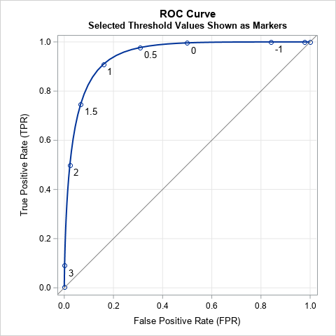
The standard ROC curve does not display the values of the threshold parameter. However, for instructional purposes, it can be enlightening to plot the values of a few selected threshold parameters. An example is shown in the following ROC curve. Displaying the ROC curve this way emphasizes that each point on the ROC curve corresponds to a different threshold parameter. For example, when t=1, the cutoff parameter is 1 and the classification is accomplished by using the vertical line and binormal populations that are shown at the beginning of this article.
Interpretation of the ROC curve
The ROC curve shows the tradeoff between correctly classifying those who have a disease/condition and those who do not. For concreteness, suppose you are trying to classify people who have cancer based on medical tests. Wherever you place the threshold cutoff, you will make two kinds of errors: You will not identify some people who actually have cancer and you will mistakenly tell other people that they have cancer when, in fact, they do not. The first error is very bad; the second error is also bad but not life-threatening. Consider three choices for the threshold parameter in the binormal model:
- If you use the threshold value t=2, the previous ROC curve indicates that about half of those who have cancer are correctly classified (TPR=0.5) while misclassifying very few people who do not have cancer (FPR=0.02). This value of the threshold is probably not optimal because the test only identifies half of those individuals who actually have cancer.
- If you use t=1, the ROC curve indicates that about 91% of those who have cancer are correctly classified (TPR=0.91) while misclassifying about 16% of those who do not have cancer (FPR=0.16). This value of the threshold seems more reasonable because it detects most cancers while not alarming too many people who do not have cancer.
- As you decrease the threshold parameter, the detection rate only increases slightly, but the proportion of false positives increases rapidly. If you use t=0, the classifier identifies 99.6% of the people who have cancer, but it also mistakenly tells 50% of the non-cancer patients that they have cancer.
In general, the ROC curve helps researchers to understand the trade-offs and costs associated with false positive and false negatives.
Concluding remarks
In summary, the binormal ROC curve illustrates fundamental features of the binary classification problem. Typically, you use a statistical model to generate scores for the negative and positive populations. The binormal model assumes that the scores are normally distributed and that the mean of the negative scores is less than the mean of the positive scores. With that assumption, it is easy to use the normal CDF function to compute the FPR and TPR for any value of a threshold parameter. You can graph the FPR and TPR as functions of the threshold parameter, or you can create an ROC curve, which is a parametric curve that displays both rates as the parameter varies.
The binormal model is a useful theoretical model and is more applicable than you might think. If the variables in the classification problem are multivariate normal, then any linear classifier results in normally distributed scores. In addition, Krzandowski and Hand (2009, p. 34-35), state that the ROC curve is unchanged by any monotonic increasing transformation of scores, which means that the binormal model applies to any set of scores that can be transformed to normality. This is a large set, indeed, since it includes the complete Johnson system of distributions.
In practice, we do not know the distribution of scores for the population. Instead, we have to estimate the FPR and TPR by using collected data. PROC LOGISTIC in SAS can estimate an ROC curve for data by using a logistic regression classifier. Furthermore, PROC LOGISTIC can automatically create an empirical ROC curve from any set of paired observed and predicted values.
