A colleague recently posted an article about how to use SAS Visual Analytics to create a circular graph that displays a year's worth of temperature data. Specifically, the graph shows the air temperature for each day in a year relative to some baseline temperature, such as 65F (18C). Days warmer than baseline are displayed in one color (red for warm) whereas days colder than the baseline are displayed in another color (blue for cold). The graph was very pretty. A reader posted a comment asking whether a similar graph could be created by using other graphical tools such as GTL or even PROC SGPLOT. The answer is yes, but I am going to propose a different graph that I think is more flexible and easier to read.
Let's generalize the problem. Suppose you have a time series and you want to compare the values to a baseline (or reference) value. One way to do this is to visualize the data as deviations from the baseline. Data values that are close to the baseline will be small and almost unnoticeable. The eye will be drawn to values that indicate large deviations from the baseline. A "deviation plot" like this can be used for many purposes. Some applications include monitoring blood glucose relative to a target value, showing expenditures relative to a fixed income amount, and, yes, displaying the temperature relative to some comfortable reference value. Deviation plots sometimes accompany a hypothesis test for a one-way frequency distribution.
Linear displays versus circular displays
My colleague's display shows one year's worth of temperatures by plotting the day of the year along a circle. While this makes for an eye-catching display, there are a few shortcomings to this approach:
- It is difficult to read the data values. It is also difficult to compare values that are on opposite sides of a circle. For example, how does March data compare with October data?
- Although a circle can show data for one year, it is less effective for showing 8 or 14 months of data.
- Even for one year's worth of data, it has a problem: It places December 31 next to January 1. In the temperature graph, the series began on 01JAN2018. However, the graph places 31DEC2018 next to 01JAN2018 even though those values are a year apart.
As mentioned earlier, you can use SAS/GRAPH or the statistical graphics (SG) procedure in SAS to display the data in polar coordinates. Sanjay Matange's article shows how to create a polar plot. For some of my thought about circular versus rectangular displays, see "Smoothers for periodic data."
A deviation-from-baseline plot
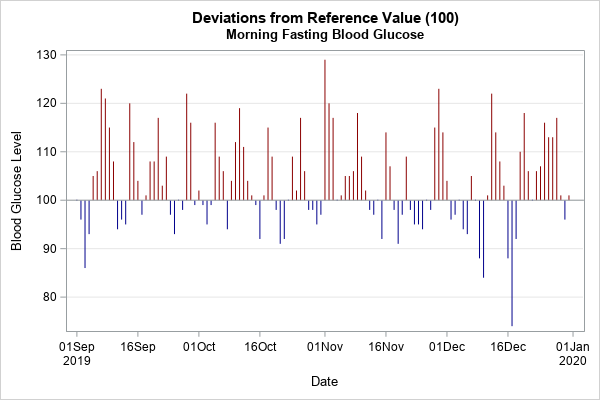
The graph to the right (click to enlarge) shows an example of a deviation plot (or deviation-from-baseline plot). It is similar to a waterfall chart, but in many waterfall charts the values are shown as percentages, whereas for the deviation plot we will show the observed values. You can see that the values are plotted for each day. The high values are plotted in one color (red) whereas low values are plotted in a different color (blue). A reference line (in this case, at 100) is displayed.
To create a deviation plot, you need to perform these three steps:
- Use the SAS DATA step to encode the data as 'High' or 'Low' by using the reference value. Compute the deviations from the reference value.
- Create a discrete attribute map that maps values to colors. This step is optional. Alternatively, SAS will assign colors based on the current ODS style.
- Use a HIGHLOW plot to graph the deviations from the reference value.
Let's implement these steps on a time series for three months of daily blood glucose values. An elderly male takes oral medications to control his blood glucose level. Each morning he takes his fasting blood glucose level and records it. The doctor has advised him to try to keep the blood glucose level below 100 mg/dL, so the reference value is 100. The following DATA step defines the dates and glucose levels for a three-month period.
data Series; informat Date date.; format Date Date.; input Date y @@; label y = "Blood Glucose (mg/dL)"; datalines; 01SEP19 100 02SEP19 96 03SEP19 86 04SEP19 93 05SEP19 105 06SEP19 106 07SEP19 123 08SEP19 121 09SEP19 115 10SEP19 108 11SEP19 94 12SEP19 96 13SEP19 95 14SEP19 120 15SEP19 112 16SEP19 104 17SEP19 97 18SEP19 101 19SEP19 108 20SEP19 108 21SEP19 117 22SEP19 103 23SEP19 109 24SEP19 97 25SEP19 93 26SEP19 100 27SEP19 98 28SEP19 122 29SEP19 116 30SEP19 99 01OCT19 102 02OCT19 99 03OCT19 95 04OCT19 99 05OCT19 116 06OCT19 109 07OCT19 106 08OCT19 94 09OCT19 104 10OCT19 112 11OCT19 119 12OCT19 111 13OCT19 104 14OCT19 101 15OCT19 99 16OCT19 92 17OCT19 101 18OCT19 115 19OCT19 109 20OCT19 98 21OCT19 91 22OCT19 92 23OCT19 100 24OCT19 109 25OCT19 102 26OCT19 117 27OCT19 106 28OCT19 98 29OCT19 98 30OCT19 95 31OCT19 97 01NOV19 129 02NOV19 120 03NOV19 117 04NOV19 . 05NOV19 101 06NOV19 105 07NOV19 105 08NOV19 106 09NOV19 118 10NOV19 109 11NOV19 102 12NOV19 98 13NOV19 97 14NOV19 . 15NOV19 92 16NOV19 114 17NOV19 107 18NOV19 98 19NOV19 91 20NOV19 97 21NOV19 109 22NOV19 98 23NOV19 95 24NOV19 95 25NOV19 94 26NOV19 . 27NOV19 98 28NOV19 115 29NOV19 123 30NOV19 114 01DEC19 104 02DEC19 96 03DEC19 97 04DEC19 100 05DEC19 94 06DEC19 93 07DEC19 105 08DEC19 . 09DEC19 88 10DEC19 84 11DEC19 101 12DEC19 122 13DEC19 114 14DEC19 108 15DEC19 103 16DEC19 88 17DEC19 74 18DEC19 92 19DEC19 110 20DEC19 118 21DEC19 106 22DEC19 100 23DEC19 106 24DEC19 107 25DEC19 116 26DEC19 113 27DEC19 113 28DEC19 117 29DEC19 101 30DEC19 96 31DEC19 101 ; |
Encode the data
The first step is to compute the deviation of each observed value from the reference value. If an observed value is above the reference value, mark it as 'High', otherwise mark it as 'Low'. We will plot a vertical bar that goes from the reference level to the observed value. Because we will use a HIGHLOW statement to display the graph, the DATA step computes two new variables, High and Low.
/* 1. Compute the deviation and encode the data as 'High' or 'Low' by using the reference value */ %let RefValue = 100; data Center; set Series; if (y > &RefValue) then Group="High"; else Group="Low"; Low = min(y, &RefValue); /* lower end of highlow bar */ High = max(y, &RefValue); /* upper end of highlow bar */ run; |
Maps high and low values to colors
If you want SAS to assign colors to the two groups, you can skip this step. However, in many cases you might want to choose which color is plotted for the high and low categories. You can map levels of a group to colors by using a discrete attribute map ("DATTR map", for short) in PROC SGPLOT. Because we are going to use a HIGHLOW statement to graph the data, we need to define a map that has the FillColor and LineColor for the vertical bars. The following DATA step maps the 'High' category to red and the 'Low' category to blue:
/* 2. Create a discrete attribute map that maps values to colors */ data DAttrs; length c FillColor LineColor $16.; ID = "HighLow"; Value = "High"; c="DarkRed"; FillColor=c; LineColor=c; output; Value = "Low"; c="DarkBlue"; FillColor=c; LineColor=c; output; run; |
Create a high-low plot
The final step is to create a high-low plot that shows the deviations from the reference value. You can use the DATTRMAP= option to tell PROC SGPLOT how to assign colors for the group values. Because a data set can contain multiple maps, the ATTRID= option specifies which mapping to use.
/* 3. Use a HIGHLOW plot to graph the deviations from the reference value */ title "Deviations from Reference Value (&RefValue)"; title2 "Morning Fasting Blood Glucose"; ods graphics / width=600px height=400px; proc sgplot data=Center DATTRMAP=DAttrs noautolegend; highlow x=day low=low high=high / group=Group ATTRID=HighLow; refline &RefValue / axis=y; yaxis grid label="Blood Glucose Level"; run; |
The graph is shown at the top of this section. It is clear that on most days the patient has high blood sugar. With additional investigation, you can discover that the highest levels are associated with weekends and holidays.
Note that these data would not be appropriate to plot on a circular graph because the data are not for a full year. Furthermore, on this graph it is easy to see specific values and days and to compare days in September with days in December.
A deviation plot for daily average temperatures
My colleague's graph displayed daily average temperatures. The following deviation plot shows average temperatures and a reference value of 65F. The graph shows the daily average temperature in Raleigh, NC, for 2018:
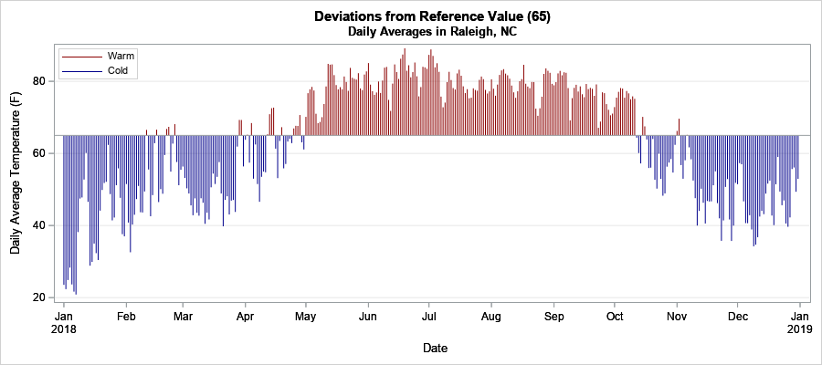
In this graph, it is easy to find the approximate temperature for any range of dates (such as "mid-October") and to compare the temperature for different time periods, such as March versus October. I think the rectangular deviation plot makes an effective visualization of how these data compare to a baseline value.
You can download the SAS program that creates the graphs in this article.
