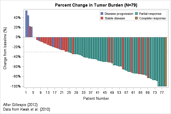
In clinical trials, a waterfall plot is often used to indicate how patients in the study responded to treatment. In oncology trials, the response variable might be the percent change in the size of a tumor from the individual's baseline value at the start of the trial. The percent change is plotted for each patient, who are usually ordered from worst (the tumor grew) to best (the tumor vanished). Tumors that grow have a positive change; a reduction in size corresponds to a negative value between 0% and -100%. Clinical trials in other areas would have a different response variable, but the ideas are the same.
Clinical researchers use a bar chart to show the distribution of the response variable because the color of the bar can encode additional characteristics for each patient, such as the patient's Response Evaluation Criteria in Solid Tumors (RECIST) scores. The RECIST score classifies a tumor's response to treatment into categories such as "Progressive Disease," "Stable Disease," "Partial Response," and "Complete Response." In the waterfall plot at the top of this article, these values are used to color each bar.
This article creates a waterfall plot that is based on Figure 2 in "Understanding Waterfall Plots" (Gillespie 2012). The data are based on Kwak et al (2010). I did not have access to the original data, so I estimated values from the published graph.
Unfortunately, there are two popular charts that have the same name! If you are looking for a chart that shows the relative increase or decrease of a quantity after each step in a process, see how to use the WATERFALL statement to construct a cascade plot. Ironically, the WATERFALL statement is not used to create the waterfall plot in this article!
Create a waterfall chart in #SAS. Share on XCreating a waterfall plot as a bar plot
The waterfall plot is essentially a bar chart where each bar represents a patient and the bars are colored by a discrete variable. Waterfall plots are limited to studies that have a few hundred patients because the width of each bar requires several pixels.
The following DATA step defines the data. The response variable (REPONSE) is the tumor's percent change from baseline measurements. A decimal value represents the percentages (for example, -0.75 represents -75% change, and the PERCENTN7. format is used to format the response. Discrete categories in SAS are (by default) arranged in alphabetical order, so I use the values 1, 2, 3, and 4 to encode the RECIST values and I create a user-defined format to display those values as text. You can download the complete program that creates the data and waterfall plot.
proc format; value RECISTFmt 1='Disease progression' 2='Stable disease' 3='Partial response' 4='Complete response'; run; data Tumor; format PatientID z4. Response percentN7. RECIST RECISTFmt.; input PatientID Response RECIST; datalines; 1001 -0.75 2 1002 -0.73 3 1003 -0.51 2 1004 -0.09 2 1005 -0.10 2 ... more data ... ; |
The first step is to sort the data by the response variable. For a response variable that measures a change in tumor size, sort the data in descending order so that first patient represents the worst outcome and the last patient represents the most desirable outcome. Each observation in the sorted data is then assigned an index that indicates the position in the sorted list. This index variable will be used to plot the response along a horizontal axis:
proc sort data=Tumor out=Waterfall; by descending Response RECIST; *use RECIST code to break ties; run; data Waterfall; set Waterfall; Position + 1; /* Position = _N_ */ run; |
The data are now ready to plot. Use the VBAR statement to create the waterfall plot. The GROUP= option enables you to color the bars according to the RECIST values.
proc sgplot data=Waterfall; refline -0.3 / axis=y lineattrs=(pattern=shortdash); vbar Position / response=Response group=RECIST; xaxis label="Patient Number" fitpolicy=thin; yaxis label="Change from baseline (%)" values=(-1 to 1 by 0.2) valueshint; keylegend / location=inside down=2; run; |
The plot appears at the top of this article. Each statement is explained below:
- The REFLINE statement puts a horizontal reference line to indicate tumors that changed by 30%, which is a clinically important value. You might also want to put a reference line at 0.2 to indicate tumors that grew by 20% or more. If you put the REFLINE statement first, the reference line vanishes behind the bars. To overlay the reference line on top of the bars, put the VBAR statement first.
- The VBAR statement draws the main bar chart. The RESPONSE= option scales each bar according to the specified response variable. The GROUP= option enables you to color to bars according to a categorical variable.
- The XAXIS statement controls options for the horizontal axis. Use the FITPOLICY= option if you have so many patients that individual labels begin to overlap. To suppress the patient numbers, you can use the DISPLAY=NONE option.
- The YAXIS statement controls options for the vertical axis. Use the VALUES= option to specify the location of tick marks. Use the VALUESHINT option to specify that the minimum and maximum values of the axis are determined by data values, not by the VALUES= option.
- The KEYLEGEND statement is optional. It enables you to place the legend in a convenient location.
If you want to specify particular colors for the bars, use the STYLEATTRS statement as shown in Sanjay Matange's blog post about Clinical Graphs.
The previous example shows how to create a waterfall plot in SAS for a small to moderate number of patients. However, even for this small sample (79 patients), the labels for the patients overlap and so you need to use the FITPOLICY= option to make the tick labels look nicer. Even after thinning the labels, this example looks a little strange because the tick labels are the "non-round" numbers 1, 5, 9, 13, 17,....
An alternative waterfall plot
An alternative way to create the waterfall plot is to replace the VBAR statement (which assumes a categorical X variable) with a NEEDLE statement (which assumes a continuous X variable). You can set the widths of the needles to be thick, thereby simulating the appearance of a bar chart. However, the continuous X axis enables you to specify the VALUES= option in the XAXIS statement, thereby producing "round numbers" for the tick values, as shown below:
proc sgplot data=Waterfall; refline -0.3 / axis=y lineattrs=(pattern=shortdash); needle x=Position y=Response / baseline=0 group=RECIST lineattrs=(thickness=5px); xaxis label="Patient Number" values=(1, 5 to 75 by 5, 79) integer; yaxis label="Change from baseline (%)" values=(-1 to 1 by 0.2) valueshint; keylegend / location=inside down=2; run; |
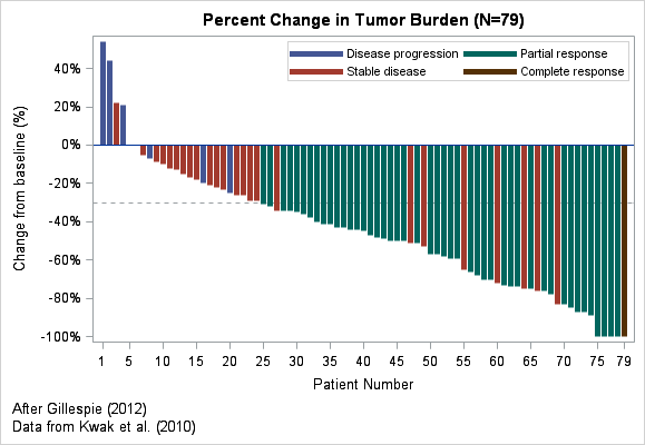
The new waterfall plot (click to enlarge) has axis labels that indicate the first and last patients; intermediate patient numbers differ by 5. You might need to play with the relative widths of the plot and of the needles in order to eliminate irregular gaps between adjacent needles.
In summary, you can create a basic waterfall plot in SAS software by using the VBAR or NEEDLE statements in the SGPLOT procedure. More complicated waterfall plots are discussed in the following papers by Pandya (2012) and Sarkar (2014).
References
- How to interpret the waterfall plot in an oncology trial: "Understanding Waterfall Plots" (Gillespie 2012).
- How to create several kinds of waterfall plots in SAS: "Waterfall Charts in Oncology Trials" (Pandya 2012)
- SAS examples that create plots that are useful in cancer research: "Plotting Against Cancer: Creating Oncology Plots Using SAS" (Sarkar 2014)

10 Comments
It seems like the business world and the scientific world have come up with two visualizations that evoke "waterfall" imagery, but in different ways. The WATERFALL statement in SGPLOT (and Waterfall charts in SAS Visual Analytics) are used to show cumulative sums over time: revenue, count of customers, number of support interactions, etc. They are also known as "progressive bar charts".
Yes, I acknowledge the irony in the last paragraph of the first section.
I don't see the NEEDLE statement, and it looks like the alternative SGPLOT code is the same as the first method.
Thanks for catching that cut-and-paste error. Fixed.
Pingback: Popular posts from The DO Loop in 2015 - The DO Loop
I have a question about how would you compare two watterfall plots, specifically in the case of different subject groups (i.e. not paired), say one group after treatment with drugs A and the other with drug B? The A & B subjects groups have more than 50 subjects each. Any comments would be appreciated. Best, Maciej
That is a great question. To get the best response, I suggest you post it to the SAS Support Communities. It seems like a good question for the Statistical Procedures Community.
Thank you for your suggestion. I followed your suggestion and received a very interesting answer involving so called Tweedy distribution which is quite unique as it is a ‘distribution that supports a positive continuous response and allows for a point mass of observed zeros’, here more about it in context of GLM:
https://communities.sas.com/t5/Statistical-Procedures/What-is-the-statistical-test-to-compare-waterfall-plots-as-used/m-p/873383/emcs_t/S2h8ZW1haWx8dG9waWNfc3Vic2NyaXB0aW9ufExINkRYS0JaNkYzTDZXfDg3MzM4M3xTVUJTQ1JJUFRJT05TfGhL
Terrible. You're supposed to show the relative increase and decrease as of a certain starting position at a certain point in time or step in the process. Each point should not start at zero, but at the net value of the previous data point. Showing progressive bar graphs is not a waterfall chart. A more helpful post would have been to simply (but factually) say that SAS cannot do waterfall charts.
Thank you for your comment. There are two popular graphs that are called "Waterfall Charts." The one I show here is used in clinical trials (especially oncology). You can click on the links in this article to learn more about the construction and interpretation of this chart in clinical trials. The second graph (also called a "cascade chart") is used in business, management, and decision science. As you say, it shows a relative increase or decrease in a quantity during steps in a process. You can use the WATERFALL statement in PROC SGPLOT to create that chart.