This week I had the opportunity to present a 1/2 day seminar on creating clinical graphs using the SG procedures during an In-House SAS Users' group meeting. I have presented this seminar quite a few times now, and I always learn something.
The audience was very receptive, with some people familiar with SAS/GRAPH, and others having some knowledge of SG procedures and GTL. The seminar focused on SG procedures. Often for such seminars, I like to get an idea in advance on the type of graphs the users need to make on a regular basis. The list of graphs that were of interest included Kaplan-Meier curves and Forest Plots.
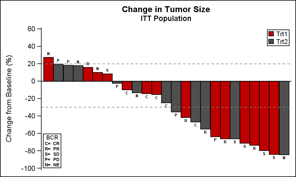 A couple of specific plots mentioned were the Waterfall graph for "Change in Tumor Size by Treatment" and a graph for "Incidence of Injection Site Reaction".
The Waterfall graph displays the range of change in tumor size in the study by treatment. The (simulated) data consists of the change in tumor size for subjects in a study, displayed in order of increasing reduction grouped by treatment. Reference lines are drawn at RECIST threshold of -30% and at 20%.
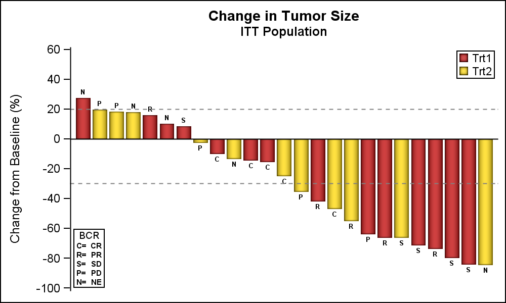 Alternative appearances can be seen on the Web, including grouping by other criteria. SGPLOT supports skins to alter the visual appearance of the graphs as shown on the right. Click on the graph for a higher resolution image.
For more information on graphs for Oncology research, see "Plotting Against Cancer: Creating Oncology Graphs using SAS" by Debpriya Sarkar.
SGPLOT code:
title 'Change in Tumor Size'; title2 'ITT Population'; proc sgplot data=TumorSize nowall noborder; styleattrs datacolors=(cxbf0000 cx4f4f4f) datacontrastcolors=(black); vbar cid / response=change group=group categoryorder=respdesc datalabel=label datalabelattrs=(size=5 weight=bold) groupdisplay=cluster clusterwidth=1; refline 20 -30 / lineattrs=(pattern=shortdash); xaxis display=none; yaxis values=(60 to -100 by -20); inset ("C="="CR" "R="="PR" "S="="SD" "P="="PD" "N="="NE") / title='BCR' position=bottomleft border textattrs=(size=6 weight=bold); keylegend / title='' location=inside position=topright across=1 border; run; |
Note: GroupDisplay=Cluster is used to be able to display the bar label on top of each bar. So the ClusterWidth option is used to modify the width of the single bar in the cluster.
I have used style colors in the code to set group colors. However, one can also use the Discrete Attributes Map to ensure the consistent assignment of colors by groups as shown in the paper mentioned above.
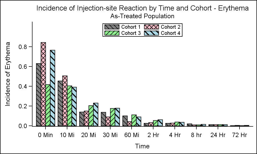 The other graph of interest was the "Incidence of Injection-Site Reaction by Time and Cohort", as shown in the graph on the right. The (simulated) data shows the incidence of reaction by time and cohort using a cluster grouped bar chart.
In this case, user wanted bar fill colors and fill patterns. Fill patterns can be useful when displaying the graph in a gray scale medium. SGPLOT supports usage of fill patterns for bars, which is enabled by setting the display option. The easiest way to do this is to set this option in the style. The Journal3 style shipped with SAS is designed to display both fill colors and fill patterns. So, I just used that style, and changed the colors to the ones I wanted using the StyleAttrs statement. You can also do this by deriving a custom style.
SGPLOT Code:
ods listing style=journal3; proc sgplot data=Incidence nowall noborder; styleattrs datacolors=(gray pink lightgreen lightblue) datacontrastcolors=(black); vbar time / response=incidence group=group groupdisplay=cluster; xaxis discreteorder=data; yaxis offsetmax=0.2; keylegend / title='' location=inside position=top across=2 border; run; |
Full SAS code: Clinical_Graphs

5 Comments
Hi Sanjay,
I have posted in the other article too, but this is more relevant.
On the waterfall plot, how do i make sure that the KEYLEGEND are shown in custom order rather than encountered in the dataset itself ?
thanks a lot.
I covered this exact issue in the article linked. One way is to use an Attr Map where the items are defined in the order you want, and use the "Show" column with a value of "ATTRMAP". This will cause all values from the attr map to be displayed in the legend (even if they are not in the data) in the order they are defined in the attr map.
Is it possible to produce Adverse events incidence using volcano plot where each bubble size is proportional to count? An example is shown at the following link
http://blogs.sas.com/content/jmp/2011/10/11/summarizing-the-incidence-of-adverse-events/
Pingback: Create a waterfall plot in SAS - The DO Loop
Pingback: Clinical graphs: Waterfall plot ++ - Graphically Speaking