Death is always a difficult topic to discuss, and death has been in the news a lot during this tragic coronavirus pandemic. Many news stories focus on states, counties, or cities that have the most cases or the most deaths. A related statistic is the case fatality rate, which is the number of deaths due to COVID-19 divided by the number of confirmed cases. (For more information about case fatality rates, see "Understanding COVID-19 data: Case fatality rate vs. mortality rate vs. risk of dying.") For this statistic, it is not always appropriate to focus on the highest values. When a county or state has only a few confirmed cases, the estimate of the case fatality rate can vary widely from day to day. The examples and graphs in this article can help you to understand the variability in a rate statistic.
This article discusses visualizing the case fatality rate for COVID-related deaths in North Carolina counties. A subsequent article discusses all US counties.
Fatalities are a grim topic. Each marker on each graph represents people who have died. A goal of these graphs is to identify counties that have extreme case-fatality rates. Decision-makers can then direct resources to the higher-than-expected communities and learn from the communities that have lower-than-expected rates.
Data visualization of the case fatality rate
Data visualization is an essential tool for researchers, decision-makers, and the general public. But you need to be careful when you visualize rates. If you use a simple bar chart, the viewer's eye is drawn towards the highest rates. This might not be appropriate when the sample size is small.
An alternative visualization is called a funnel plot (Spiegelhalter, 2005). The funnel plot is a scatter plot that can help to identify communities where the case fatality rate is higher than expected or lower than expected. This article emphasizes two main statistical ideas:
- An estimate of a rate is highly variable when the sample size is small.
- A funnel plot can help you visualize the rates relative to a reference rate (which is often the overall rate). A funnel plot can help you decide whether a sample rate is much higher or lower than the reference rate by taking the size of the sample into account.
Variability in estimates of proportion
Let's get specific. The case fatality rate is a proportion: the number of deaths due to COVID-19 (the numerator) divided by the number of confirmed cases (the denominator): Rate = Deaths / (Confirmed Cases). When the denominator is small, a small change in the numerator causes a large change in the estimate of the rate. For example, consider a hypothetical county in which initially only one person has tested positive for the coronavirus and no one has died. The county might experience the following progression over time:
- First week: 0 deaths and 1 confirmed case. The case fatality rate is 0.0.
- Second week: 1 death and 2 confirmed cases. The case fatality rate is 1/2 = 0.5 or 50%.
- Third week: 2 death and 5 confirmed cases. The case fatality rate is 2/5 = 0.40 or 40%.
- Fourth week: 2 death and 10 confirmed cases. The case fatality rate is 2/10 = 0.2 or 20%.
When a public-health official looks at the case fatality rate for this county, should she be unduly concerned when she sees that the rate jumped from 0% to 50% in one week? No. That spike is due to one additional death and occurred because the denominator was so small. For counties with 20 or fewer cases, one or two new deaths can cause the case fatality rate to spike. Looking only at the raw case fatality rates can be misleading. Therefore, you should not use a table or bar chart to visualize the counties that have the highest rates.
A funnel plot for case fatality rates
Instead, you can visualize each county as a point in a funnel plot. A sample funnel plot for counties in North Carolina is shown below. In a funnel plot, the horizontal axis represents the number of confirmed cases (the denominator) and the vertical axis represents the estimate of the case fatality rate. For comparison, you can add a reference line that represents an overall case fatality rate. You can also add curves that indicate the usual range of variability for an estimate as a function of the sample size.
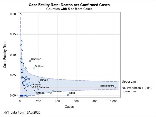
The blue-gray funnel-shaped area between these curves is the "range of variability." Estimates that are within the range of variability are not much different from the reference rate. Estimates that are outside the range are higher than expected or lower than expected. The last section of this article provides references to the theoretical justification of a funnel plot, as well as links that show how to create a funnel plot in SAS.
In the funnel plot, each marker represents one of the 78 counties in North Carolina that have five or more confirmed cases of coronavirus. The graph shows the names of the 10 counties that have 100 or more confirmed cases. Not surprisingly, these are among the most populous counties in NC, including the counties that are near the big cities of Charlotte, Raleigh, Durham, and Greensboro.
The points along the left side of the funnel plot represent counties that have few confirmed cases. As you can see, the empirical estimates for these counties vary between 0.0 (no reported deaths) to 0.2 (one death among five cases). The other high rates correspond to the fractions 2/15, 1/8, and 2/18. Although the raw rates are high, these are inside or near the boundary of the funnel-shaped region. There is not sufficient evidence to conclude that these rates are significantly different than the overall case fatality rate in North Carolina, which is 1.9%.
The two counties that stand out in this funnel plot are Johnston County and Guilford County. On 15APR2020, both had case fatality rates that were much higher than you would expect if their rate was the state average of 1.9%. Johnston County (just south of Raleigh) had an outbreak at a nursing home, which resulted in four of the county's nine deaths.
There are also two counties that have fewer-than-expected rates: Durham County and Wake County. Durham County (which contains the city of Durham) has had 330 cases and two deaths. Wake County (which contains Raleigh and SAS World Headquarters) has had 151 confirmed cases and one death.
In this graph, the reference rate is the overall case fatality rate in NC (1.9%), but you can create a similar graph by using some other rate, such as a national rate or a target rate.
It is important to remember that the denominator of the estimate is the number of confirmed cases of infection. Therefore, the estimate depends on the availability of tests, the number of people tested, and other factors that might be beyond the control of county health officials.
Summary
It is a statistical fact that estimates that are based on small samples are highly variable. In other words, it is not unusual to observe an extreme rate for a small sample. A funnel plot is a good way to visualize many estimates that are based on samples of different sizes. The funnel plot incorporates the size of the sample into the visualization. The graph includes curves that indicate an acceptable range of variability for each sample size. If a sample rate is far outside the region, the sample can be examined more closely to understand why the rate is extreme.
A funnel plot is a statistical tool that applies to any rate, but this article used the case fatality rate for the COVID-19 pandemic. A funnel plot can help decision-makers identify unusual rates that merit additional attention. If a rate is abnormally high, the community might need additional support or assistance. If a rate is abnormally low, the community might be doing something well that other communities can learn from.
Further reading
- Spiegelhalter, D. J. (2005), "Funnel plots for comparing institutional performance," Statistics in Medicine, 24(8), 1185-1202.
- Wicklin, R. (2011), "Funnel plots for proportions," The DO Loop blog.
- Wicklin, R. (2018), "A funnel plot for immunization rates," The DO Loop blog.
- You can download the data and the SAS program that creates the funnel plot in this article.
LEARN MORE | See all Coronavirus dashboard blog posts

5 Comments
Rick,
I plot funnel using Chinese data, But the graphic is weird .
Most scatter is under Lower Limit. Maybe the sample size is too small ?
data have;
infile cards expandtabs truncover;
input County : $20. / new now cases cure deaths ;
if cases > 0 then Proportion = Deaths / Cases;
else delete;
if cases>=1000 then
Label = County;
else Label = " ";
cards;
黑龙江
2 408 930 509 13
香港
0 280 1037 753 4
台湾
1 148 429 275 6
内蒙古
3 82 197 114 1
上海
0 76 641 558 7
北京
0 60 593 525 8
山西
0 48 197 149 0
广东
0 43 1585 1534 8
陕西
7 30 286 253 3
湖北
0 23 68128 63593 4512
澳门
0 17 45 28 0
山东
0 13 787 767 7
浙江
0 11 1268 1256 1
吉林
1 9 109 99 1
江苏
0 7 653 646 0
福建
0 5 355 349 1
天津
1 5 190 182 3
河北
0 4 328 318 6
云南
1 3 185 180 2
辽宁
0 1 146 143 2
河南
0 0 1276 1254 22
湖南
0 0 1019 1015 4
安徽
0 0 991 985 6
江西
0 0 937 936 1
重庆
0 0 579 573 6
四川
0 0 561 558 3
广西
0 0 254 252 2
海南
0 0 168 162 6
贵州
0 0 147 145 2
甘肃
0 0 139 137 2
新疆
0 0 76 73 3
宁夏
0 0 75 75 0
青海
0 0 18 18 0
西藏
0 0 1 1 0
;
Hi KSharp. Thanks for writing. My code for the funnel plot assumes that you want to compare each region's rate to the average rate over all regions. In the China data, the Wuhan province experienced many more cases and deaths than other provinces. That causes the overall rate to be very high, which is why the non-Wuhan rates are displayed as much lower than the average.
As I say in the article, "you can create a similar graph by using some other rate, such as ... target rate." Let's say you want to compare the China data to the North Carolina rate of 0.02. In the IML step that computes the funnel curves, replace the line
theta = sum(Events) / sum(Trials);
with
theta = 0.02;
Also specify
%let AvgProp = 0.02;
Now when you create the funnel plot, many provinces are inside the funnel, and Wuhan is an extreme outlier.
Hi Rick,
First of all, thank you so much for providing this very useful funnel plot example.
I am beginner SAS programmer and was trying to copy the code and apply to my work.
I got error "ERROR: (execution) Matrix has not been set to a value." on the following code
nTrials = T(do(4,200,10)) // T( do(200, round(max(Trials)+20, 50), 50) );
prob = {0.025 0.975};
But when I searched it up in one of your other example and I found the following code which kind of explain the parameters, but still not exactly:
/* plot limits at equally spaced points between min & max */
minN = min(Trials); maxN = max(Trials);
n = T( do(minN, maxN, (maxN-minN)/20) );
n = round(n); /* binomial parameter must be integer */
p = {0.001 0.025 0.975 0.999}; /* lower/upper limits */
/* compute matrix with four columns, one for each CL */
Could you please explain how I can customize the code in below:
nTrials = T(do(4,200,10)) // T( do(200, round(max(Trials)+20, 50), 50) );
Thank you so much for your help!
Yichuan
To compute a proportion, you need a numerator (the number of events) and a denominator (the number of trials). If Trials is the observed vector denominators for the data. This might not be good for visualizing the confidence limits, so you can create a second vector (nTrials) for plotting purposes. For example, if you want 20 evenly spaced points to plot, you can use the following:
minN = min(Trials); maxN = max(Trials);
n = T( do(minN, maxN, (maxN-minN)/20) );
n = round(n); /* binomial parameter must be integer */
If that doesn't answer your question, post your program (and data, if possible) to the SAS Support Community for SAS/IML programmers.
Thank you so much, Rick!
Really Appreciated
I have post my program and sample data to SAS/IML Software and Matrix Computations in the link below:
https://communities.sas.com/t5/SAS-IML-Software-and-Matrix/Use-a-funnel-plot-to-visualize-rates/m-p/758648#M5565