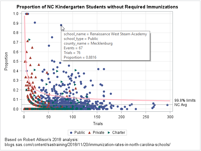
Last week my colleague, Robert Allison, visualized data regarding immunization rates for kindergarten classes in North Carolina. One of his graphs was a scatter plot that displayed the proportion of unimmunized students versus the size of the class for 1,885 kindergarten classes in NC. This scatter plot is the basis for a statistical plot that is known as a funnel plot for proportions. The plot to the right shows a funnel plot that I created based on Robert's analysis.
The basic idea of a funnel plot is that small random samples have more variation than large random samples from the same population. If students are randomly chosen from a population in which some small proportion of children have an attribute, it might not be unusual if 40% of the students in a five-student class have the attribute (that's 2 out of 5) whereas it might be highly unusual to see such a high proportion in a 100-student class. The funnel plot enhances a scatter plot by adding curves that indicate a reasonable range of values for the proportion, given the size of a random sample.
For a discussion of funnel plots and how to create a funnel plot in SAS, see the article "Funnel plots for proportions." You can download the immunization data and the SAS program that I used to create the funnel plot for proportions.
A funnel plot for proportions
The preceding funnel plot contains the following statistical features:- A scatter plot of the data. Each marker represents a school.
- A horizontal reference line. The line indicates the average proportion for the data. For these data, the statewide average proportion of unimmunized kindergarteners is 4.58%.
- A curve that indicates an upper confidence limit for the proportion of unimmunized students, assuming that the classes are a random sample from a population in which 4.58% of the students are unimmunized. When a marker (school) appears above the curve, the proportion of unimmunized students in that school is significantly higher than the statewide proportion.
This funnel plot uses the shape (and color) of a marker to indicate whether the school is public (circle), private (upward-pointing triangle), or a charter school (right-pointing triangle). The plot includes tool tips so that you can hover the mouse over a marker and see the name and county of the school.
The graph indicates that there are dozens of schools for which the proportion of unimmunized students far exceeds the state average. A graph like this enables school administrators and public health officials to identify schools that have a larger-than-expected proportion of unimmunized students. Identifying schools is the first step to developing initiatives that can improve the immunization rate in school-age children.
Funnel plots for each school district
You can use a WHERE statement or BY-group processing in PROC SGPLOT to create a funnel plot for each county. A graph that shows only the schools in a particular district is more relevant for local school boards and administrators. The following graphs show the proportion of unimmunized students in Mecklenburg County (near Charlotte) and Wake County (near Raleigh), which are the two largest school districts in NC.
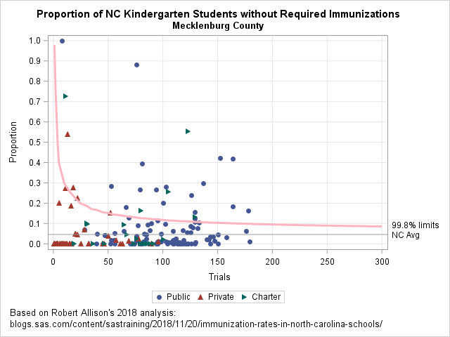
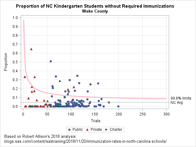
The first graph shows that Mecklenburg County has several schools that contain more than 60 kindergarten students and for which 25% or more of the students are unimmunized. In fact, some large schools have more than 40% unimmunized! In Wake County, fewer schools have extreme proportions, but there are still many schools for which the proportion of unimmunized students is quite large relative to the statewide average.
As Robert pointed out in his blog post, these are not official figures, so it is possible that some of the extreme proportions are caused by data entry errors rather than by hordes of unimmunized students.
Funnel plots for public, private, and charter schools
The following graph shows a panel of plots for public, private, and charter schools. There are many public schools whose proportion of unimmunized students is well above the statewide average. For the private and charter schools, about 10 schools stand out in each group.
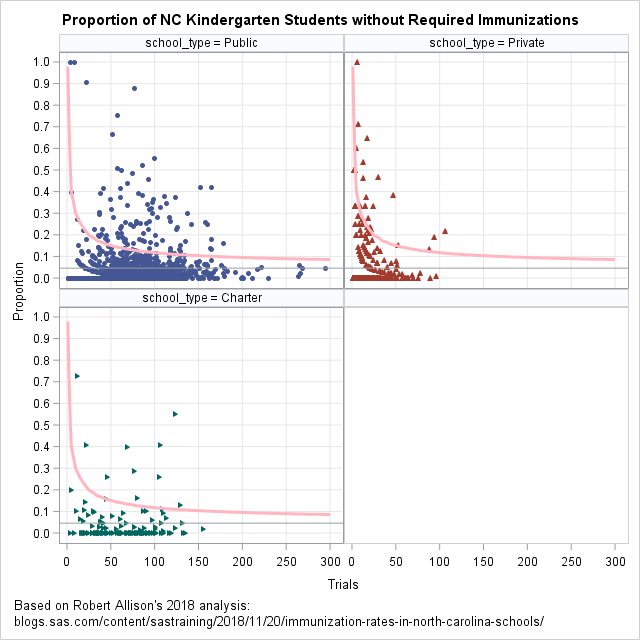
I think the plot of private schools is particularly interesting. When the media reports on outbreaks of childhood diseases in schools, there is often a mention of a "religious exemption," which is when a parent or guardian states that a child will not be immunized because of their religious beliefs. The report often mentions that private schools are often affiliated with a particular religion or church. I've therefore assumed that private schools have a larger proportion of unimmunized students because of the religious exemption. These data do not indicate which students are unimmunized because of a religious exemption, but the panel of funnel plots indicates that, overall, not many private schools have an abnormally large proportion of unimmunized students. In fact, the private schools show smaller deviations from the expected value than the public and charter schools.
Summary
In summary, I started with one of Robert Allison's graphs and augmented it to create a funnel plot for proportions. A funnel plot shows the average proportion and confidence limits for proportions (given the sample size). If the students in the schools were randomly sampled from a population where 4.58% of students are unimmunized, then few schools would be outside of the confidence curve. Of course, in reality, schools are not random samples. Many features of school performance—including unimmunized students—depend on local socioeconomic conditions. By taking into account the size of the classes, the funnel plot identifies schools that have an exceptionally large proportion of unimmunized students. A funnel plot can help school administrators and public health officials identify schools that might benefit from intervention programs and additional resources, or for which the data were incorrectly entered.

4 Comments
Nice summary!
Great post! however would you please let me know how to keep the tip value after exporting the funnel plot to excel or word?
I don't know about exporting to Excel, but you can export to an HTML5 destination and then send in an email or post on a web page.
Pingback: Compute and visualize binomial proportions in SAS - The DO Loop