Computing rates and proportions is a common task in data analysis. When you are computing several proportions, it is helpful to visualize how the rates vary among subgroups of the population. Examples of proportions that depend on subgroups include:
- Mortality rates for various types of cancers
- Incarceration rates by race
- Four-year graduation rates by academic major
The first two examples are somewhat depressing, so I will use graduation rates for this article.
Uncertainty in estimates
An important fact to remember is that the uncertainty in an estimate depends on the sample size. If a small college has 8 physics majors and 5 of them graduate in four years, the graduation rate in physics is 0.6. However, because of the small sample size, the uncertainty in that estimate is much greater than for a larger group, such as if the English department graduates 50 out of 80 students. Specifically, if the estimate of a binomial proportion is p, the standard error of the estimate is sqrt(p(1–p)/n), where n is the sample size. Thus for the physics students, the standard error is sqrt(0.6*0.4/8) = 0.17, whereas for the English majors, the standard error is sqrt(0.6*0.4/80) = 0.05.
Therefore, it is a good idea to incorporate some visual aspect of the uncertainty into any graph of proportions and rates. For analyses that involve dozens or hundreds of groups, you can use a funnel plot of proportions, which I have used to analyze adoption rates for children and immunization rates for kindergartens in North Carolina. When you have a smaller number of groups, a simple alternative is a dot plot with error bars that indicate either the standard error or a 95% confidence interval for the estimate. As I've explained, I prefer to display the confidence interval.
Sample data: Graduation rates
The Chronicle of Higher Education web site enables you to find the graduation rates for US colleges and universities. You can find the average graduation rate by states (50 groups) or by college (hundreds of groups). You can also find the graduation rate by race (five groups) for any individual college. Because most colleges have fewer Hispanic, Asian, and Native American students, it is important to indicate the sample size or the uncertainty in the empirical estimates.
I don't want to embarrass any small college, so the following data are fake but are typical of the group sizes that you might see in real data. Suppose a college has six majors, labeled as A, B, C, D, E, and F. The following SAS DATA step defines the number of students who graduated in four years (Grads) and the number of students in each cohort (Total).
data Grads; input Major $ Grads Total @@; datalines; A 10 22 B 10 32 C 17 25 D 4 7 E 8 14 F 16 28 ; |
Manual computations of confidence intervals for proportions
If you use a simple Wald confidence interval, it is easy to write a short DATA step to compute the empirical proportions and a 95% confidence interval for each major:
data GradRate; set Grads; GradRate = Grads / Total; p = Grads / Total; /* empirical proportion */ StdErr = sqrt(p*(1-p)/Total); /* standard error */ /* use Wald 95% CIs */ z = quantile("normal", 1-0.05/2); LCL = max(0, p - z*StdErr); /* LCL can't be less than 0 */ UCL = min(1, p + z*StdErr); /* UCL can't be more than 1 */ label p = "Proportion" LCL="Lower 95% CL" UCL="Upper 95% CL"; run; proc print data=GradRate noobs label; var Major Grads Total p LCL UCL; run; |
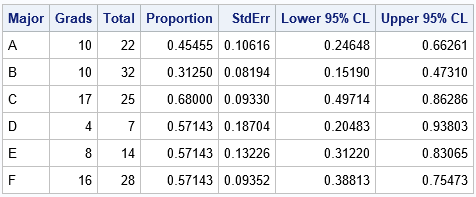
The output shows that although majors D, E, and F have the same four-year graduation rate (57%), the estimate for the D group, which has only seven students, has twice as much variability as the estimate for the F group, which has four times as many students.
Automating the computations by using PROC FREQ
Although it is easy enough to write a DATA step for the Wald CI, other types of confidence intervals are more complicated. The BINOMIAL option in the TABLES statement of PROC FREQ enables you to compute many different confidence intervals (CIs), including the Wald CI. In order to use these data in PROC FREQ, you need to convert the data from Event-Trials format to Event-Nonevent format. For each major, let Graduated="Yes" indicate the count of students who graduated in four years and let Graduated="No" indicate the count of the remaining students. The following data step converts the data and estimates the binomial proportion for each group:
/* convert data to Event/Nonevent format */ data GradFreq; set Grads; Graduated = "Yes"; Count = Grads; output; Graduated = "No "; Count = Total-Grads; output; run; /* Use PROC FREQ to analyze each group separately and compute the binomial CIs */ proc freq data=GradFreq noprint; by notsorted Major; tables Graduated / binomial(level='Yes' CL=wald); /* choose from among many confidence intervals */ weight Count; output out=FreqOut binomial; run; proc print data=FreqOut noobs label; var Major N _BIN_ L_BIN U_BIN ; label _BIN_ = "Proportion" L_BIN="Lower 95% CL" U_BIN="Upper 95% CL"; run; |
The output is not shown because the estimates and CIs from PROC FREQ are identical to the estimates from the "manual" calculations in the previous section. However, by using PROC FREQ you can easily compute more sophisticated confidence intervals.
Visualizing binomial proportions
As indicated earlier, it is useful to plot the proportions and confidence intervals. When you plot several proportions on the same graph, I recommend that you sort the data in some way, such as by the estimated proportions. If there are two groups that have the same proportion, you can use the size of the group to break the tie.
It can also be helpful to draw a reference line for the overall rate, regardless of group membership. (You can get the overall proportion by repeating the previous call to PROC FREQ but without using the BY statement.) For these data, the overall proportion of students who graduate in four years is 65/128 = 0.5078. Lastly, I think it is a good idea to add a table that shows the number of students in each major. You can use the YAXISTABLE statement to add that information to the graph, as follows:
/* sort by estimated proportion; break ties by using CI */ proc sort data=FreqOut; by _BIN_ N; run; title "Graduation Rates by College Major"; proc sgplot data=FreqOut; label _BIN_ = "Proportion" N="Number of Students"; scatter y=Major x=_BIN_ / xerrorlower=L_BIN xerrorupper=U_BIN; yaxistable N / y=Major location=inside position=left valueattrs=(size=9); refline 0.5078 / axis=x labelloc=inside label="Overall"; yaxis discreteorder=data offsetmax=0.1; /* preserve order of categories */ xaxis grid values=(0 to 1 by 0.1) valueshint; run; |
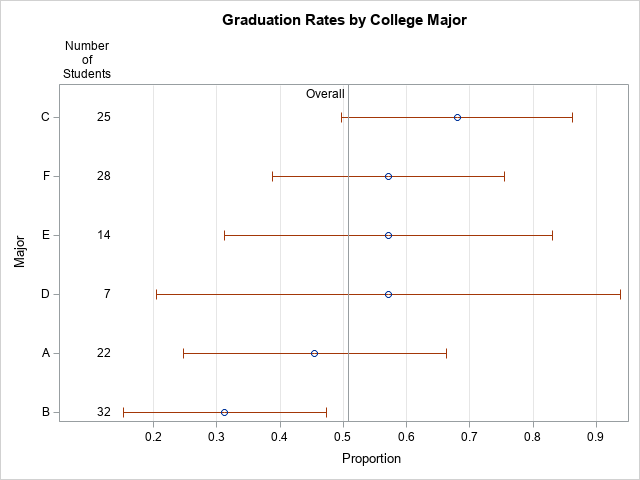
The graph shows the range of graduation rates. The "error bars" are 95% CIs, which show that majors that have few students have larger uncertainty than majors that have more students. If there are 10 or more categories, I recommend that you use alternating color bands to make it easier for the reader to associate intervals with the majors.
In summary, this article shows how to use PROC FREQ to estimate proportions and confidence intervals for groups of binary data. A great way to convey the proportions to others is to graph the proportions and CIs. By including the sample size on the graph, readers can connect the uncertainty in the estimates to the sample size.

3 Comments
Hello, Rick.
Could I ask a question: Why the comment "LCL can't be less than 0"? Is there any basis for that?
By the way, the comment of UCL should be "UCL can't be more than 1" according to your logic.
The basis is that a proportion must be in the interval [0,1]. Suppose I tell you that a 95% CI for a proportion is [-3, 0.2]. Since the proportion is never negative, this is equivalent to the CI [0, 0.2].
Indeed it is. Thanks, Rick.