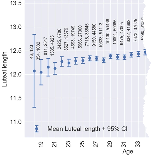
I often use axis tables in PROC SGPLOT in SAS to add a table of text to a graph so that the table values are aligned with the data. But axis tables are not the only way to display tabular data in a graph. You can also use the TEXT statement, which supports many features that are not available in axis tables, such as rotating the text. Recently I saw some graphs by Bull, et al. (Fig 3, Nature, 2019) in which a table was presented in an interesting way. Part of the graph is reproduced at the right.
The complete graph includes ages from 18 to 45 years old, so there are many horizontal categories and they are very close together. For each age, the graph shows the mean luteal-phase length for women in a study about menstrual cycles. (The luteal-phase length is the number of days between ovulation and menstruation.) The numbers indicate the number of women (first number) and the number of menstrual cycles (second number) from which the mean is calculated. The vertical bars are a 95% confidence interval (CI) for the mean.
This article uses the SGPLOT procedure in SAS to create three graphs that are similar to this one:
- When the numbers in a table are small (a few digits), you can use the standard X axis table to show the numbers. However, an X axis table isn't effective for this particular graph because the numbers have too many digits to fit into the available horizontal space.
- One alternative (used by Bull, et al.) is to rotate the text.
- A second alternative is to rotate the entire plot and use a Y axis table to present the data table.
Use an XAXISTABLE statement
The authors did not make the data publicly available, so I estimated values from the chart to create some similar-looking data. I did not want to type in the means and CIs for all 28 age groups, so I stopped at Age=26.
/* Data based on Fig 3 of Bull, et al. (2019) "Real-world menstrual cycle characteristics of more than 600,000 menstrual cycles" npj Digital Medicine https://www.nature.com/articles/s41746-019-0152-7 */ data menstrual; input Age mean low high Users Cycles; label mean = "Luteal length"; datalines; 18 12.1 11.3 12.8 46 123 19 12.07 11.75 12.3 354 1082 20 12.2 11.97 12.33 811 2547 21 12.18 12.0 12.25 1535 4925 22 12.27 12.15 12.4 2425 8786 23 12.25 12.2 12.3 3527 13579 24 12.28 12.22 12.39 4693 19749 25 12.3 12.24 12.39 5966 27000 26 12.33 12.3 12.42 7718 35845 ; ods graphics / width=270px height=480px; /* make sure there isn't much room between age groups */ /* first attempt: Use XAXISTABLE to position text that shows Users and Cycles for each age */ title "Show Table of Counts"; title2 "XAXISTABLE Statement"; proc sgplot data=menstrual noautolegend; scatter x=Age y=mean / yerrorlower=low yerrorupper=high errorbarattrs=GraphData1; xaxistable Users Cycles / x=Age location=inside; /* can use POSITION=TOP */ xaxis grid min=18 offsetmin=0.1 offsetmax=0.1; yaxis grid; run; |
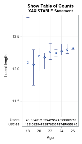
For graphs like this, the XAXISTABLE statement should usually be the first statement you try because it is so simple to use. In the XAXISTABLE statement, you list each variable that you want to display (Users and Cycles) and specify the variable for the horizontal positions (Age). The result is shown above. You can see that for these data, the cells in the axis table overlap each other and are unreadable because the distance between groups is so small.
Clearly, this first attempt does not work for this table. And because this table is intended to fit on one slide or piece of paper, you cannot simply make the graph wider to prevent the overlap. Instead, an alternative approach is required.
Use rotated text
The authors chose to display the Users and Cycles data above each age group by using rotated text. To do this in SAS, you need to add two new variables to the data set. The first is a character variable that contains the comma-separated values of Users and Cycles. The second is the location for the text, in data coordinates. The following DATA step uses the CATX function to concatenate the data values into a comma-separated string. The height of the text string is set to 13 for all groups in this example, but you could make the height depend on the value of the mean if you prefer.
/* second attempt: Use TEXT and ROTATE=90 to position text */ data menstrual2; set menstrual; length Labl $20; Labl = catx(", ", Users, Cycles); /* concatenate: "123, 4567" */ Height = 13; /* this variable can depend on Age */ run; title2 "TEXT Statement, ROTATE=90"; proc sgplot data=menstrual2 noautolegend; scatter x=Age y=mean / yerrorlower=low yerrorupper=high errorbarattrs=GraphData1; text x=Age y=Height text=Labl / position=right rotate=90 backfill fillattrs=(color=white); yaxis grid offsetmin=0.1; xaxis grid min=18 offsetmin=0.1 offsetmax=0.1; run; |
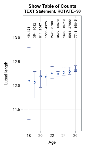
When you use the ROTATE= option to display rotated text, it is important to understand how the text is positioned relative to the coordinates that you specify. The coordinates (in this case, (Age, Height)) determine an anchor point. The POSITION= option specifies how the text is positioned relative to the anchor point BEFORE the rotation. Therefore, the combination POSITION=RIGHT ROTATE=90 results in text that is positioned above the anchor point.
Use a YAXISTABLE statement
There is another option, which is to rotate the entire graph. Rather than specify Age as the horizontal variable and using vertical bars for the CIs, you can specify Age as the vertical variable and use horizontal bars. This results in a graphic that will be long rather than wide. There should be enough horizontal space to include two columns of text that show the data for Users and Cycles. Because a printed page (in portrait mode) is longer than it is wide, the graph will probably fit on a standard sheet of paper. However, it might not fit on a slide, which is wider than it is tall.
The following call to PROC SGPLOT creates a rotated version of the graph. In addition to rotating the graph, I add alternating bands of gray so that the reader can more easily associate intervals with age groups./* third attempt: Rotate plot, use YAXISTABLE, add alternating bands */ ods graphics / width=480px height=300px; title2 "YAXISTABLE Statement"; %macro HalfWidth(nCat); %sysevalf(0.5/&nCat) %mend; proc sgplot data=menstrual noautolegend; scatter y=Age x=mean / xerrorlower=low xerrorupper=high errorbarattrs=GraphData1; yaxistable Users Cycles / y=Age location=inside position=left valueattrs=(size=9); yaxis grid reverse type=discrete discreteorder=data fitpolicy=none offsetmin=%HalfWidth(9) offsetmax=%HalfWidth(9) /* half of 1/k, where k=number of categories */ colorbands=even colorbandsattrs=(color=gray transparency=0.9); xaxis grid; run; |
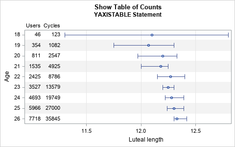
By rotating the graph, the table of numbers is easier to read. The graph for the full data will be somewhat long, but that is not usually a problem for the printed page or for HTML. The main drawback is that long graphs might not fit on a slide for a presentation. A second drawback is that the authors wanted to show that the luteal-phase length depends on age, and it is traditional to plot independent variables (age) horizontally and dependent variables (luteal length) vertically.
In summary, this article shows three ways to add tabular data to a scatter plot with error bars. The first way is to use the XAXISTABLE statement, which works when the table entries are not too wide relative to the horizontal spacing between groups. The second way is to rotate the text, as done in the Nature article. The third way is to rotate the plot so that the error bars are shown horizontally rather than vertically. This third presentation is further enhanced by adding alternating bands of color to help the reader distinguish the age categories. (You can use alternating color bands for the XAXISTABLE, too.)
All three methods are useful in various circumstances, so remember to consider all three methods when you design graphs like this.
To learn more about using horizontal and vertical axis tables in SAS, see Chapter 3 of Warren Kuhfeld's free e-book Advanced ODS Graphics Examples.

5 Comments
Nice plots. I really like the last one, even though as you say the original authors were fitting a regression, so would have felt unusual to swap the axes. It's also a nice example of heteroscedastic data. Even more so in their plot that shows the full range of ages.
Rick,
Maybe this is ugly. x2axis can be used in this scenario .
proc sgplot data=menstrual noautolegend;
scatter x=Users y=mean / yerrorlower=low yerrorupper=high errorbarattrs=GraphData1;
scatter x=Cycles y=mean/x2axis;
xaxistable age / x=Users location=inside; /* can use POSITION=TOP */
x2axis type=discrete ;
xaxis grid min=18 offsetmin=0.1 offsetmax=0.1 type=discrete;
yaxis grid;
run;
Thanks for this contribution. I like that you always try new variations and share your ideas. In this case, you need to use the same OFFSETMIN= and OFFSETMAX= options in the XAXIS and XAXIS2 statements so that the vertical grids align. You might also want to reduce the size of the axis values by using VALUEATTRS=(size=6).
I will point out that the axis table approach can handle more than two variables, whereas overloading the XAXIS and XAXIS2 tick values is limited to at most two variables.
While I just found this, I use two axis tables and every other instance will jitter the values.
data menstrual;
input Age mean low high Users Cycles;
label mean = "Luteal length";
datalines;
18 12.1 11.3 12.8 46 123
19 12.07 11.75 12.3 354 1082
20 12.2 11.97 12.33 811 2547
21 12.18 12.0 12.25 1535 4925
22 12.27 12.15 12.4 2425 8786
23 12.25 12.2 12.3 3527 13579
24 12.28 12.22 12.39 4693 19749
25 12.3 12.24 12.39 5966 27000
26 12.33 12.3 12.42 7718 35845
;
run;
data menstrual;
set menstrual;
if int(age/2) ne age/2 then do;
users2=users;
cycles2=cycles;
users=.;
cycles=.;
end;
run;
options missing=' ';
ods graphics / width=270px height=480px; /* make sure there isn't much room between age groups */
/* first attempt: Use XAXISTABLE to position text that shows Users and Cycles for each age */
title "Show Table of Counts";
title2 "XAXISTABLE Statement";
proc sgplot data=menstrual noautolegend;
scatter x=Age y=mean / yerrorlower=low yerrorupper=high errorbarattrs=GraphData1;
xaxistable Users / x=Age location=inside; /* can use POSITION=TOP */
xaxistable Users2 / x=Age location=inside nolabel; /* can use POSITION=TOP */
xaxistable Cycles / x=Age location=inside; /* can use POSITION=TOP */
xaxistable Cycles2 / x=Age location=inside nolabel; /* can use POSITION=TOP */
xaxis grid min=18 offsetmin=0.1 offsetmax=0.1;
yaxis grid;
run;
Additionally, if you pad the top of the Cycles xaxistable, it looks much better.
title "Show Table of Counts";
title2 "XAXISTABLE Statement";
proc sgplot data=menstrual noautolegend;
scatter x=Age y=mean / yerrorlower=low yerrorupper=high errorbarattrs=GraphData1;
xaxistable Users / x=Age location=inside; /* can use POSITION=TOP */
xaxistable Users2 / x=Age location=inside nolabel; /* can use POSITION=TOP */
xaxistable Cycles / x=Age location=inside pad=(top=20); /* can use POSITION=TOP */
xaxistable Cycles2 / x=Age location=inside nolabel; /* can use POSITION=TOP */
xaxis grid min=18 offsetmin=0.1 offsetmax=0.1;
yaxis grid;
run;