When you create a graph by using the SGPLOT procedure in SAS, usually the default tick locations are acceptable. Sometimes, however, you might want to specify a set of custom tick values for one or both axes. This article shows three examples:
- Specify evenly spaced values.
- Specify tick values that are not evenly spaced.
- Specify custom labels for the ticks, including symbols such as π.
You can accomplish these tasks by using options on the XAXIS and YAXIS statements. The VALUES= option enables you to specify tick locations; the VALUESDISPLAY= option enables you to specify text strings to display on an axis.
Use the VALUES= option to specify tick locations
You can use the VALUES= option on the XAXIS or YAXIS statement to specify a set of values at which to display ticks. If you want to specify a set of evenly spaced values, you can use the (start TO stop BY increment) syntax. For example, the following call to PROC SGPLOT specifies that the ticks on the Y axis should be specified at the locations -0.5, 0, 0.5, 1, ..., 3.
/* create data for the graph of the function y = x*exp(x) */ data Function; do x = -5 to 1 by 0.05; y = x*exp(x); output; end; run; ods graphics / width=480px height=360px; title "Graph of y = x*exp(x)"; proc sgplot data=Function; series x=x y=y; yaxis grid values=(-0.5 to 3 by 0.5); /* specify tick locations */ xaxis grid; run; |
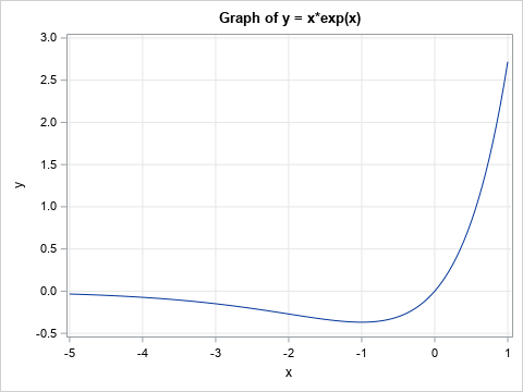
Notice that the Y axis has tick marks at the values that are specified by the VALUES= option.
Specify tick mark locations and labels
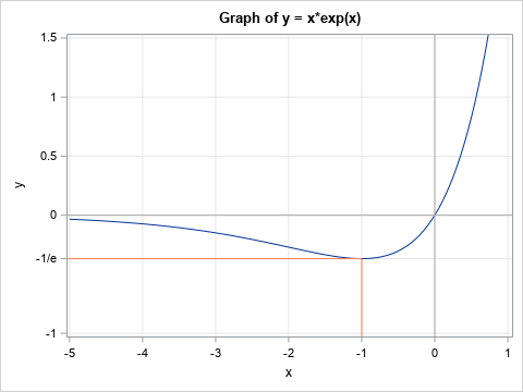
Sometimes you might want to highlight a specific value on a graph. For example, you might want to indicate where a graph has a maximum, minimum, or inflection point. The graph in the previous section has a minimum value at (x,y) = (1, -1/e) ≈ (1, -0.368). You can use the VALUES= option to specify a set of tick locations that include -0.368. Because nobody who reads the graph will associate -0.368 with the number -1/e, you might want to display the text string "-1/e" on the axis instead of -0.368.
The VALUESDISPLAY= option enables you to specify a text string for each value in the VALUES= list. The strings are used as labels for each tick mark. For example, the following call to PROC SGPLOT uses the VALUESDISPLAY= option to display the string "-1/e" at the location y = -0.368. To further emphasize that the value corresponds to the minimum value of the function, I use the DROPLINE statement to display line segments that extend from the point (1, -0,368) to each axis.
%let eInv = %sysfunc(exp(-1)); /* e inverse = exp(-1) */ title "Graph of y = x*exp(x)"; proc sgplot data=Function; series x=x y=y; dropline x= -1 y= -&eInv / dropto=both lineattrs=(color=coral); /* Draw coordinate axes in dark grey */ refline 0 / axis=y lineattrs=(color=darkgrey); refline 0 / axis=x lineattrs=(color=darkgrey); /* ticks on the Y axis include -1/e */ yaxis grid max=1.5 values = (-1 -&eInv 0 0.5 1 1.5 ) /* locations */ valuesdisplay = ("-1" "-1/e" "0" "0.5" "1" "1.5"); /* strings to display */ xaxis grid; run; |
Use symbols for tick labels
The previous example displays the string "-1/e" at a tick mark. You can also display symbols on the axes. Back in 2011, Dan Heath discussed how to specify symbols by using Unicode values. Since SAS 9.4M3, you can also use Unicode symbols in user-defined formats. The following example defines the Unicode symbol for pi (π) and uses the symbol in the VALUESDISPLAY= option to label tick marks at π/2, π, 3π/2, and 2π.
/* create the graph of y = sin(x) on [0, 2*pi] */ data Trig; pi = constant('pi'); drop pi; do x = 0 to 2*pi by pi/25; y = sin(x); output; end; run; %let piChar = (*ESC*){Unicode pi}; /* define pi symbol */ title "Graph of y = sin(x)"; proc sgplot data=Trig noautolegend; series x=x y=y; refline 0 / axis=y lineattrs=(color=darkgrey); xaxis grid values = (0 1.57 3.14 4.71 6.28 ) /* 0, pi/2, pi, 3pi/2, 2pi */ valuesdisplay = ("0" "&piChar/2" "&piChar" "3&piChar/2" "2&piChar"); run; |
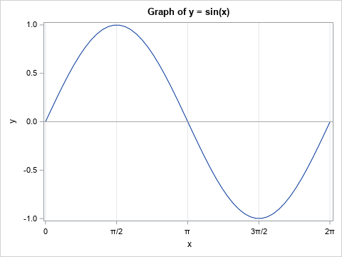
In this example, I used the VALUES= and VALUESDISPLAY= option on the XAXIS statement. Consequently, the X axis displays the symbols π/2, π, 3π/2, and 2π.
In summary, you can use the VALUES= option to specify a list of locations for ticks on an axis. You can use the (start TO stop BY increment) notation to specify evenly spaced ticks. For unevenly spaced ticks, you can list the ticks manually, such as (1 5 10 25 50 100). If you want to display text instead of numbers, you can use the VALUESDISPLAY= option, which enables you to specify arbitrary strings. You can use Unicode symbols in the VALUESDISPLAY= list.

9 Comments
Love this sin(x) graph! Feels like real math, not a digital surrogate.
Rick: this is very useful information. I have a different issue: I want the marks of the x-axis to be spaced unevenly so that they are the distance between the marks are correlated with the values of the x-axis variable. How can I do that? thank you.
It sounds like you want to write a program to compute the location of the ticks. If the locations are in a SAS data set, you can read the values into a macro variable and include the macro on the VALUES= option.
Dear Rick, thanks für the above examples.
I would like to specify some tick marks in a vbar graphic with proc sgplot.
With the values=() option, the vbars are printed only für the indicated values not for the other.
Do you have an idea to print all the vbars together with own specified tick marks?
The VALUES= option specifies the values for ALL tick marks. The option overrides the automatic placement of tick values. So if you use the VALUES= option, specify values for all bars.
my issue is related to the above - I want tick marks and labels that are unevenly spaced. However, it seems like I can only have a maximum of 15 such labels. How can I make SAS print more than 15 tick marks/labels when they are unevenly spaced?
I don't think there is a limit of 15. I think the labels are overlapping and the default FITPOLICY= is to THIN the labels that would otherwise collide.
Try the following:
1. Make the graph wider so that there is more space to display the labels. For example, use
ODS GRAPHICS / WIDTH=1000px HEIGHT=400px;
2. USE the FITPOLICY=STAGGER on the XAXIS statement and see if that enables the tick marks to display without overlapping.
Could you change the color of one of the tick marks?
If you want one tick mark to be different than the others, I think you would have to use an annotation data set. When I want to highlight a special value, I use a REFLINE statement and label it so that it looks like an extra tick mark. For example, see https://blogs.sas.com/content/iml/2022/08/24/stagger-labels-axis.html
The following graph shows this technique: