During an outbreak of a disease, such as the coronavirus (COVID-19) pandemic, the media shows daily graphs that convey the spread of the disease. The following two graphs appear frequently:
- New cases for each day (or week). This information is usually shown as a histogram or needle plot. The graph is sometimes called a frequency graph.
- The total number of cases plotted against time. Usually, this graph is a line graph. The graph is sometimes called a cumulative frequency graph.
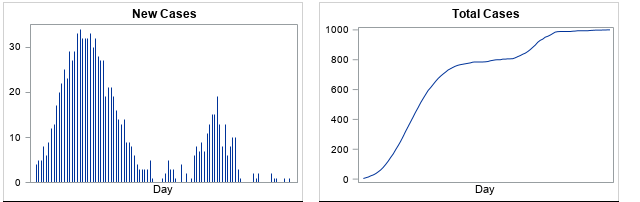
An example of each graph is shown above. The two graphs are related and actually contain the same information. However, the cumulative frequency graph is less familiar and is harder to interpret. This article discusses how to read a cumulative frequency graph. The shape of the cumulative curve indicates whether the daily number of cases is increasing, decreasing, or staying the same.
For this article, I created five examples that show the spread of a hypothetical disease. The numbers used in this article do not reflect any specific disease or outbreak.
How to read a cumulative frequency graph
When the underlying quantity is nonnegative (as for new cases of a disease), the cumulative curve never decreases. It either increases (when new cases are reported) or it stays the same (if no new cases are reported).
When the underlying quantity (new cases) is a count, the cumulative curve is technically a step function, but it is usually shown as a continuous curve by connecting each day's cumulative total. A cumulative curve for many days (more than 40) often looks smooth, so you can describe its shape by using the following descriptive terms:
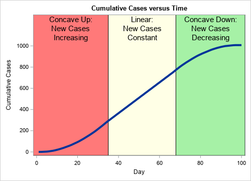
- When the number of new cases is increasing, the cumulative curve is "concave up." In general, a concave-up curve is U-shaped, like this: ∪. Because a cumulative frequency curve is nondecreasing, it looks like the right side of the ∪ symbol.
- When the number of new cases is staying the same, the cumulative curve is linear. The slope of the curve indicates the number of new cases.
- When the number of new cases is decreasing, the cumulative curve is "concave down." In general, a concave-up curve looks like an upside-down U, like this: ∩. Because a cumulative frequency curve is nondecreasing, a concave-down curve looks like the left side of the ∩ symbol.
A typical cumulative curve is somewhat S-shaped, as shown to the right. The initial portion of the curve (the red region) is concave up, which indicates that the number of new cases is increasing. The cumulative curve is nearly linear between Days 35 and 68 (the yellow region), which indicates that the number of new cases each day is approximately constant. After Day 68, the cumulative curve is concave down, which indicates that the number of daily cases is decreasing. Each interval can be short, long, or nonexistent.
The cumulative curve looks flat near Day 100. When the cumulative curve is exactly horizontal (zero slope), it indicates that there are no new cases.
Sometimes you might see a related graph that displayed the logarithm of the cumulative cases. Near the end of this article, I briefly discuss how to interpret a log-scale graph.
Examples of frequency graphs
It is useful to look at the shape of the cumulative frequency curve for five different hypothetical scenarios. This section shows the cases-per-day frequency graphs; the cumulative frequency curves are shown in subsequent sections.
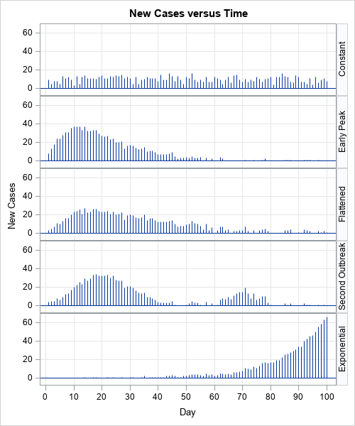
In each scenario, a population experiences a total of 1,000 cases of a disease over a 100-day time period. For the sake of discussion, suppose that the health care system can treat up to 20 new cases per day. The graphs to the right indicate that some scenarios will overwhelm the health care system whereas others will not. The five scenarios are:
- Constant rate of new cases: In the top graph, the community experiences about 10 new cases per day for each of the 100 days. Because the number of cases per day is small, the health care system can treat all the infected cases.
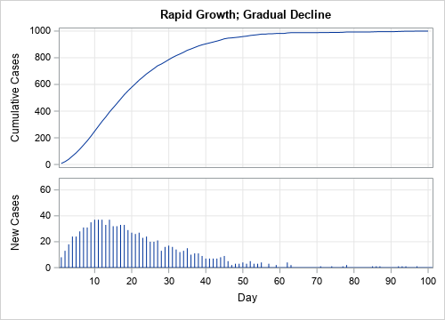
- Early peak: In the second graph, the number of new cases quickly rises for 10 days before gradually declining over the next 50 days. Because the more than 20 new cases develop on Days 5–25, the health care system is overwhelmed on those days.
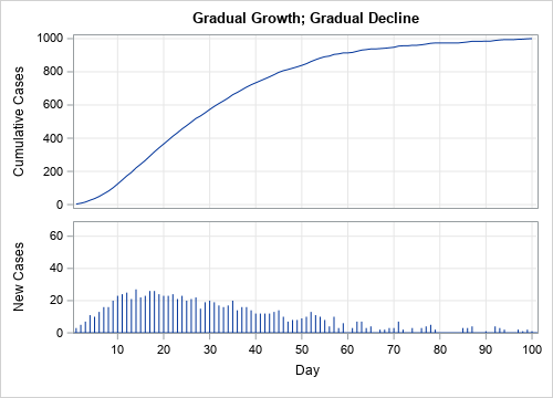
- Delayed peak: In the third graph, the number of new cases gradually rises, levels out, and gradually declines. There are only a few days in which the number of new cases exceeds the capacity of the health care system. Epidemiologists call this scenario "flattening the curve" of the previous scenario. By practicing good hygiene and avoiding social interactions, a community can delay the spread of a disease.
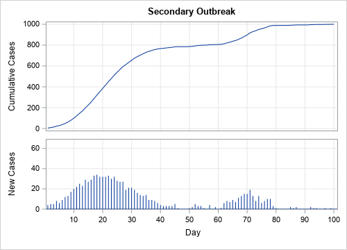
- Secondary outbreak: In the fourth graph, the first outbreak is essentially resolved when a second outbreak appears. This can happen, for example, if a new infected person enters a community after the first outbreak ends. To prevent this scenario, public health officials might impose travel bans on certain communities.
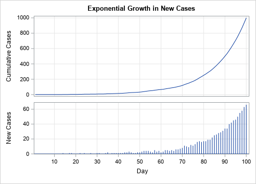
- Exponential growth: In the fifth graph, the number of new cases increases exponentially. The health care system is eventually overwhelmed, and the graph does not indicate when the spread of the disease might end.
The graphs in this section are frequency graphs. The next sections show and interpret a cumulative frequency graph for each scenario.
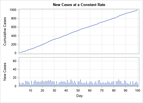
Constant rate of new cases
In the first scenario, new cases appear at a constant rate. Consequently, the cumulative frequency chart looks like a straight line. The slope of the line is the rate at which new cases appear. For example, in this scenario, the number of new cases each day is approximately 10. Consequently, the cumulative curve has an average slope ("rise over run") that is close to 10.
Early peak
In the second scenario, new cases appear very quickly at first, then gradually decline. Consequently, the first portion of the cumulative curve is concave up and the second portion is concave down. In this scenario, the number of new cases dwindles to zero, as indicated by the nearly horizontal cumulative curve.
At any moment in time, you can use the slope of the cumulative curve to estimate the number of new cases that are occurring at that moment. Days when the slope of the cumulative curve is large (such as Day 10), correspond to days on which many new cases are reported. Where the cumulative curve is horizontal (zero slope, such as after Day 60), there are very few new cases.
Delayed peak
In the third scenario, new cases appear gradually, level out, and then decline. This is reflected in the cumulative curve. Initially, the cumulative curve is concave up. It then straightens out and appears linear for 10–15 days. Finally, it turns concave down, which indicates that the number of new cases is trending down. Near the end of the 100-day period, the cumulative curve is nearly horizontal because very few new cases are being reported.
Secondary outbreak
In the fourth scenario, there are two outbreaks. During the first outbreak, the cumulative curve is concave up or down as the new cases increase or decrease, respectively. The cumulative curve is nearly horizontal near Day 50, but then goes through a smaller concave up/down cycle as the second outbreak appears. Near the end of the 100-day period, the cumulative curve is once again nearly horizontal as the second wave ends.
Exponential growth
The fifth scenario demonstrates exponential growth. Initially, the number of new cases increases very gradually, as indicated by the small slope of the cumulative frequency curve. However, between Days 60–70, the number of new cases begins to increase dramatically. The lower and upper curves are both increasing at an exponential rate, but the scale of the vertical axis for the cumulative curve (upper graph) is much greater than for the graph of new cases (lower graph). This type of growth is more likely in a population that does not use quarantines and "social distancing" to reduce the spread of new cases.
This last example demonstrates why it is important to label the vertical axis. At first glance, the upper and lower graphs look very similar. Both exhibit exponential growth. One way to tell them apart is to remember that a cumulative frequency graph never decreases. In contrast, if you look closely at the lower graph, you can see that some bars (Days 71 and 91) are shorter than the previous day's bar.
Be aware of log-scale axes
The previous analysis assumes that the vertical axis plot the cumulative counts on a linear scale. Scientific articles might display the logarithm of the total counts. The graph is on a log scale if the vertical axis says "log scale" or if the tick values are powers of 10 such as 10, 100, 1000, and so forth. If the graph uses a log scale:
- A straight line indicates that new cases are increasing at an exponential rate. The slope of the line indicates how quickly cases will double, with steep lines indicating a short doubling time.
- A concave-down curve indicates that new cases are increasing at rate that is less than exponential. Log-scale graphs make it difficult to distinguish between a slowly increasing rate and a decreasing rate.
Because so many COVD-related graphs use a log-scale axis, I have written a second article that shows how the "doubling time" is related to the slope of graph on a log-scale axis.
Summary
In summary, this article shows how to interpret a cumulative frequency graph. A cumulative frequency graph is provided for five scenarios that describe the spread of a hypothetical disease. In each scenario, the shape of the cumulative frequency graph indicates how the disease is spreading:
- When the cumulative curve is concave up, the number of new cases is increasing.
- When the cumulative curve is linear, the number of new cases is not changing.
- When the cumulative curve is concave down, the number of new cases is decreasing.
- When the cumulative curve is horizontal, there are no new cases being reported.
Although the application in this article is the spread of a fictitious disease, the ideas apply widely. Anytime you see a graph of a cumulative quantity (sales, units produced, number of traffic accidents,...), you can the ideas in this article to interpret the cumulative frequency graph and use its shape to infer the trends in the underlying quantity. Statisticians use these ideas to relate a cumulative distribution function (CDF) for a continuous random variable to its probability density function (PDF).

11 Comments
Rick,
Thanks so much for your excellent post. Do you mind sharing your SAS code to create those graphs? The graph I like most is one with three different colors.
With appreciation,
Ethan
I am planning a post next week that shows how to use SAS to create a cumulative curve (and variants) from data, but if you can't wait, here is the SAS program that creates the graphs in this blog post.
Awesome graphs! Thanks for sharing!
A good time to learn/refresh how to interpret line curvatures. As always, you explain the concept well Rick!!!
Very handy skills to have when exploring the Case Curve Comparison chart in the SAS Coronavirus Dashboard at https://tbub.sas.com/COVID19/ (Click on the Trend Analysis tab to see the Case Curve Comparison chart)
Great post. Also points to how important it is to clearly label graphs. We're all besieged by Covid-19 graphs from the media (both journalists and social media). I've seen so many graphs labeled just "Covid-19" and wondered: is that a graph of new cases, or cumulative cases, or new deaths, or cumulative deaths, or ... Look forward to your follow-up post on the code. Happy to have your PROC TEMPLATE code for the panel plots to use as a future template.
Thanks for writing. I agree with labeling the axes. So important. And if the X axis is "days since 100 cases," it would be nice if the graph states "Created on 21Mar2020" or something similar. Stating the source of the data is also a good practice.
Thank you for sharing such a amazing information
Thank you!
Pingback: Top posts from The DO Loop in 2020 - The DO Loop
The only difference between a relative frequency distribution graph and a frequency distribution graph is that the vertical axis uses proportional or relative frequency rather than simple frequency.
Awesome article, very clearly explained and pointing out all the relevant but easy to miss details, thanks a lot!