Last year, I wrote more than 100 posts for The DO Loop blog. In previous years, the most popular articles were about SAS programming tips, statistical analysis, and data visualization. But not in 2020. In 2020, when the world was ravaged by the coronavirus pandemic, the most-read articles were related to analyzing and visualizing the tragic loss and suffering of the pandemic. Here are some of the most popular articles from 2020 in several categories.
The coronavirus pandemic

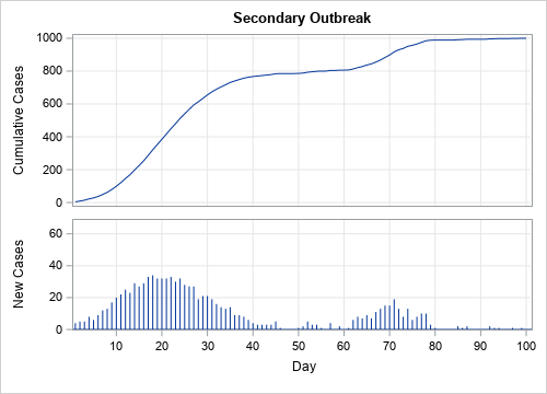
- How to read a cumulative frequency graph: This post shows how to interpret a graph that shows the cumulative number of cases of COVID-19 infections or deaths. This analysis is most useful for graphs that use a linear scale.
- Estimates of doubling time for exponential growth: This post shows how to estimate the doubling time for COVID-19 infections by using a moving average of the most recent data. This analysis applies to graphs that use a logarithmic scale on the vertical axis.
- Pool testing: The math behind combining medical tests: Pool testing can be a highly efficient way to test hundreds of individuals who must be tested regularly (such as workers in a hospital or meatpacking plant). By understanding the mathematics of pool testing, you can predict the optimal number of samples to combine and test.
Statistical analysis: Regression

- The best way to generate dummy variables in SAS: SAS provides several ways to generate dummy variables for a regression, but for most analyses you should use the GLMSELECT procedure. This article presents five reasons why PROC GLMSELECT is the best ways to generate dummy variables in SAS.
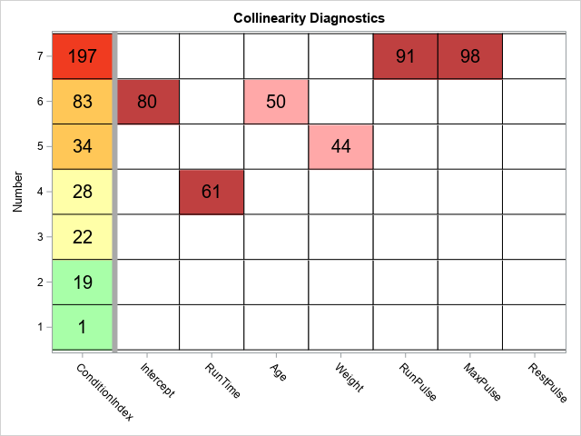
- Collinearity diagnostics in regression: Do you suspect that you have collinearities among the explanatory variables in your regression model? How can you check for collinearities? If you do have collinearities, what can you do about them? These and other questions are answered in this article about how to use the COLLIN option in PROC REG and interpret results. In a follow-up article, I discuss how to use visualization techniques to make the collinearity diagnostics easier to interpret.
Other statistical analyses
- How to interpret graphs in a principal component analysis: Technically, this article is from late 2019, but it attracted a lot of views in 2020. This post describes how to interpret six different graphs that are produced as part of a principal component analysis (PCA). A related plot is the biplot, which is discussed in a separate article.
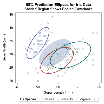
- What is pooled variance and covariance?: When an analysis contains a classification variable, you might want to estimate the overall variance as a weighted average of the variance in each level of the classification variable. For univariate data, this is called the pooled variance. For multivariate data, the mathematics generalizes to covariance matrices. You can compute and visualize the within-group covariance matrices and the pooled covariance matrix.
- The Johnson system of distributions: You can use the Johnson system of distributions to model univariate data. The Johnson system is a flexible system of distributions that matches the mean, standard deviation, skewness, and kurtosis of the data. The Johnson SB family is used to model bounded distributions on a finite interval. The Johnson SU family is used to model unbounded distributions on an infinite interval. There is a statistical test that can help you decide whether to model the data by using a bounded or unbounded distribution.

Data visualization
Many articles in the previous sections included data visualization, but two popular articles are specifically about data visualization:

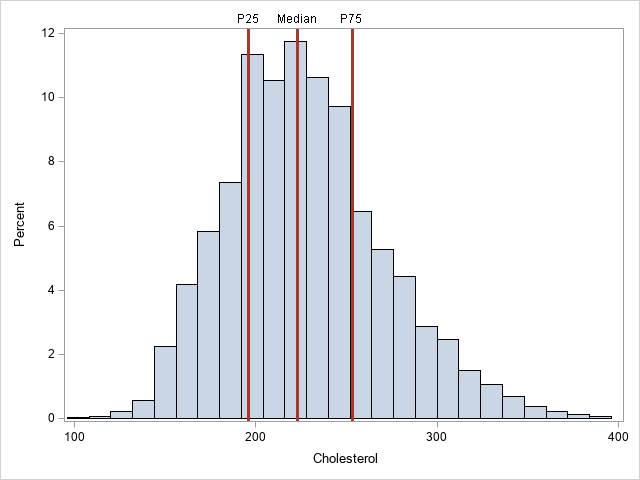
- Add horizontal and vertical reference lines to SAS graphs: This article describes how to use the REFLINE statement in PROC SGPLOT to add horizontal and vertical reference lines to a graph. You can label the lines. If the lines are at the locations of a statistic (such as a mean or percentile), you can save the locations in a SAS data set and plot the lines based on the values in the data set.
- Add custom tick marks to a SAS graph: Although SAS graphs automatically place tick marks according to the data range, you can override the default placement of tick marks and labels. You can add tick marks and labels at any location on an axis. You can even use Unicode symbols (such as π) instead of decimal numbers.
Many people claim they want to forget 2020, but these articles provide a few tips and techniques that you might want to remember. So, read (or re-read!) these popular articles from 2020. And if you made a resolution to learn something new this year, consider subscribing to The DO Loop so you don't miss a single article!

2 Comments
2020 certainly was a year where analytical and visualization skills were of value. I love that you keep your readers informed of statistical techniques in an learned way that is also relevant and helpful. I look forward to another year of being a DO Loop avid reader and fan! Thanks Rick and Happy New Year.
Pingback: Blog posts from 2020 that deserve a second look - The DO Loop