Understanding multivariate statistics requires mastery of high-dimensional geometry and concepts in linear algebra such as matrix factorizations, basis vectors, and linear subspaces. Graphs can help to summarize what a multivariate analysis is telling us about the data. This article looks at four graphs that are often part of a principal component analysis of multivariate data. The four plots are the scree plot, the profile plot, the score plot, and the pattern plot.
The graphs are shown for a principal component analysis of the 150 flowers in the Fisher iris data set. In SAS, you can create the graphs by using PROC PRINCOMP. By default, the scatter plots that display markers also label the markers by using an ID variable (such as name, state, patient ID, ...) or by using the observation number if you do not specify an ID variable. To suppress the labels, you can create an ID variable that contains a blank string, as follows:
data iris; set Sashelp.iris; id = " "; /* create empty label variable */ run; |
The following statements create the four plots as part of a principal component analysis. The data are the measurements (in millimeters) of length and width of the sepal and petal for 150 iris flowers:
ods graphics on; proc princomp data=iris /* use N= option to specify number of PCs */ STD /* optional: stdize PC scores to unit variance */ out=PCOut /* only needed to demonstate corr(PC, orig vars) */ plots=(scree profile pattern score); var SepalLength SepalWidth PetalLength PetalWidth; /* or use _NUMERIC_ */ ID id; /* use blank ID to avoid labeling by obs number */ ods output Eigenvectors=EV; /* to create loadings plot, output this table */ run; |
The principal components are linear combinations of the original data variables. Before we discuss the graph, let's identify the principal components and interpret their relationship to the original variables. The linear coefficients for the PCs (sometimes called the "loadings") are shown in the columns of the Eigenvectors table.
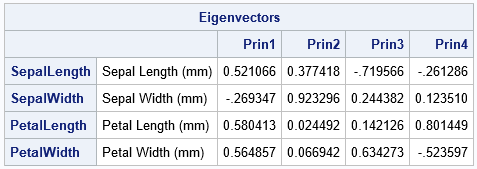
- The first PC is the linear combination PC1 = 0.52*SepalLength – 0.27*SepalWidth + 0.58*PetalLength + 0.56*PetalWidth. You can interpret this as a contrast between the SepalWidth variable and an equally weighted sum of the other variables.
- For the second PC, the coefficients for the PetalLength and PetalWidth variables are very small. Therefore, the second PC is approximately PC2 ≈ 0.38*SepalLength + 0.92*SepalWidth. You can interpret this weighted sum as a vector that points mostly in the direction of the SepalWidth variable but has a small component in the direction of the SepalLength variable.
- In a similar way, the third PC is primarily a weighted contrast between the SepalLength and PetalWidth variables, with smaller contributions from the other variables.
- The fourth PC is a weighted contrast between the SepalWidth and PetalLength variables (with positive coefficients) and the SepalLength and PetalWidth variables (with negative coefficients).
Note that the principal components (which are based on eigenvectors of the correlation matrix) are not unique. If v is a PC vector, then so is -v. If you compare PCs from two different software packages, you might notice that a PC from one package is the negative of the same PC from another package.
You could present this table graphically by creating a "loadings plot," as shown in the last section of this article.
The scree plot
Recall that the main idea behind principal component analysis (PCA) is that most of the variance in high-dimensional data can be captured in a lower-dimensional subspace that is spanned by the first few principal components. You can therefore to "reduce the dimension" by choosing a small number of principal components to retain. But how many PCs should you retain? The scree plot is a line plot of the eigenvalues of the correlation matrix, ordered from largest to smallest. (If you use the COV option, it is a plot of the eigenvalues of the covariance matrix.)
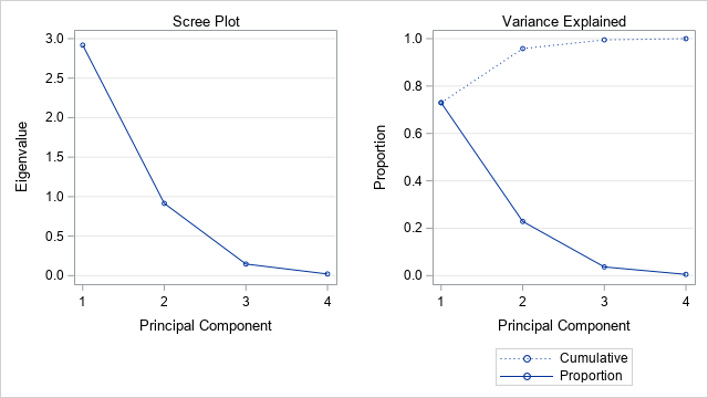
You can use the scree plot as a graphical tool to help you choose how many PCs to retain. In the scree plot for the iris data, you can see (on the "Variance Explained" plot) that the first two eigenvalues explain about 96% of the variance in the four-dimensional data. This suggests that you should retain the first two PCs, and that a projection of the data onto the first to PCs will give you a good way to visualize the data in a low-dimensional linear subspace.
The profile plot
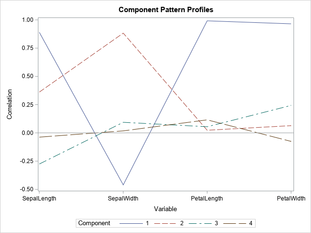
The profile plot shows the correlations between each PC and the original variables. To some extent, you can guess the sign and the approximate magnitude of the correlations by looking at the coefficients that define each PC as a linear combination of the original variables. The correlations are shown in the following "Component Pattern Profiles" plot.
The profile plot reveals the following facts about the PCs:
- The first PC (solid blue line) is strongly positively correlated with SepalLength, PetalLength, and PetalWidth. It is moderately negatively correlated with SepalWidth.
- The second PC (dashed reddish line) is positively correlated with SepalLength and SepalWidth.
- The third and fourth PCs have only small correlations with the original variables.
The component pattern plot shows all pairwise correlations at a glance. However, if you are analyzing many variables (say 10 or more), the plot will become very crowded and hard to read. In that situation, the pattern plots are easier to read, as shown in the next section.
The pattern plots
The output from PROC PRINCOMP includes six "component pattern" plots, which show the correlations between the principal components and the original variables. Because there are four PCs, a component pattern plot is created for each pairwise combination of PCs: (PC1, PC2), (PC1, PC3), (PC1, PC4), (PC2, PC3), (PC2, PC4), and (PC3, PC4). In general, if there are k principal components, there are N(N-1)/2 pairwise combinations of PCs.
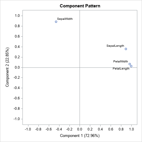
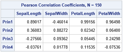
Each plot shows the correlations between the original variables and the PCs. For example, the graph shown to the right shows the correlations between the original variables and the first two PCs. Each point represents the correlations between an original variable and two PCs. The correlations with the first PC are plotted on the horizontal axis; the correlations with the second PC are plotted on the vertical axis.
Six graphs require a lot of space for what is essentially a grid of sixteen numbers. If you want to see the actual correlations in a table, you can call PROC CORR on the OUT= data set, as follows:
/* what are the correlations between PCs and orig vars? */ proc corr data=PCOUT noprob nosimple; label SepalLength= SepalWidth= PetalLength= PetalWidth=; with SepalLength SepalWidth PetalLength PetalWidth; var Prin1-Prin4; run; |
If you know you want to keep only two PCs, you can use the N=2 option on the PROC PRINCOMP statement, which will reduce the number of graphs that are created.
The loadings plots
The literature is not consistent regarding the definition of a loadings plot. Sometimes people call the component pattern plot a loading plot. Even the SAS documentation is not consistent. For example, in the FACTOR procedure, you can create various plots by using the INITLOADINGS, LOADINGS, and PRELOADINGS options on the PLOTS= option. Curiously, these "loadings plots" are assigned the ODS names InitPatternPlot, PatternPlot, and PrePatternPlot, respectively. They do, in fact, seem to be pattern plots.
Their is also inconsistency regarding "loading plot" (singular) versus "loading plot" (plural).
For this article, I define a loadings plot to be a plot of two columns of the Eigenvectors table. PROC PRINCOMP does not create a loadings plot automatically, but there are two ways to create it. One way is to use the ODS OUTPUT to write the Eigenvectors table to a SAS data set. The previous call to PROC PRINCOMP created a data set named EV. The following call to PROC SGPLOT creates a plot that projects the original variables onto the first two PCs.
title "Loadings Plot"; title2 "Variables Projected onto PC1 and PC2"; proc sgplot data=EV aspect=1; vector x=Prin1 y=Prin2 / datalabel=Variable; xaxis grid label="Component 1 (72.96%)" min=-1 max=1; yaxis grid label="Component 2 (22.85%)" min=-1 max=1; run; |
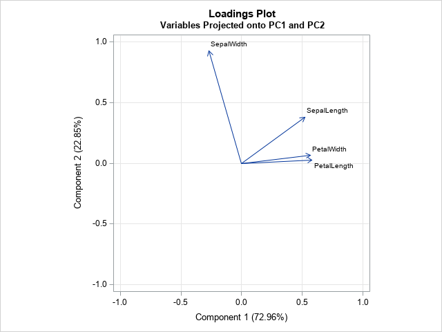
The loadings plot shows the relationship between the PCs and the original variables. You can use the graph to show how the original variables relate to the PCs, or the other way around. For example, the graph indicates that the PetalWidth and PetalLength variables point in the same direction as PC1. The graph also shows that the second PC is primarily in the direction of the SepalWidth variable, with a small shift towards the direction of the SepalLength variable. The second PC is essentially orthogonal to the and PetalWidth and PetalLength variables.
The second way to create a loadings plot is to use PROC FACTOR, as shown by the following statements. To documentation for PROC FACTOR compares the PROC FACTOR analysis to the PROC PRINCOMP analysis.
proc factor data=iris N=2 /* use N= option to specify number of PCs */ method=principal plots=(initloadings(vector)); var SepalLength SepalWidth PetalLength PetalWidth; /* or use _NUMERIC_ */ run; |
For many examples, the arrangement of the vectors on the loadings plot look similar to, but not identical to, the vectors on the component pattern plot.
The score plots
The score plots indicate the projection of the data onto the span of the principal components. As in the previous section, this four-dimensional example results in six score plots, one for each pairwise combination of PCs. You will get different plots if you create PCs for the covariance matrix (the COV option) as opposed to the correlation matrix (the default). Similarly, if you standardize the PCs (the STD option) or do not standardize them (the default), the corresponding score plot will be different.
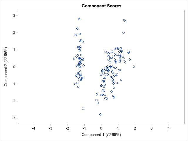
The score plot for the first two PCs is shown. Notice that it uses equal scales for the axes. The graph shows that the first principal component separates the data into two clusters. The left cluster contains the flower from the Iris setosa species. You can see a few outliers, such as one setosa flower whose second PC score (about -2.5) is much smaller than the other setosa flowers.
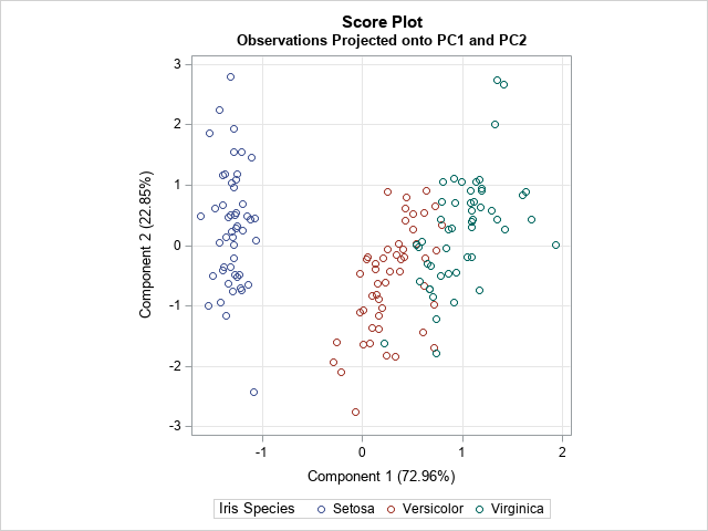
ODS graphics provide an easy way to generate a quick look at the data. However, if you want to more control over the graphs, it is often simplest to output the results to a SAS data set and customize the plots by hand. You can use the OUT= option to write the PCs to a data set. The following call to PROC SGPLOT creates the same score plot but colors the markers by the Species variable and adds a grid of reference lines.
title "Score Plot"; title2 "Observations Projected onto PC1 and PC2"; proc sgplot data=PCOut aspect=1; scatter x=Prin1 y=Prin2 / group=species; xaxis grid label="Component 1 (72.96%)"; yaxis grid label="Component 2 (22.85%)"; run; |
Summary
In summary, PROC PRINCOMP can compute a lot of graphs that are associated with a principal component analysis. This article shows how to interpret the most-used graphs. The scree plot is useful for determining the number of PCs to keep. The component pattern plot shows the correlations between the PCs and the original variables. The component pattern plots show similar information, but each plot displays the correlations between the original variables and a pair of PCs. The score plots project the observations onto a pair of PCs. The loadings plot projects the original variables onto a pair of PCs.
When you analyze many variables, the number of graphs can be overwhelming. I suggest that you use the WHERE option in the ODS SELECT statement to restrict the number of pattern plots and score plots. For example, the following statement creates only two pattern plots and two score plots:
ods select Eigenvectors ScreePlot PatternProfilePlot where=(_label_ in: ('2 by 1','4 by 3')); /* limit pattern plots and score plots */ |
There is one more plot that is sometimes used. It is called a "biplot" and it combines the information in a score plot and a loadings plot. I discuss the biplot in a subsequent article.
WANT MORE GREAT INSIGHTS MONTHLY? | SUBSCRIBE TO THE SAS TECH REPORT

9 Comments
Pingback: What are biplots? - The DO Loop
Thank you for the very useful article. It helped me understand how to interpret PCA results.
I have one question - I don't follow how you got the correlation coefficients (which are then used in the Component Plots, and Loading Plots). Why can't the original Eigen Vectors be used instead for these plots.
Suppose you have n observations and k variables. A PC is a linear combination of the original variables, so it is a vector that has n elements. You can therefore compute the correlation between the PC and each original variable. The Component Plot shows those correlations for each PC.
The eigenvectors are vectors that have only k elements, so you can never compute the correlation between an eigenvector and an original variable.
Its really a useful information regarding PC's. It is perfect for those who already have knowledge about PC analysis and due to some reason they forget some essential points.
Thank you. Regards
Question:
Can we interpret these biplots in order of quadrants? As in is it true that those eigenvectors in the lower-right side matter/cause more variance than those in the upper-left side? Or does that depend on the size of the eigenvectors? So, if I have a small sized eigenvector in the lower-right quadrant (positive for PC1 but negative for PC2) would it still be more significant in terms of the variance it is causing than a larger sized eigenvector on the upper-left (positive PC2 but negative PC1) quadrant?
Your question doesn't really make sense because it is the eigenVALUES that are connected to the variance, not the eigenvectors.
Your question is really about PCA, not biplots. An eigenvalue is the variance of the data in the direction of the associate eigenvector. Eigenvectors traditionally have unit length. Also, the eigenvectors are labeled in order of the size of the eigenvalues. The first eigenvector is the direction of the greatest variance, the second eigenvector is the direction of the second greatest variance, and so on.
So, by definition, the data never have more variance in the direction of the second eigenvector. It doesn't matter what direction the eigenvectors point.
Pingback: Order two-dimensional vectors by using angles - The DO Loop
Pingback: Comparing flavor characteristics of Scotch whiskies: A principal component analysis - The DO Loop
Pingback: Two new visualizations of a principal component analysis - The DO Loop