Principal component analysis (PCA) is an important tool for understanding relationships in continuous multivariate data. When the first two principal components (PCs) explain a significant portion of the variance in the data, you can visualize the data by projecting the observations onto the span of the first two PCs. In a PCA, this plot is known as a score plot. You can also project the variable vectors onto the span of the PCs, which is known as a loadings plot. See the article "How to interpret graphs in a principal component analysis" for a discussion of the score plot and the loadings plot.
A biplot overlays a score plot and a loadings plot in a single graph. An example is shown at the right. Points are the projected observations; vectors are the projected variables. If the data are well-approximated by the first two principal components, a biplot enables you to visualize high-dimensional data by using a two-dimensional graph.
In general, the score plot and the loadings plot will have different scales. Consequently, you need to rescale the vectors or observations (or both) when you overlay the score and loadings plots. There are four common choices of scaling. Each scaling emphasizes certain geometric relationships between pairs of observations (such as distances), between pairs of variables (such as angles), or between observations and variables. This article discusses the geometry behind two-dimensional biplots and shows how biplots enable you to understand relationships in multivariate data.
Some material in this blog post is based on documentation that I wrote in 2004 when I was working on the SAS/IML Studio product and writing the SAS/IML Studio User's Guide. The documentation is available online and includes references to the literature.
The Fisher iris data
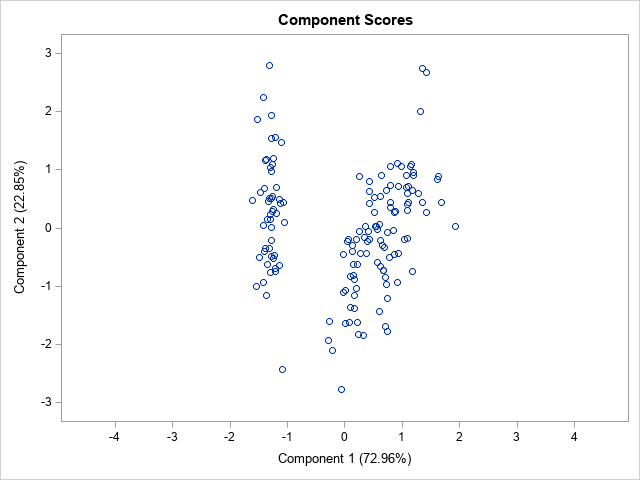
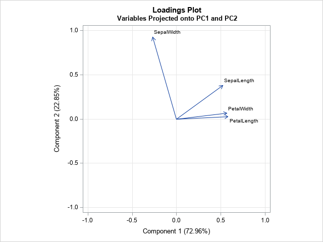
A previous article shows the score plot and loadings plot for a PCA of Fisher's iris data. For these data, the first two principal components explain 96% of the variance in the four-dimensional data. Therefore, these data are well-approximated by a two-dimensional set of principal components. For convenience, the score plot (scatter plot) and the loadings plot (vector plot) are shown below for the iris data. Notice that the loadings plot has a much smaller scale than the score plot. If you overlay these plots, the vectors would appear relatively small unless you rescale one or both plots.
The mathematics of the biplot
You can perform a PCA by using a singular value decomposition of a data matrix that has N rows (observations) and p columns (variables). The first step in constructing a biplot is to center and (optionally) scale the data matrix. When variables are measured in different units and have different scales, it is usually helpful to standardize the data so that each column has zero mean and unit variance. The examples in this article use standardized data.
The heart of the biplot is the singular value decomposition (SVD). If X is the centered and scaled data matrix, then the SVD of X is
X = U L V`
where U is an N x N orthogonal matrix, L is a diagonal N x p matrix, and V is an orthogonal p x p matrix. It turns out that the principal components (PCs) of X`X are the columns of V and the PC scores are the columns of U.
If the first two principal components explain most of the variance, you can choose to keep only the first two columns of U and V and the first 2 x 2 submatrix of L. This is the closest rank-two approximation to X.
In a slight abuse of notation,
X ≈ U L V`
where now U, L, and V all have only two columns.
Since L is a diagonal matrix, you can write L = Lc L1-c for any number c in the interval [0, 1]. You can then write
X ≈ (U Lc)(L1-c V`)
= A B
This the factorization that is used to create a biplot. The most common choices for c are 0, 1, and 1/2.
The four types of biplots
The choice of the scaling parameter, c, will linearly scale the observations and vectors separately. In addition, you can write X ≈ (β A) (B / β) for any constant β. Each choice for c corresponds to a type of biplot:
- When c=0, the vectors are represented faithfully. This corresponds to the GH biplot. If you also choose β = sqrt(N-1), you get the COV biplot.
- When c=1, the observations are represented faithfully. This corresponds to the JK biplot.
- When c=1/2, the observations and vectors are treated symmetrically. This corresponds to the SYM biplot.
The GH biplot for variables
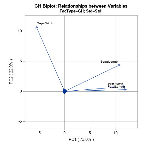
If you choose c = 0, then A = U and B = L V`. The literature calls this biplot the GH biplot. I call it the "variable preserving" biplot because it provides the most faithful two-dimensional representation of the relationship between vectors. In particular:
- The length of each vector (a row of B) is proportional to the variance of the corresponding variable.
- The Euclidean distance between the i_th and j_th rows of A is proportional to the Mahalanobis distance between the i_th and j_th observations in the data.
In preserving the lengths of the vectors, this biplot distorts the Euclidean distance between points. However, the distortion is not arbitrary: it represents the Mahalanobis distance between points.
The GH biplot is shown to the right, but it is not very useful for these data. In choosing to preserve the variable relationships, the observations are projected onto a tiny region near the origin. The next section discusses an alternative scaling that is more useful for the iris data.
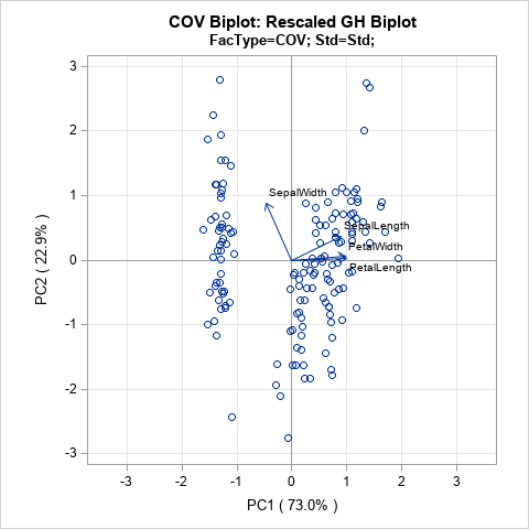
The COV biplot
If you choose c = 0 and β = sqrt(N-1), then A = sqrt(N-1) U and B = L V` / sqrt(N-1). The literature calls this biplot the COV biplot. This biplot is shown at the top of this article. It has two useful properties:
- The length of each vector is equal to the variance of the corresponding variable.
- The Euclidean distance between the i_th and j_th rows of A is equal to the Mahalanobis distance between the i_th and j_th observations in the data.
In my opinion, the COV biplot is usually superior to the GH biplot.
The JK biplot
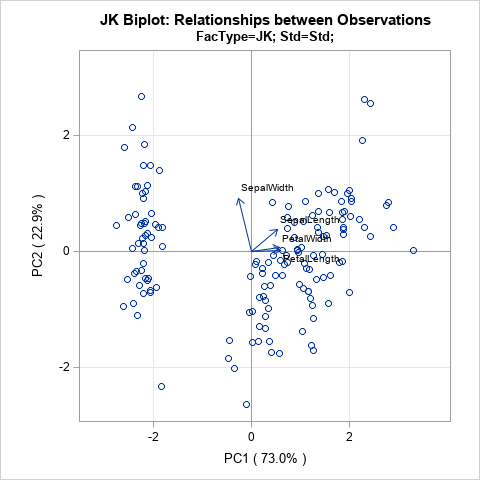
If you choose c = 1, you get the JK biplot, which preserves the Euclidean distance between observations. Specifically, the Euclidean distance between the i_th and j_th rows of A is equal to the Euclidean distance between the i_th and j_th observations in the data.
In faithfully representing the observations, the angles between vectors are distorted by the scaling.
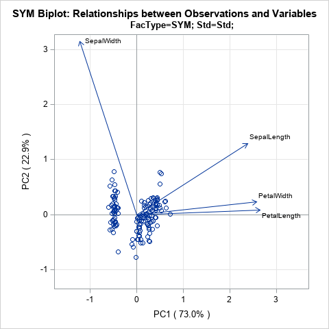
The SYM biplot
If you choose c = 1/2, you get the SYM biplot (also called the SQ biplot), which attempts to treat observations and variables in a symmetric manner. Although neither the observations nor the vectors are faithfully represented, often neither representation is very distorted. Consequently, some people prefer the SYM biplot as a compromise between the COV and JK biplots. The SYM biplot is shown in the next section.
How to interpret a biplot
As discussed in the SAS/IML Studio User's Guide, you can interpret a biplot in the following ways:
- The cosine of the angle between a vector and an axis indicates the importance of the contribution of the corresponding variable to the principal component.
- The cosine of the angle between pairs of vectors indicates correlation between the corresponding variables. Highly correlated variables point in similar directions; uncorrelated variables are nearly perpendicular to each other.
- Points that are close to each other in the biplot represent observations with similar values.
- You can approximate the relative coordinates of an observation by projecting the point onto the variable vectors within the biplot. However, you cannot use these biplots to estimate the exact coordinates because the vectors have been centered and scaled. You could extend the vectors to become lines and add tick marks, but that becomes messy if you have more than a few variables.
If you want to faithfully interpret the angles between vectors, you should equate the horizontal and vertical axes of the biplot, as I have done with the plots on this page.
If you apply these facts to the standardized iris data, you can make the following interpretations:
- The PetalLength and PetalWidth variables are the most important contributors to the first PC. The SepalWidth variable is the most important contributor to the second PC.
- The PetalLength and PetalWidth variables are highly correlated. The SepalWidth variable is almost uncorrelated with the other variables.
- Although I have suppressed labels on the points, you could label the points by an ID variable or by the observation number and use the relative locations to determine which flowers had measurements that were most similar to each other.
Summary
This article presents an overview of biplots. A biplot is an overlay of a score plot and a loadings plot, which are two common plots in a principal component analysis. These two plots are on different scales, but you can rescale the two plots and overlay them on a single plot. Depending upon the choice of scaling, the biplot can provide faithful information about the relationship between variables (lengths and angles) or between observations (distances). It can also provide approximates relationships between variables and observations.
A separate post shows how to use SAS to create the biplots in this article.

5 Comments
Rick,
This graph remind me that proc prinqual also can make this biplot .
And proc prinqual can do some transform for these variables and make result better .
Yes. As I say in the last sentence, I will blog about how to create biplots in SAS. PROC PRINQUAL is one option.
Pingback: Create biplots in SAS - The DO Loop
Hi Rick,
I appreciate your articles. These are helping me complete my master's capstone more than the course material that I was provided with. Thank you for the great explanations and insight!
Pingback: How to interpret graphs in a principal component analysis - The DO Loop