Data tell a story. A purpose of data visualization is to convey that story to the reader in a clear and impactful way. Sometimes you can let the data "speak for themselves" in an unadorned graphic, but sometimes it is helpful to add reference lines to a graph to emphasize key features of the data.
This article discusses the REFLINE statement in PROC SGPLOT in SAS. This is a statement that I use daily. This article provides multiple "Getting Started" examples that show how to use the REFLINE statement to improve your graphs. Examples include:
- Display a reference line at a value such as a mean or median
- Add labels to a reference line
- Display normal ranges for measurements
- Use reference lines for a categorical variable on a discrete axis
Basic reference lines
The REFLINE statement in PROC SGPLOT is easy to use. You can specify one or more values (separated by spaces) or you can specify a variable in the data set that contains the values at which to display the reference lines. You then use the AXIS=X or AXIS=Y option to specify which axis the reference lines are for. The reference lines are perpendicular to the axis.
A simple use of a reference line is to indicate a reference value on a histogram. For example, a healthy total cholesterol level is less than 200 mg/dL. A "borderline" (or moderately elevated) cholesterol level is between 200 and 240 mg/dL. A cholesterol level that is 240 or more is considered high. The Sashelp.Heart data set contains cholesterol and blood pressure information for patients in a heart study. The following histogram shows the distribution of cholesterol values for 5,195 subjects. You can use reference lines to indicate good, borderline, and high cholesterol.
data Heart; set sashelp.Heart(where=(Cholesterol<400)); keep Cholesterol Systolic; run; proc sgplot data=Heart; histogram Cholesterol; refline 200 240 / axis=x lineattrs=(thickness=3 color=darkred pattern=dash); /* Note: Order matters. Put REFLINE stmt first if you want it behind the bars */ run; |
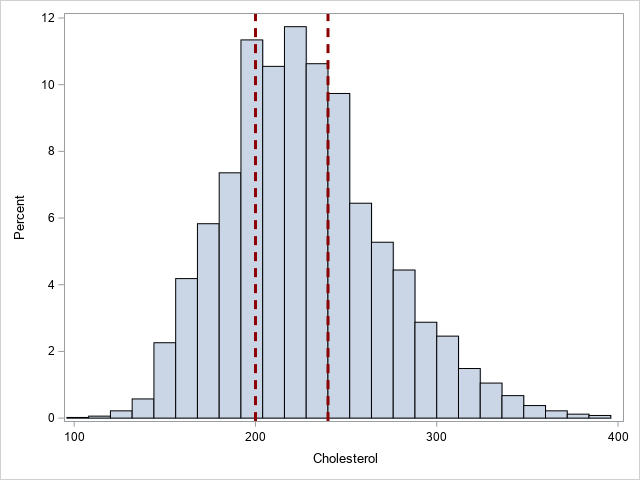
In this example, I used the optional LINEATTRS= option to show how to change the color, line pattern, and thickness of the reference lines.
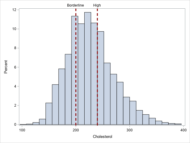
Reference lines with labels
If you might want to add a label to the reference lines, you can use the LABEL= option to specify one or more labels. You can use the LABELLOC= option to put the label inside or outside the data area of the graph. I like "outside" (the default) because then the line does not interfere with the label. You can use the LABELPOS= option to specify whether the label is displayed at the top or bottom (for a vertical reference line) or at the left or right (for a horizontal reference line). The following example adds labels to the previous example.
proc sgplot data=Heart; histogram Cholesterol; refline 200 240 / axis=x lineattrs=(thickness=3 color=darkred pattern=dash) label=("Borderline" "High"); /* OPT: labelloc=inside labelpos=max; */ run; |
You can also use the BLOCK statement to show the cholesterol ranges.
Reference lines at computed locations
Sometimes the reference values are the result of a computation. The REFLINE values and the LABEL= option can come from variables in a SAS data set. For multiple values, you probably want to arrange the values in "long form."
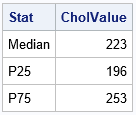
A good example is displaying descriptive statistics such as a mean, median, and percentiles. The following call to PROC MEANS computes three statistics for the Cholesterol variable: the median, the 25th percentile, and the 75th percentile. The output from PROC MEANS is one row and three columns, so I use PROC TRANSPOSE to convert the data set into long form, as follows:
/* create a data set of statistics */ proc means data=Heart Median P25 P75; var Cholesterol; output out=MeansOut(drop=_TYPE_ _FREQ_) median=Median P25=P25 P75=P75; run; proc transpose data=MeansOut Name=Stat out=Stats(rename=(Col1=CholValue)); run; proc print data=Stats noobs; run; |
You can append the statistics to the original data set and use PROC SGPLOT to create a histogram with reference lines that display the computed percentiles.
data HeartChol; set Heart Stats; run; proc sgplot data=HeartChol; histogram Cholesterol; refline CholValue / axis=x label=Stat lineattrs=GraphData2(thickness=3); run; |
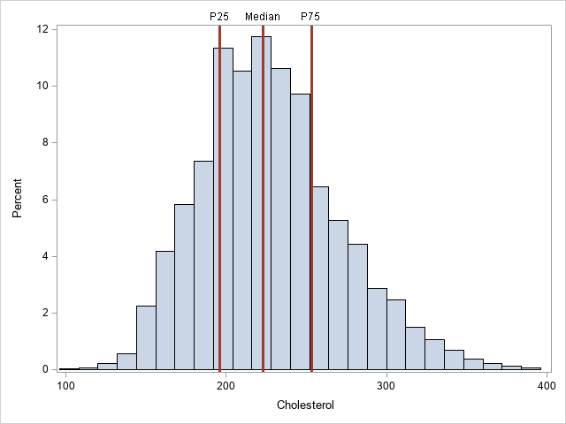
In this example, I used the LINEATTRS=GRAPHDATA2 option to assign the style attributes of the lines. I used the THICKNESS= suboption to override the default thickness.
Reference lines for 2-D plots
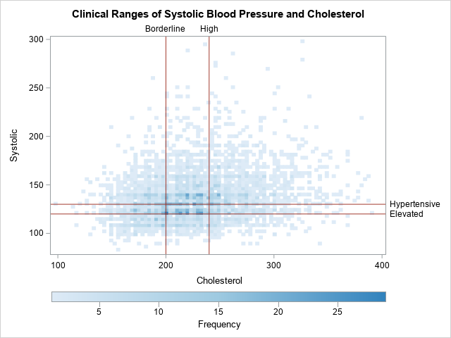
You can also add reference lines to one or both axes of a two-dimensional plot such as a scatter plot, heat map, or contour plot. The following graph shows a heat map of the cholesterol and systolic blood pressure values for more than 5,000 patients. The reference lines show clinical values for normal, slightly high, and high levels of both variables:
title "Clinical Ranges of Systolic Blood Pressure and Cholesterol"; proc sgplot data=HeartStats; heatmap x=Cholesterol y=Systolic / colormodel=(CXDEEBF7 CX9ECAE1 CX3182BD ); refline 200 240 / axis=x label=('Borderline' 'High') lineattrs=GraphData2; refline 120 130 / axis=y label=('Elevated' 'Hypertensive') lineattrs=GraphData2; gradlegend / position=bottom; run; |
Reference lines for a discrete axis
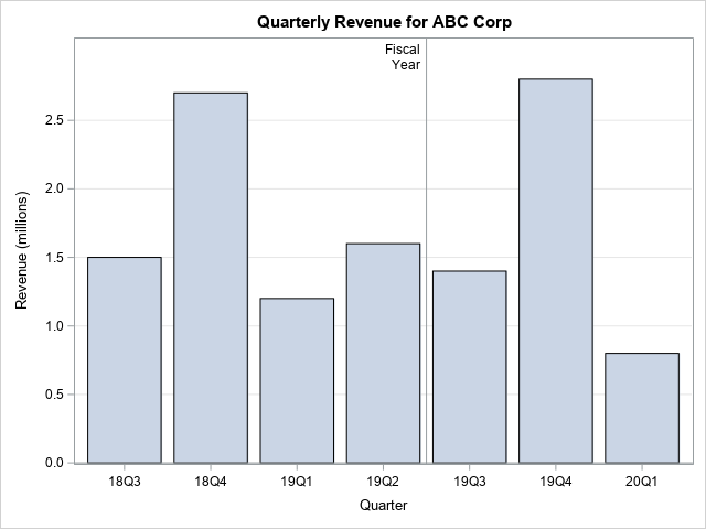
You can also display reference lines on a discrete axis, although it is not common. One application that I can think of is displaying an expected value for a discrete probability distribution. Another application is simply drawing a line that separates one set of categories from another. In the following example, I use a reference line to indicate a fiscal year. Notice the following:
- If the categorical variable has a format, you need to specify the formatted value.
- By default, the reference line will be in the middle of the category. You can use the DISCRETEOFFSET= option and a value in the interval [-0.5, 0.5] to move the line left or right of center. Positive values move the line to the right; negative values move the line to the left. In the example, DISCRETEOFFSET=0.5 moves the line between the reference category and its neighbor to the right.
- The REFLINE statement supports a SPLITCHAR= option that you can use to split a long label across multiple lines.
data Revenue; input Quarter Date9. Revenue; label Revenue = "Revenue (millions)"; format Quarter YYQ4.; datalines; 01Sep2018 1.5 01Dec2018 2.7 01Mar2019 1.2 01Jun2019 1.6 01Sep2019 1.4 01Dec2019 2.8 01Mar2020 0.8 ; title "Quarterly Revenue for ABC Corp"; proc sgplot data=Revenue; vbar Quarter/ response=Revenue; /* for a discrete variable, specified the formatted value */ refline "19Q2" / axis=x discreteoffset=0.5 /* move ref line to right */ labelloc=inside label="Fiscal /Year " splitchar="/"; /* split label */ xaxis discreteorder=data; yaxis grid offsetmax=0.1; run; |
Getting fancy with reference lines
Because you can control the thickness of the reference lines, you can use them for many purposes. Sanjay Matange shows two creative uses for reference lines for a discrete axis:
- Use reference lines to highlight a category of interest.
- Although you can use the COLORBANDS= option on the YAXIS statement to add alternating bands of colors to a graph, the REFLINE statement enables you to add lines that are not strictly alternating or that vary in width.
Summary
This article shows several ways to use the REFLINE statement in PROC SGPLOT to add information to your graphs. You can display a line to indicate a reference value or a sample statistic. You can display labels for reference lines. You can even use reference lines for a categorical variable on a discrete axis. Reference lines are a powerful way to enhance your graphs.

7 Comments
Thank you Rick,
Very helpful. on a similar path, how do I add IQR (interquartile range) reference lines to BoxPlot using SGPLOT?
Thank you,
Helal
The technique is exactly the same: Compute the 25th and 75th quantiles and plot them by using the REFLINE statement.
Thank you,
I am having an issue where my x-axis (on a vbar chart) is time.
(for illustrative purposes, imagine wanting a reference line on each holiday, but the x-axis simply displayed the month, and the underlying data columns were date date9. and sales).
I can add reference lines by matching the date format of the x-axis, but I lose the reference lines if I change the interval of the x-axis.
If I display the data by day, I can have all 11 reference lines, but if I change the x-axis to month values=(date to date by month), I lose the reference values, since those exact dates are no longer tick marks.
I am trying interval=, tickvalueformat=, and even x2axis with refticks, and many other options, but I cannot figure out how to have reference lines that correspond to my x axis data, but also display a graph that does not squeeze every individual date.
The only reason I want to change the x-axis to months is to make it legible, since each individual date is displayed en mass.
Use
XAXIS TYPE=TIME;
I also suggest you use the NEEDLE statement instead of VBAR. (You could also use VBARPARM, but NEEDLE is better.)
Pingback: Add reference lines to a bar chart in SAS - The DO Loop
Thank you for the post. It is very helpful. Could you please let me know how to add tick marks/values on reference line? I wanted to make a graph like this. https://figshare.com/articles/figure/_Incremental_cost_effectiveness_plane_/232793/1
You can ask programming questions on the SAS Support Community. Personally, I would discourage you from trying to create this plot. The axes and ticks should be drawn on the outside of the graph so that they do not get obscured by the markers. You can add a coordinate grid by using the statements
XAXIS grid;
YAXIS grid;