A previous article shows how to interpret the collinearity diagnostics that are produced by PROC REG in SAS. The process involves scanning down numbers in a table in order to find extreme values. This can be a tedious and error-prone process. Friendly and Kwan (2009) compare this task to a popular picture book called Where's Waldo? in which children try to find one particular individual (Waldo) in a crowded scene that involves of hundreds of people. The game is fun for children, but less fun for a practicing analyst who is trying to discover whether a regression model suffers from severe collinearities in the data.
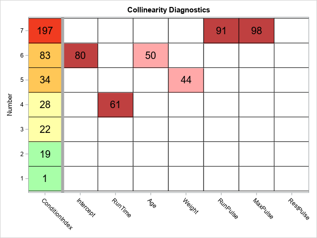
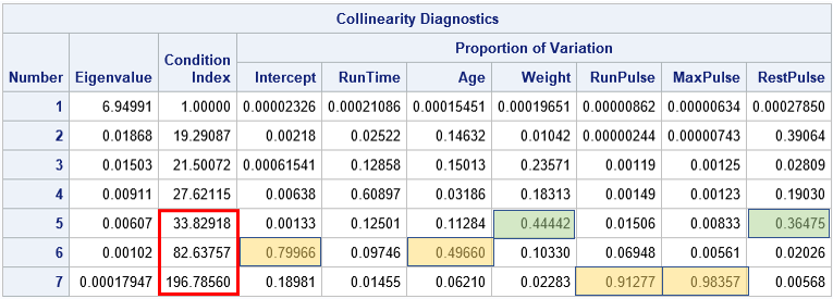
Friendly and Kwan suggest using visualization to turn a dense table of numbers into an easy-to-read graph that clearly displays the collinearities, if they exist. Friendly and Kwan (henceforth, F&K) suggest several different useful graphs. I decided to implement a simple graph (a discrete heat map) that is easy to create and enables the analyst to determine whether there are collinearities in the data. One version of the collinearity diagnostic heat map is shown below. (Click to enlarge.) For comparison, the table from my previous article is shown below it. The highlighted cells in the table were added by me; they are not part of the output from PROC REG.
Visualization principles
There are two important sets of elements in a collinearity diagnostics table. The first is the set of condition indices, which are displayed in the leftmost column of the heat map. The second is the set of cells that show the proportion of variance explained by each row. (However, only the rows that have a large condition index are important.) F&K make several excellent points about the collinearity diagnostic table:
- Display order: In a table, the important information is in the bottom rows. It is better to reverse-sort the table so that the largest condition indices (the important ones) are at the top.
- Condition indices: A condition number between 20 and 30 is starting to get large (F&K use 10-30). An index over 30 is generally considered large and an index that exceeds 100 is "a sign of potential disaster in estimation" (p. 58). F&K suggest using "traffic lighting" (green, yellow, and red) to color the condition indices by the severity of the collinearity. I modified their suggestion to include an orange category.
- Proportion of variance: F&K note that "the variance proportions corresponding to small condition numbers are completely irrelevant" (p. 58) and also that tables print too many decimals. "Do we really care that [a]variance proportion is 0.00006088?" Of course not! Therefore we should only display the large proportions. F&K also suggest displaying a percentage (instead of proportion) and rounding the percentage to the nearest integer.
A discrete heat map to visualize collinearity diagnostics
There are many ways to visualize the Collinearity Diagnostics table. F&K use traffic lighting for the condition numbers and a bubble plot for the proportion of variance entries. Another choice would be to use a panel of bar charts for the proportion of variance. However, I decided to use a simple discrete heat map. The following list describes the main steps to create the plot. You can download the complete SAS program that creates the plot and modify it (if desired) to use with your own data. For each step, I link to a previous article that describes more details about how to perform the step.
- Use the ODS OUTPUT statement to save the Collinearity Diagnostics table to a data set.
- Use PROC FORMAT to define a format. The format converts the table values into discrete values. The condition indices are in the range [1, ∞) whereas the values for the proportion of variance are in the range [0, 1). Therefore you can use a single format that maps these values into 'low', 'medium', and 'high' values.
- The HEATMAPPARM statement in PROC SGPLOT is designed to work with data in "long format." Therefore convert the Collinearity Diagnostics data set from wide form to long form.
- Create a discrete attribute map that maps categories to colors.
- Use the HEATMAPPARM statement in PROC SGPLOT to create a discrete heat map that visualizes the collinearity diagnostics. Overlay (rounded) values for the condition indices and the important (relatively large) values of the proportion of variance.
The discrete heat map enables you to draw the same conclusions as the original collinearity diagnostics table. However, whereas using the table is akin to playing "Where's Waldo," the heat map makes it apparent that the most severe collinearity (top row; red condition index) is between the RunPulse and MaxPulse variables. The second most severe collinearity (second row from top; orange condition index) is between the Intercept and the Age variable. None of the remaining rows have two or more large cells for the proportion of variance.
You can download the SAS program that creates the collinearity plot. It would not be hard to turn it into a SAS macro, if you intend to use it regularly.
References
Friendly, M., & Kwan, E. (2009). "Where's Waldo? Visualizing collinearity diagnostics." The American Statistician, 63(1), 56-65. https://doi.org/10.1198/tast.2009.0012

2 Comments
This is very useful. Thanks for posting this.
Thank you Rick. I appreciate the simple, straightforward explanation.