A previous article describes the funnel plot (Spiegelhalter, 2005), which can identify samples that have rates or proportions that are much different than expected. The funnel plot is a scatter plot that plots the sample proportion of some quantity against the size of the sample. The variance of the sample proportion is inversely proportional to the sample size, so the plot is funnel-shaped. An example of a funnel plot is shown to the right.
A funnel plot can visualize any rate, but this article visualizes the case fatality rate for COVID-19 deaths for counties in the US. The case fatality rate is the number of deaths due to COVID-19 divided by the number of confirmed cases. (For more information about case fatality rates, see "Understanding COVID-19 data: Case fatality rate vs. mortality rate vs. risk of dying.")
The graphs are sobering: Each marker represents dozens, hundreds, or even thousands of people who have died because of the coronavirus pandemic. A goal of this visualization is to identify counties that have extreme case-fatality rates so that public health officials can react swiftly and save lives.
The range of coronavirus cases for US counties
The following table shows the distribution of the number of confirmed coronavirus cases among the 2,717 counties that have reported at least one case by 15Apr2020.
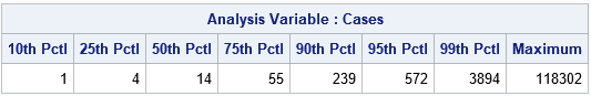
The table shows the percentiles for the number of cases in each county that has at least one case:
- 10% of the counties report at most 1 case.
- 25% of the counties report at most 4 cases.
- Half of the counties report at most 14 cases.
- 75% of the counties report at most 55 cases.
The previous table shows that most (75%) of the US counties have only a few dozen confirmed cases. However, remember that testing is not widespread and many people who contract the virus and recover at home are never counted in the official statistics.
Many news stories focus on the hardest-hit communities. The following table shows the US counties that have reported more than 10,000 cases by 15Apr2020:
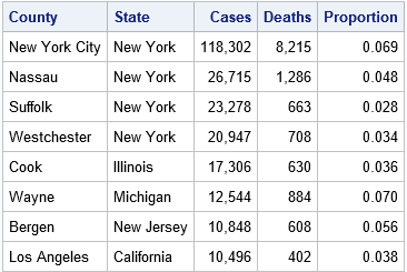
As expected, most cases occur in the most populous communities. In addition to New York City and its neighboring counties (such as Bergen, NJ, across the Hudson River from Manhatten), the list includes counties that contain the cities of Chicago, Detroit, and Los Angeles. The following sections create two different funnel plots. The first includes the most populous counties. The second highlights the majority of US counties, which have fewer cases per county.
A funnel plot for all US counties
In general, it is difficult to visualize data that range over many orders of magnitude. If you use a linear axis, the largest data tend to stretch out the axes on a plot, pushing the smaller values into a tiny slice of the graph. This is seen in the following funnel plot, which plots the case fatality rate versus the number of confirmed cases for US counties on 15Apr2020. The reference line represents the overall case fatality rate in the US, which is 4.5%. The curves indicate the usual range of variability for an estimate as a function of the sample size, assuming that each county is experiencing deaths at the overall rate.

The top counties are labeled, but New York dominates the graph. Most of the markers are squashed into the left side of the graph. You can see that New York not only has more cases, but its case fatality rate is very high relative to the national average. Because of the extreme number of cases in New York, it is difficult to see the rest of the data or the funnel-shaped region.
There are two ways to modify the graph. The first is to use a nonlinear scale on the horizontal axis (typically a logarithmic scale, but a square root transformation is another option). The second is to truncate the graph at some value such as 5,000 cases. Essentially, this is "zooming in" on part of the previous graph.
A logarithmic-scale funnel plot
The following plot shows exactly the same data, but the horizontal axis now uses a logarithmic scale.
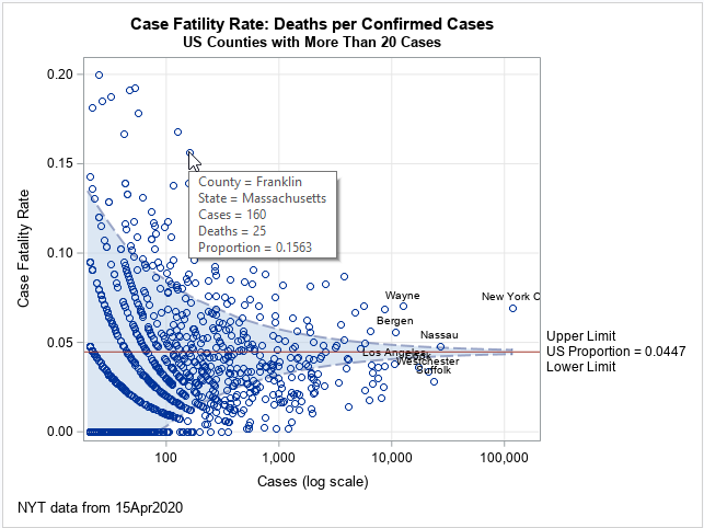
In this graph, you can clearly see the funnel-shaped region. Markers outside the region have higher- or lower-than-expected rates. If you create the graph in SAS, you can hover the pointer over a marker in any of these plots to reveal the name of the county and additional details. An example is shown for Franklin County, MA. You might notice that markers in the lower-left corner appear to fall along curves. These curves correspond to counties that have experienced zero deaths, one death, two deaths, and so forth.
Zoom in on a funnel plot
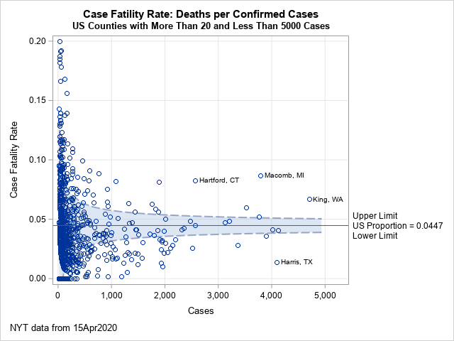
Another alternative is to zoom in on a region of interest. For example, the following plot shows only counties that have between 20 and 5,000 cases.
A few counties are labeled because their rates are much higher or much lower than expected:
- King County (WA): This county was the original epicenter in the US. Many residents died at a nursing home in Kirkland, WA. To date, the county has experienced 314 deaths and about 3,700 confirmed cases.
- Macomb County (MI): Along with Wayne County, Macomb County has been a hot spot as the Detroit area struggle to contain the spread of coronavirus.
- Hartford County (CT): Connecticut is adjacent to New York and has experienced more than 1,000 COVID-19 deaths. Hartford County is one of three hard-hit counties in Connecticut.
- Harris County (TX): The home of Houston reports half as many COVID-related deaths as other comparable cities. I do not know why this rate is so low, but it demonstrates that the funnel plot can reveal lower-than-expected rates.
Summary
Estimates that are based on small samples are highly variable. A funnel plot is a good way to visualize many estimates that are based on samples of different sizes. The funnel plot includes curves that indicate an acceptable range of variability for each sample size. If a sample rate is far outside the region, the sample can be examined more closely to understand why the rate is extreme.
The funnel plots in this article compare the case fatality rates due to COVID-19 for thousands of US counties on 15Apr2020. The funnel plots reveal counties whose rates are higher-than-expected or lower-than-expected.
It is worth mentioning that you can use a funnel plot for any rate. Other coronavirus rates include the rate of hospitalization, the proportion of confirmed cases that are on ventilators, the rate of recovery, and so forth.
You can download the SAS program that creates the funnel plots in this article.
LEARN MORE | See all Coronavirus dashboard blog posts

1 Comment
Hi,
Thanks you so much..!! This is definitely one of the best blog on Data visualization I had read, I have also liked this video on YouTube which has helped me alot
Animation plot of COVID 19 data