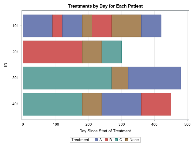
The HighLow plot often enables you to create many custom plots without resorting to annotation. Although it is designed to create a candlestick chart for stocks, it is incredibly versatile. Recently, a SAS programmer wanted to create a patient-profile graph that looked like a stacked bar chart but had repeated categories. The graph is shown to the right. The graph shows which treatments each patient was given and in which order. Treatments can be repeated, and during some periods a patient was given no treatment.
Although the graph looks like a stacked bar chart, there is an important difference. A stacked bar chart is a graph of (counts of) discrete categories. For each patient, each category appears at most one time. Although the categories can be ordered, the categories are displayed in the same order for every patient.
In contrast, by using the HighLow chart, you can order the categories independently for each patient and you can display repeated categories.
A graph of mutually exclusive events over time
This chart visualizes the sequence of treatments for a set of patients over time, but you can generalize the idea. In general, this graph is used to show different subjects over time. At each instant of time, the subject can experience one and only one event at a time. In theory, this means that the events should be mutually exclusive, but you can get around that restriction by defining additional events such as "A and B", "A and C", and "B and C".
The following DATA step defines the data in "long form," meaning that each patient profile is defined by using multiple rows. There are four variables: The subject ID, the starting time, the ending time, and the treatment category. Each row of the data set defines the starting and ending time for one treatment for one patient. The DATA step also implements a trick that I like: prepend "fake data" to specify the order that the treatments will appear in the legend.
data Patients; length Treatment $ 10; input ID StartDay EndDay Treatment; /* trick: The first patient is a 'missing patient', which determines the order that the categories appear in the legend. */ datalines; . 0 0 A . 0 0 B . 0 0 C . 0 0 None 101 0 90 A 101 90 120 B 101 120 180 A 101 180 210 None 101 210 270 B 101 270 360 None 101 360 420 A 201 0 180 B 201 180 240 None 201 240 300 C 301 0 270 C 301 270 320 None 301 320 480 A 401 0 180 C 401 180 240 None 401 240 360 A 401 360 450 B ; title "Treatments by Day for Each Patient"; proc sgplot data=Patients; highlow y=ID low=StartDay high=EndDay / group=Treatment type=BAR; yaxis type=discrete reverse; /* the ID var is numeric, so you must specify DISCRETE */ xaxis grid label='Day Since Start of Treatment'; run; |
The graph is shown at the top of the article. The PROC SGPLOT is a one-liner. The "hard part" about creating this graph is knowing that it can be created by using a HighLow plot and creating the data in the correct form.
In summary, the HighLow plot gives you more control over the graph than a standard stacked bar chart. It enables you to display repeated categories and to order the categories independently for each subject. By using these features, you can visualize a sequence of mutually exclusive events over time for each subject.
Further reading
There have been many blog posts that use the HighLow plot to create custom graphs. In statistics, I have used the HighLow plot to create deviation plots and butterfly fringe plots. In clinical graphs, it can create graphs such as:
- Swimmer plots
- Adverse event charts and other patient profile charts
- Schedule charts and GANTT charts
