Last week Bruno asked about creating a Schedule Chart using SG Procedures. To me, such projects are very interesting and challenging...How much mileage can we get out of the current set of SGPLOT procedure features to create a visual that was not part of the original requirements?
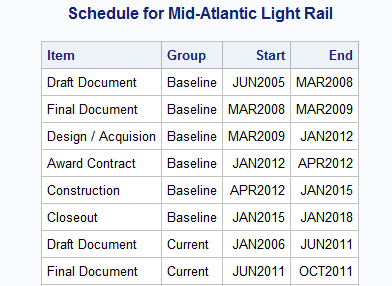
The clear choice for such a graph is the HIGHLOW plot. I found an image of a Schedule Chart on the Web, and decided to do it using SGPLOT procedure. Here is the data I created:
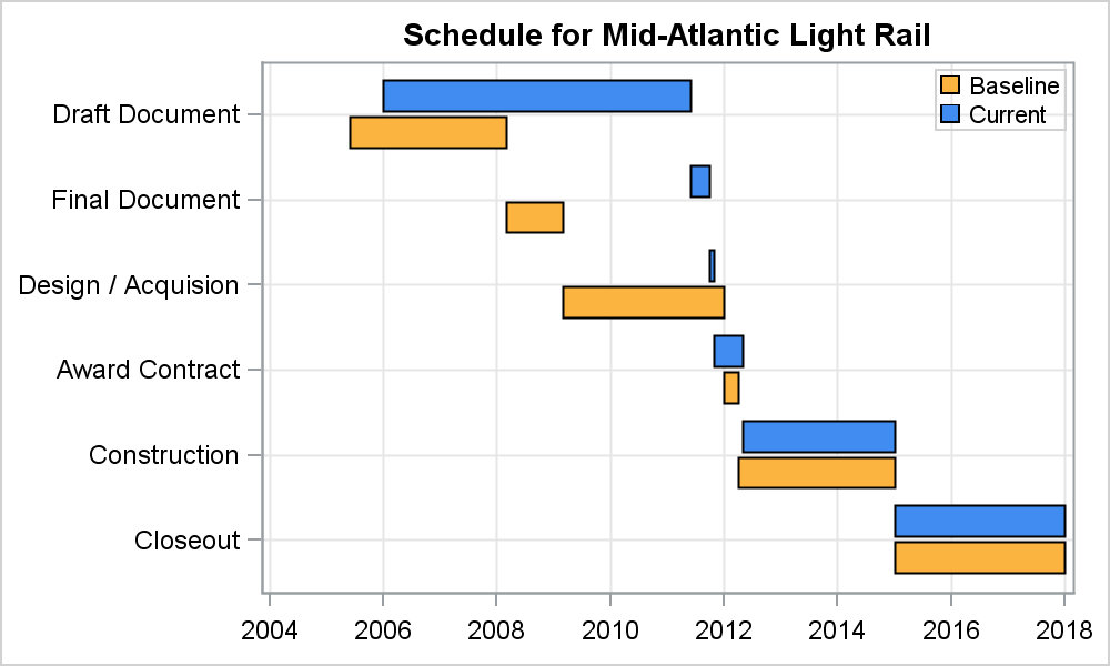
I used the HIGHLOW plot, with Y=Item, Low=Start, high=End and group=Group. I used the MODSTYLE macro to set the group colors to the blue and gold from the image I saw on the web. Here is the graph. Click on the graph for a higher resolution image.
SAS 9.3 SGPLOT Code:
proc sgplot data=schedule; title 'Schedule for Mid-Atlantic Light Rail'; highlow y=item low=start high=end / type=bar group=group groupdisplay=cluster barwidth=0.9 name='a'; yaxis reverse display=(nolabel) grid; xaxis display=(nolabel) grid; keylegend 'a' / location=inside position=topright across=1; run; |
At SAS9.3, HIGHLOW plot in SGPLOT procedure does not support the DataSkin option. GTL does. So, I simulated the drop shadow by adding a second plot with a slight offset.

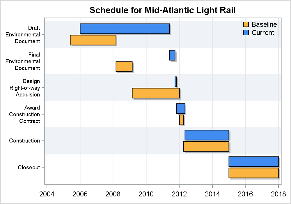
With SAS 9.4, a few additional features can be used. SAS 9.4 SGPLOT supports split Y axis tick values, and color bands. So, I used longer Item strings with the SPLITALWAYS fit policy. I also used the color bands option.
SAS 9.4 SGPLOT Graph:
Bruno wanted to add connections between start and end segments. He did that using a STEP plot in a non-grouped case. For the grouped case (like this one), I wonder if connecting line segments are important, and if they are, how should we handle the crossings over the other group values?
Full SAS 9.3 Code: Schedule_Chart_93
Full SAS 9.4 Code: Schedule_Chart_94


3 Comments
Sanjay, you produce a never ending stream of useful and interesting tips and graphing applications. I really appreciate and enjoy your blog.
Jonathan
Thanks, Jonathan. Such projects are always interesting. Someone wanted to do a Radar Chart the other day. We don't have a statement but you could use Series Plot.
Pingback: Schedule Chart with Links - Graphically Speaking