A couple of weeks back I described q way to create a Schedule Chart using the SGPLOT procedure. In that case, I used the HIGHLOW plot to draw bar segments, both for a single and grouped case. A natural extension is to create one with links between each segment. So, here is an example of a schedule chart with links. Click on the graph to see a higher resolution view.
SAS 9.4 Schedule Plot with Links:
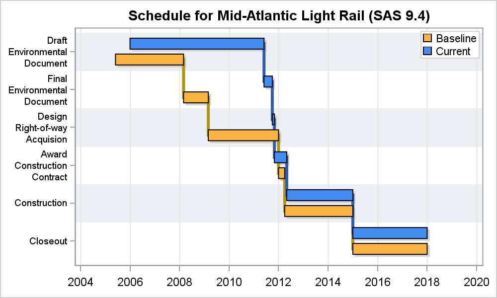
This chart is created using SAS 9.4 SGPLOT procedure. The way to add the links is to use a STEP plot or a SERIES plot. Step plot makes sense, as the same data as used for the HIGHLOW can be directly used for step.
SAS 9.4 SGPLOT Code:
proc sgplot data=scheduleLine; title 'Schedule for Mid-Atlantic Light Rail (SAS 9.4)'; highlow y=item low=start2 high=end2 / type=bar barwidth=0.75 discreteoffset=0.05 fillattrs=(color=lightgray) nooutline group=group groupdisplay=cluster; step y=Item x=end / group=group lineattrs=(thickness=3) groupdisplay=cluster; highlow y=item low=start high=end / group=group type=bar barwidth=0.75 groupdisplay=cluster name='a' lineattrs=(color=black); yaxis reverse display=(nolabel) colorbands=odd colorbandsattrs=(transparency=0.4) fitpolicy=splitalways valueattrs=(size=7); xaxis display=(nolabel) grid; keylegend 'a' / location=inside position=topright across=1 opaque; run; |
Using step y=Item x=end, the step plot automatically steps up at each new value, and the rendering will be exactly what you would want. The only problem here is that the STEP plot does not support category Y axis (bummer!). So, clearly we have to fix that in an upcoming release. So, how did I do the graph above?
Well, I used the SERIES plot instead. Series plot does support category Y axis with cluster groups. But, in order to do that, I have to create a new column (Line_x) with all the points needed to draw the stepped line. This column has the end point of first segment, followed by start point of next segment followed by endpoint of same segment and so on for each "Item". See attached code. Then, I used the Series plot with cluster groups to create this graph.
SAS 9.4 SGPLOT Code:
proc sgplot data=scheduleLine; title 'Schedule for Mid-Atlantic Light Rail (SAS 9.4)'; highlow y=item low=start2 high=end2 / type=bar barwidth=0.75 discreteoffset=0.05 fillattrs=(color=lightgray) nooutline group=group groupdisplay=cluster; series y=Item x=Line_x / group=group lineattrs=(thickness=3) groupdisplay=cluster; highlow y=item low=start high=end / group=group type=bar barwidth=0.75 groupdisplay=cluster name='a' lineattrs=(color=black); yaxis reverse display=(nolabel) colorbands=odd colorbandsattrs=(transparency=0.4) fitpolicy=splitalways valueattrs=(size=7); xaxis display=(nolabel) grid; keylegend 'a' / location=inside position=topright across=1 opaque; run; |
Note the use of the category bands and split Y axis tick values, both of which are new SAS 9.4 feature for discrete axes.
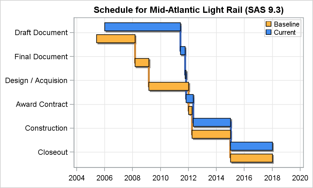
But, what about SAS 9.3? Yes, you can create this graph with SAS 9.3. The features (or lack thereof at SAS 9.3) we have to account for are cluster grouping for a Series plot with category Y axis. This feature did not exist at SAS 9.3. To do this, we use an interval Y axis with values of 1-N for each item, and a user defined format to label each value correctly. For cluster grouping, we offset the y value for each HighLow bar ourselves. Here is the result:
SAS 9.3 Schedule Plot with Links:
SAS 9.3 SGPLOT Code:
proc sgplot data=schedule; title 'Schedule for Mid-Atlantic Light Rail (SAS 9.3)'; format id2 id3 item.; highlow y=id3 low=start2 high=end2 / type=bar fillattrs=(color=gray) intervalbarwidth=15 name='a' lineattrs=(color=gray); step y=id2 x=start / group=group groupdisplay=cluster lineattrs=(thickness=3); highlow y=id2 low=start high=end / type=bar group=group intervalbarwidth=15 name='a' lineattrs=(color=black); yaxis reverse display=(nolabel) grid values=(1 to 6 by 1) offsetmin=0.1 offsetmax=0.1; xaxis display=(nolabel) grid; keylegend 'a' / location=inside position=topright across=1; run; |
ID2 has the numeric values used to offset the two groups and ID3 to draw the drop shadows.
What about SAS 9.2 you ask? Here you will have to use the VECTOR plot to draw the segments, but the rest should work the same.
Full SAS 9.4 Code: Schedule_Line_94
Full SAS 9.3 Code: Schedule_Line_93


1 Comment
Pingback: The HIGHLOW Plot - Graphically Speaking