In cold and blustery conditions, the weather forecast often includes two temperatures: the actual air temperature and the wind chill temperature. The wind chill temperature conveys the cumulative effect of air temperature and wind on the human body. The goal of the wind-chill scale is to communicate the effect of the wind by giving an equivalent hypothetical scenario in which the temperature is colder but there is no wind. For example, if the wind chill temperature is 0 degrees, it means that the outdoor air temperature and wind combine to make you feel as cold as if it was a calm, clear, night with a temperature of 0°.
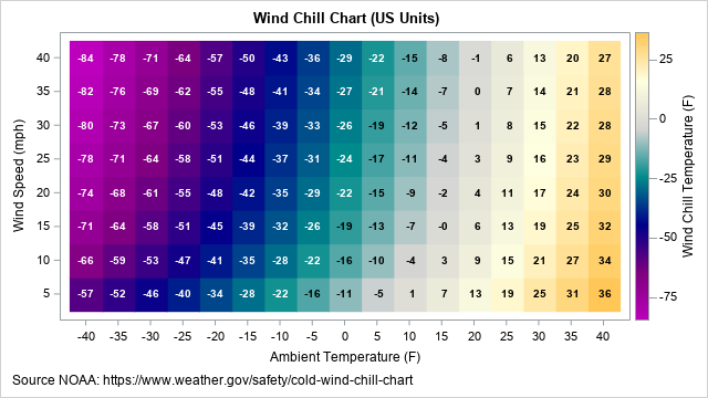
This article briefly discusses wind chill calculations and presents a statistical formula for predicting wind chill temperatures. It then creates two wind chill charts by using the formula. The first chart (shown below; click to enlarge) is for US customary units (temperatures in Fahrenheit and wind speeds in miles per hour (mph)). A second chart is shown for SI units (temperatures in Celsius and wind speeds in kilometers per hour (kph)). The end of the article links to information about how scientists developed the wind chill chart. For readers who are interested in how the charts were made, I link to a SAS program.
What is wind chill?
A challenge for meteorologists is how to communicate the risk of severe weather. The wind chill table was developed to communicate the cumulative risk of extreme cold and windy conditions. The table displays the "wind chill equivalent temperature" (WCT or WCET), for a grid of values of air temperature and wind speed.
The wind chill table is based on sophisticated calculations of heat transfer from the human face in the presence of wind, which greatly increases the loss of heat due to convection. It is based on a lot of modeling assumptions (clear night, no sun, the human face is approximately a cylinder,...), and a lot of experimental data to estimate thermal properties of humans. The wind chill calculations that are used currently in the US, Canada, and the UK are based on a 2001 revision of an earlier wind chill table.
A formula for wind chill
The numbers in the official wind-chill table are based on equations from physics and mathematical modeling. The equations are very complicated, and you cannot get the numbers in the table by using a simple formula. However, because a simple formula is very useful for understanding how the apparent temperature depends on wind speed, researchers constructed a linear regression model for which the apparent temperature (WCT) is regressed onto the air temperature and a power of the wind speed. The model includes the main effects and an interaction term.
The formula is accurate to within 1° over the range of physically relevant temperatures and wind speeds. The formula is a valid approximation only for temperatures below 10° C (50° F) and for wind speeds above 5 kph (3 mph). In particular, if you plug in V=0, you do not get the air temperature.
The formula for the wind chill temperature in US units is available on a web page for the National Weather Service:
\(WCT_{US} = 35.74 + 0.6215*T_F - 35.75*V_{mph}^{0.16} + 0.4275*T_F*V_{mph}^{0.16}\)
where TF is the air temperature in degrees Fahrenheit, and Vmph is the wind speed in miles per hour.
The previous formula is a conversion from the official metric formula:
\(WCT_{SI} = 13.12 + 0.6215*T_C - 11.37*V_{kph}^{0.16} + 0.3965*T_C*V_{kph}^{0.16}\)
where TC is the air temperature in degrees Celsius, and Vkph is the wind speed in kilometers per hour. You can get one formula from the other by using the equations
TC = 5/9*TF – 32 and Vkph=Vmph / 1.609.
Notice that the exponent for the wind speed is rather strange (0.16), but presumably this is based on either a statistical transformation (such as a Box-Cox transformation) or by fitting the exponent as a parameter in the model. Despite my efforts, I was unable to find details about how the regression formula was fitted.
A little-known fact is that the wind speeds in the formula are measured at 10 meters (standard anemometer height). The formula uses a wind-profile model to adjust the wind speed to approximate the speed at the height of an average person.
Visualizing wind chill for a given air temperature
Wind removes heat from a layer next to your skin. If you specify the air temperature but allow the wind speed to vary, a graph of the wind chill temperature (WTC) shows how much colder it feels based on the speed of the wind. The following graph shows the WTC (in US units) for four sub-freezing air temperatures: 30°, 20°, 10°, and 0° F.
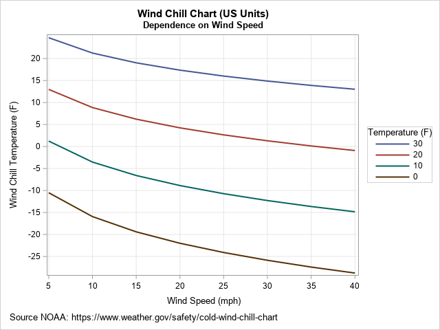
In each case, you can see that stronger winds make it seem colder. The effect of the wind is nonlinear and is stronger for colder temperatures. For example, if the air temperature is 30° F, a 25-mph wind makes it seem about 13 degrees colder. However, if the air temperature is 0° F, a 25-mph wind makes it seem about 24 degrees colder.
Creating a wind chill chart in US units
You can evaluate the formula for the wind chill temperature on a regular grid to obtain a chart that enables you to estimate the wind chill from the current conditions. The chart for US units is shown at the top of this article. To use the chart, find the approximate outdoor temperature along the horizontal axis, then move up the chart into the row for the approximate wind speed. For example, an outdoor temperature of 5° F and a wind speed of 20 mph results in a wind chill temperature of -15° F.
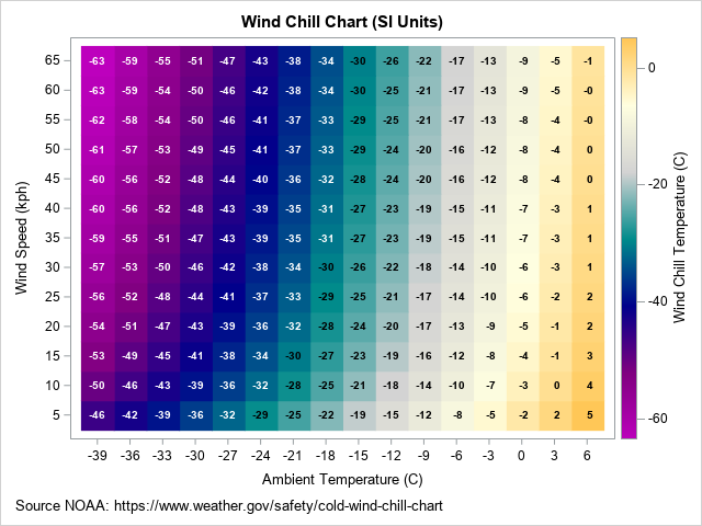
Creating a wind chill chart in SI units
You can create a similar chart for SI (metric) units, as shown below. Because the Celsius degree is almost twice as large as the Fahrenheit degree, I used increments of 3° C along the horizontal axis. However, I continue to use 5 as an increment for wind speed, even though 5 kph is only about 3 mph. The ranges for the axes are chosen so that the range of temperatures and wind speeds are approximately the same as for the US chart.
Summary and further reading
This article discusses wind chill temperature. The computations that calculate the numbers in the official wind chill chart are very complicated. However, you can fit a linear regression to the numbers in the official chart to obtain an approximate formula that is easy to evaluate. This article presents several wind chill charts that are based on the regression formula.
The history of wind chill computations is fascinating. The Wikipedia article for "Wind Chill" has a few sentences about the history. For an interesting account of the development of the most recent wind chill chart (2001), I highly recommend reading Osczevski and Bluestein, "The New Wind Chill Equivalent Temperature Chart," 2005. They explain some of the complications and approximations used to construct the chart. They note that "the public seems to have a strong preference for the equivalent temperature" chart, which seems simple but hides a lot of complexity. They conclude that the chart is "a deceptive simplification" that only seems to be easy to understand.
A future article will discuss how I constructed the wind chill charts in SAS. You can download the complete SAS program that creates these graphs.

1 Comment
Pingback: Create a wind chill chart in SAS - The DO Loop