I recently wrote about a simple statistical formula that approximates the wind chill temperature, which is the cumulative effect of air temperature and wind on the human body. The formula uses two independent variables (air temperature and wind speed) to predict the wind chill temperature. This article describes how to use SAS to create line charts and heat maps that visualize the formula. For the heat map, I show how to overlay numerical values and to choose colors for the numbers so that the text is more readable.
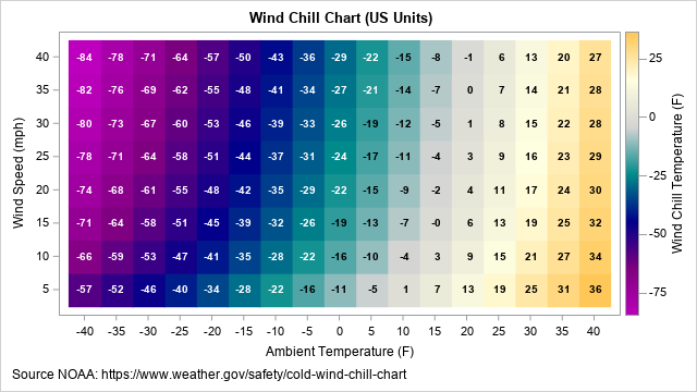
An example of a wind chill chart is shown below. You can use the techniques in this article to visualize any response surface.
A formula for wind chill
The wind chill calculations that are used currently in the US, Canada, and the UK are based on a 2001 revision of an earlier wind chill table. The numbers in the wind chill table are based on equations from physics and mathematical modeling. However, you can fit a simple linear regression model that includes the main effects and an interaction term.
The formula for the wind chill temperature in US units is
\(WCT_{US} = 35.74 + 0.6215*T_F - 35.75*V_{mph}^{0.16} + 0.4275*T_F*V_{mph}^{0.16}\)
where TF is the air temperature in degrees Fahrenheit, and Vmph is the wind speed in miles per hour.
The formula in SI units is
\(WCT_{SI} = 13.12 + 0.6215*T_C - 11.37*V_{kph}^{0.16} + 0.3965*T_C*V_{kph}^{0.16}\)
where TC is the air temperature in degrees Celsius, and Vkph is the wind speed in kilometers per hour.
Visualize slices of the wind chill surface
Given a function of two variables, f(x1, x2), I often visualize the graph of the function by using two techniques. The first technique is to use a sliced fit plot. To create a sliced fit plot, specify a sequence of values for one variable and then overlay the sequence of graphs as a function of the remaining variable. For example, if you choose the values x1=0, 10, 20, and 30, you would overlay the graphs of the functions of x2: f(0, x2), f(10, x2), f(20, x2), and f(30, x2).
The following SAS DATA step evaluates the wind chill function (in US units) at a regular grid of values for the air temperature and the wind speed. The subsequent call to PROC SGPLOT overlays four curves that show the wind chill temperature as a function of the wind speed:
/* Wind chill formula for US customary units. The formula gives the apparent temperature (F) from ambient temperature (F) and wind speed (mph). Source NOAA: https://www.weather.gov/safety/cold-wind-chill-chart */ data WindChillUS; label T = "Ambient Temperature (F)" V = "Wind Speed (mph)" WCT = "Wind Chill Temperature (F)"; do T = 40 to -40 by -5; do V = 5 to 40 by 5; WCT = 35.74 + 0.6215*T - 35.75*V**0.16 + 0.4275*T*V**0.16; output; end; end; run; ods graphics / width=640px height=480px; title "Wind Chill Chart (US Units)"; title2 "Dependence on Wind Speed"; footnote J=L "Source NOAA: https://www.weather.gov/safety/cold-wind-chill-chart"; proc sgplot data=WindChillUS; label T = "Temperature (F)"; where T in (30 20 10 0); series x=V y=WCT / group=T lineattrs=(thickness=2); keylegend / position=E ; xaxis grid values=(-40 to 40 by 5) valueshint; yaxis grid values=(-80 to 40 by 5) valueshint; run; |
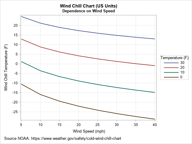
For any air temperature, the apparent temperature decreases as a function of the wind speed. Stronger winds make it seem colder. Notice that the curves are not parallel, which indicates an interaction between temperature and wind speed. For example, if the air temperature is 30° F, a 25-mph wind makes it seem about 13 degrees colder. However, if the air temperature is 0° F, a 25-mph wind makes it seem about 24 degrees colder.
Create a heat map of the wind chill surface
A second way to visualize a response surface is to create a heat map. To be more useful, you can overlay the wind chill temperatures on the heat map.
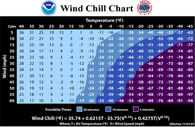
When I look at the wind-chill chart that is provided by the National Weather Service (NWS) (shown at the right), I notice three things:
- The NWS chart contains only four colors. The colors correspond to the danger of frostbite for exposed skin.
- The temperature axis (horizontal dimension) is reversed. The extremely cold temperatures are on the right side of the graph and the temperatures decrease from left to right. The wind speed axis is also reversed.
- The NWS chart uses light colors for moderately cold temperatures and dark colors for extremely cold temperatures. Black text is overlaid on the light colors and white text is overlaid on the dark colors. This way, the color of the text contrasts with the color of the background, which makes the text more readable.
I decided to deviate from the NWS chart in two ways. First, instead of four colors, I decided to use a spectrum of colors that represent the wind chill temperature, not the risk of frostbite. Second, I decided to use the traditional orientation of the axes, where temperatures increase from left to right and wind speeds increase from bottom to top. However, I followed the NWS example for choosing the color of the text.
You can use a trick to get the text to display as either white or black. The following DATA step assigns a binary variable according to whether the temperature is less than some threshold value. If you use the TEXT statement in PROC SGPLOT to display the text, you can use the COLORRESPONSE= option and a white-to-black color ramp to generate text that is white or black according to whether the wind chill temperature is above or below the threshold value. (You could also use the GROUP= option and the STYLEATTRS statement.) To be effective, you also need to choose the color ramp so that lighter colors are used above the threshold and darker colors are used below the threshold. Like the NWS, I use dark purples and blues for extremely cold temperatures, but I added lighter colors (off-white, yellow, and orange) for the milder temperatures.
The following SAS program generates the wind chill chart in US units. Notice the trick that generates white/black text for different temperatures. The chart is shown at the top of this article.
title "Wind Chill Chart (US Units)"; footnote J=L "Source NOAA: https://www.weather.gov/safety/cold-wind-chill-chart"; /* use threshold to decide between white text and dark text */ data WindChillUS2; set WindChillUS; textColor = (WCT > -19.5); /* use to color text */ run; proc sgplot data=WindChillUS2; format WCT 3.0; heatmapparm x=T y=V colorresponse=WCT / name="w" colormodel=(DarkPurple Purple DarkBlue DarkCyan LightGray LightYellow LightOrange); /* trick: white text on a dark background and dark text on a light background */ text x=T y=V text=WCT / colorresponse=textColor colormodel=(white black) textattrs=(weight=bold); gradlegend "w"; xaxis values=(-40 to 40 by 5) valueshint; yaxis values=(-100 to 40 by 5) valueshint; run; |
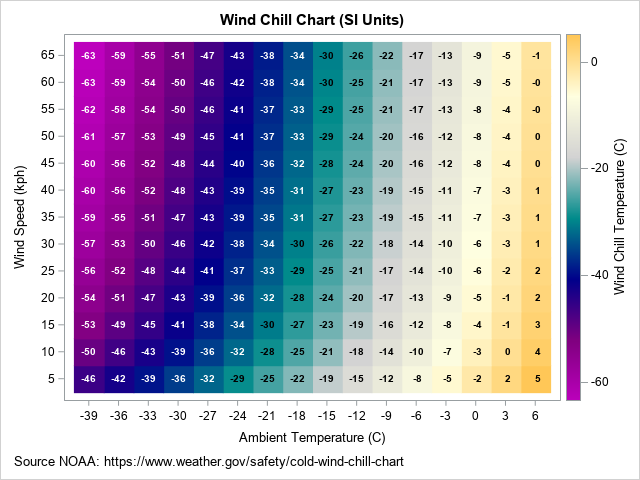
Creating a wind chill chart in SI units
Because most of the world uses SI (metric) units, the following program repeats the process for temperatures in Celsius and wind speeds in kilometers per hour (kph). The range of temperatures and wind speeds are approximately the same as for the US chart.
data WindChillSI; label TC = "Ambient Temperature (C)" VK = "Wind Speed (kph)" WCT = "Wind Chill Temperature (C)"; do TC = 6 to -39 by -3; do VK = 5 to 65 by 5; WCT = 13.12 + 0.6215*TC - 11.37*VK**0.16 + 0.3965*TC*VK**0.16; output; end; end; /* use white text on a dark background and dark text on a light background */ data WindChillSI2; set WindChillSI; textColor = (WCT > -29.5); /* use to color text */ run; ods graphics / width=640px height=480px; title "Wind Chill Chart (SI Units)"; proc sgplot data=WindChillSI2; format WCT 3.0; heatmapparm x=TC y=VK colorresponse=WCT / name="w" colormodel=(DarkPurple Purple DarkBlue DarkCyan LightGray LightYellow LightOrange); text x=TC y=VK text=WCT / colorresponse=textColor colormodel=(white black) textattrs=(weight=bold); gradlegend "w"; xaxis values=(-39 to 6 by 3) valueshint; yaxis values=(5 to 100 by 5) valueshint; run; |
Summary
This article shows how to create a wind chill chart in SAS. One technique slices the response surface and overlays the one-dimensional graph. Another creates a heat map of the wind chill temperature and overlays text. The colors of the heat map and the text are chosen so that the text is readable on both light and dark backgrounds. You can use the techniques in this article to visualize any response surface.
You can download the complete SAS program that creates these graphs.

3 Comments
On behalf of the rest of the world, thanks for creating a chart in familiar SI units Celsius and km/h.
Wind speed is often reported in forecasts here in Germany using the Beaufort scale, which was originally based on observation of sea conditions and later extended with the addition of phenomena observable on land.
Units of measurement are a constant challenge!
I feel bad every time I use the ancient Sashelp.Class data in an example. Weight in pounds? Height in inches? What century is this! Even Sashelp.Cars has outdated units like horsepower, miles per gallon, pounds, and inches. To the rest of the world: Sorry!
Great examples, Rick!