I previously showed an easy way to visualize a regression model that has several continuous explanatory variables: use the SLICEFIT option in the EFFECTPLOT statement in SAS to create a sliced fit plot. The EFFECTPLOT statement is directly supported by the syntax of the GENMOD, LOGISTIC, and ORTHOREG procedures in SAS/STAT. If you are using another SAS regression procedure, you can still visualize multivariate regression models:
- If a procedure supports the STORE statement, you can save the model to an item store and then use the EFFECTPLOT statement in PROC PLM to create a sliced fit plot.
- If a procedure does not support the STORE statement, you can manually create the "slice" of observations and score the model on the slice.
Use PROC PLM to score regression models
Most parametric regression procedures in SAS (GLM, GLIMMIX, MIXED, ...) support the STORE statement, which enables you to save a representation of the model in a SAS item store. The following program creates sample data for 500 patients in a medical study. The call to PROC GLM fits a linear regression model that predicts the level of cholesterol from five explanatory variables. The STORE statement saves the model to an item store named 'GLMModel'. The call to PROC PLM creates a sliced fit plot that shows the predicted values versus the systolic blood pressure for males and females in the study. The explanatory variables that are not shown in the plot are set to reference values by using the AT option in the EFFECTPLOT statement:
data Heart; /* create example data */ set sashelp.heart(obs=500); where cholesterol < 400; run; proc glm data=Heart; class Sex Smoking_Status BP_Status; model Cholesterol = Sex Smoking_Status BP_Status /* class vars */ Systolic Weight; /* contin vars */ store GLMModel; /* save the model to an item store */ run; proc plm restore=GLMModel; /* load the saved model */ effectplot slicefit / at(Smoking_Status='Non-smoker' BP_Status='Normal' Weight=150); /* create the sliced fit plot */ run; |
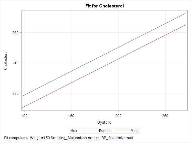
The graph shows a sliced fit plot. The footnote states that the lines obtained by slicing through two response surfaces that correspond to (Smoking_Status, BP_Status) = ('Non-smoker', 'Normal') at the value Weight = 150. As shown in the previous article, you can specify multiple values within the AT option to obtain a panel of sliced fit plots.
Create a sliced fit plot manually by using the SCORE statement
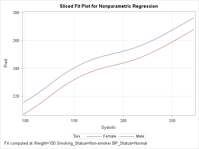
The nonparametric regression procedures in SAS (ADAPTIVEREG, GAMPL, LOESS, ...) do not support the STORE statement. Nevertheless, you can create a sliced fit plot using a traditional scoring technique: use the DATA step to create observations in the plane of the slice and score the model on those observations.
There are two ways to score regression models in SAS. The easiest way is to use PROC SCORE, the SCORE statement, or the CODE statement. The following DATA step creates the same "slice" through the space of explanatory variables as was created by using the EFFECTPLOT statement in the previous example. The SCORE statement in the ADAPTIVEREG procedure then fits the model and scores it on the slice. (Technical note: By default, PROC ADAPTIVEREG uses variable selection techniques. For easier comparison with the model from PROC GLM, I used the KEEP= option on the MODEL statement to force the procedure to keep all variables in the model.)
/* create the scoring observations that define the slice */ data Score; length Sex $6 Smoking_Status $17 BP_Status $7; /* same as for data */ Cholesterol = .; /* set response variable to missing */ Smoking_Status='Non-smoker'; /* set reference levels ("slices") */ BP_Status='Normal'; /* for class vars */ Weight=150; /* and continuous covariates */ do Sex = "Female", "Male"; /* primary class var */ do Systolic = 98 to 272 by 2; /* evenly spaced points for X variable */ output; end; end; run; proc adaptivereg data=Heart; class Sex Smoking_Status BP_Status; model Cholesterol = Sex Smoking_Status BP_Status Systolic Weight / nomiss /* for comparison with other models, FORCE all variables to be selected */ keep=(Sex Smoking_Status BP_Status Systolic Weight); score data=Score out=ScoreOut Pred; /* score the model on the slice */ run; proc sgplot data=ScoreOut; series x=Systolic y=Pred / group=Sex; /* create sliced fit plot */ xaxis grid; yaxis grid; run; |
The output, which is not shown, is very similar to the graph in the previous section.
Create a sliced fit plot manually by using the missing value trick
If your regression procedure does not support a SCORE statement, an alternative way to score a model is to use "the missing value trick," which requires appending the scoring data set to the end of the original data. I like to add an indicator variable to make it easier to know which observations are data and which are for scoring. The following statements concatenate the original data and the observations in the slice. It then calls the GAMPL procedure to fit a generalized additive model (GAM) by using penalized likelihood (PL) estimation.
/* missing value trick: append score data to original data */ data All; set Heart /* data to fit the model */ Score(in=s); /* grid of values on which to score model */ ScoreData=s; /* SCoreData=0 for orig data; =1 for scoring observations */ run; proc gampl data=All; class Sex Smoking_Status BP_Status; model Cholesterol = Param(Sex Smoking_Status BP_Status) Spline(Systolic Weight); output out=GamOut pred; id ScoreData Sex Systolic; /* include these vars in output data set */ run; proc sgplot data=GamOut(where=(ScoreData=1)); /* plot only the scoring obs */ series x=Systolic y=Pred / group=Sex; /* create sliced fit plot */ xaxis grid; yaxis grid; run; |
The GAMPL procedure does not automatically include all input variables in the output data set; the ID statement specifies the variables that you want to output. The OUTPUT statement produces predicted values for all observations in the ALL data set, but the call to PROC SGPLOT creates the sliced plot by using only the observations for which ScoreData = 1. The output shows the nonparametric regression model from PROC GAMPL.
You can also use the ALL data set to overlay the original data and the sliced fit plot. The details are left as an exercise for the reader.
Summary
The EFFECTPLOT statement provides an easy way to create a sliced fit plot. You can use the EFFECTPLOT statement directly in some regression procedures (such as LOGISTIC and GENMOD) or by using the STORE statement to save the model and PROC PLM to display the graph. For procedures that do not support the STORE statement, you can use the DATA step to create "the slice" (as a scoring data set) and use traditional scoring techniques to evaluate the model on the slice.

4 Comments
Hey Rick, these posts on visualization are great. I was wondering if you could do some posts on the logistic regression, particularly on calculating the standard errors of the marginal effects and average marginal effects.
Thanks for your kind words. You might want to read this Usage Note:
Marginal effect estimation for predictors in logistic and probit models.
If you specific questions, I recommend that you post some sample data and ask your question of the experts in the SAS Support Community.
Hey Rick,
I am sorry to bother you. I have two questions.
1. I used the SERIES statement to plot predicted values and explanatory variable, but the line was not so smooth. I wonder if I can use REG statement instead.
2. My model was included two random effects, but when I intended to use the last method to plot my graph, the predicted values could not be output. How can I deal with this issue?
Read this article about visualizing mixed models with random effects and if that doesn't answer your questions, post your code and sample data to the SAS Support Communities for Statistical Procedures.