Slice, slice, baby! You've got to slice, slice, baby!
When you fit a regression model that has multiple explanatory variables, it is a challenge to effectively visualize the predicted values. This article describes how to visualize the regression model by slicing the explanatory variables. In SAS, you can use the SLICEFIT option in the EFFECTPLOT statement visualize a slice of a regression surface.
Why the naive visualization fails
For a regression model that contains one explanatory variable and (optionally) one classification variable, it is easy to visualize the predicted values. Most statistical software packages make it easy to create a "fit plot." For example, the following call to PROC GLM in SAS fits a model to some patients in a heart study:
data Heart; /* create example data */ set sashelp.heart(obs=500); where cholesterol < 400; run; ods graphics / attrpriority=none /* groups determine symbols and line patterns */ imagemap tipmax=1500; /* enable tool tips */ /* easy to visualize predicted values for 1 continuous and 1 categorical explanatory variable */ proc glm data=Heart plots=meanplot; /* PLOTS= option supported in many procedures */ class Sex; model Cholesterol = Sex Systolic; quit; |

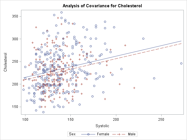
The graph shows the observed responses versus the continuous explanatory variable and overlays two curves: one for the predicted values when Sex='Male' and the other when Sex='Female'. Creating this graph is easy because the procedure does all the work.
What happens if you add additional explanatory variables into the model and try to create the same graph? For reasons that will soon be apparent, the procedure will not automatically create the graph when there are additional variables in the model. However, you can use the OUTPUT statement to write the predicted values to a SAS data set and use PROC SGPLOT to create the graph. You will need to sort by the variable that you are plotting on the X axis, as follows:
proc glm data=Heart; class Sex Smoking_status; model Cholesterol = Sex Smoking_Status /* two classification variables */ Systolic Weight; /* two continuous variables */ output out=GLMOut p=Pred; /* output data set contains predicted values */ quit; proc sort data=GLMOut; by Systolic Sex; run; /* sort by X variable for graphing */ title "Predicted Values"; proc sgplot data=GLMOut; styleattrs datalinepatterns=(solid solid); scatter x=Systolic y=Cholesterol / group=Sex transparency=0.75; series x=Systolic y=Pred / group=Sex tip=(Smoking_Status Weight); /* add tool tips */ yaxis min=180 max=300; /* zoom in on predicted values */ footnote J=L "Jagged Lines Because Covariates Have Multiple Values"; run; |

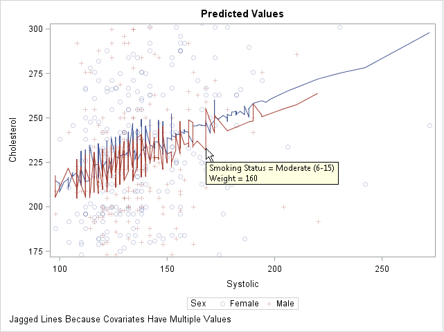
This graph looks strange. The regression model is linear, but a plot of the predicted values shows a jagged line for the predicted values. What is going on?
You can use the tool tips feature of the graph to understand why the curves are jagged. If you hover the cursor near a point on the jagged line, the values of the hidden explanatory variables (Weight and Smoking_Status) appear. The graph shows the tool tip at a point that corresponds to a male patient who weighs 160 pounds and who is a moderate smoker. By moving the cursor, you can discover that the previous point along the red line corresponds to a male patient who weighs 155 pounds and is a non-smoker. The subsequent point corresponds to a heavy smoker who weighs 151 pounds.
Because Weight and Smoking_Status were included in the model, the predicted values "jump" up or down as you move along the Systolic axis. Two observations that have similar Systolic values might have very different values for other (hidden) components. Geometrically, this graph displays the projection of the predicted values onto the two-dimensional (Systolic, Cholesterol) plane. To obtain a smooth curve, you must "slice" a response surface rather than project it.
Slice the response surfaces
The predicted values for this model form a set of 10 planes in the three-dimensional space (x, y, z) = (Systolic, Weight, Cholesterol). Each plane is the graph of predicted values for a combination of the 2 genders and 5 levels of smokers. There is one plane is for the ('Male', 'Non-smoker') patients, another for the ('Female', 'Light (1-5)') patients, and so on.
A "slice" through the response surfaces is accomplished by evaluating the model at a particular value of one of the continuous variables. This gives a two-dimensional plot that has 10 lines on it. Because 10 lines might overcrowd the display, it is common to pick a reference value for one of the classification variables and plot only the lines that are indexed by that value. For example, if you choose the reference value Smoking_Status = 'Non-smoker', the plot contains two lines that correspond to ('Male', 'Non-smoker') and ('Female', 'Non-smoker').
This might sound complicated, but SAS provides an easy implementation: the SLICEFIT option in the EFFECTPLOT statement, which is supported in several regression procedures, enables you to specify how you want to slice the surfaces and which combinations of levels you want to display.
By default, the EFFECTPLOT SLICEFIT statement creates a "sliced fit plot" that graphs the response variable versus the first continuous variable and shows the predicted values for each level of the first class variable. "First" is determined by the order in which the variables are listed on the MODEL statement. Other continuous variables are sliced (evaluated) at their mean value; other classification variables are evaluated at their last level.
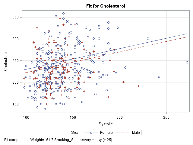
PROC GLM does not support the EFFECTPLOT statement, but PROC GENMOD does. The following call to PROC GENMOD fits the same model and creates a "sliced fit plot" of the predicted values. The sliced fit plot will show the response variable (Cholesterol) versus the first continuous variable (Systolic) overlaid with predictions for males and females. The value of the Weight variable is set to 151.7, which is the mean value of the sample. The value of the Smoking_Status variable is set to 'Very Heavy (> 25)', which is the last level in alphanumeric order.
title; footnote; ods graphics / attrpriority=none imagemap=off; proc genmod data=Heart; class Sex Smoking_status; model Cholesterol = Sex Smoking_Status /* classification variables */ Systolic Weight; /* continuous variables */ /* Plot response vs first cont var for each level of first class var */ /* Set other cont vars to MEAN; set other class vars to last level */ effectplot slicefit / obs; /* add scatter plot of observations */ run; |

The sliced fit plot shows smooth (not jagged) lines because the model is evaluated at constant values of the hidden variables. The values (Weight, Smoking_Status) = (151.7, 'Very Heavy (> 25)') are held constant while the model is evaluated over the range of the Systolic and Sex variables.
Other ways to slice the response surfaces
The SLICEFIT option in the EFFECTPLOT statement supports many suboptions that enable you to control the way that the model is sliced:
- You can plot any two variables, one continuous and one categorical. Use the X= option to specify the continuous variable and the SLICEBY= option to specify the categorical variable.
- You can specify the statistics that are used to slice the continuous covariates. By default the covariates are sliced at their mean values. You can use the AT option to specify the following keywords: MEAN (the default), MIN, MAX, MEDIAN, or MIDRANGE. (Recall that the midrange is the value (min+max)/2.) For class variables, the REF option specifies that the last level be used.
- You can use the AT option to specify particular values for slicing the continuous covariates and class variables.
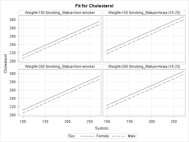
- You can specify multiple values for the AT option. The EFFECTPLOT statement will create a panel of sliced fit plots, one for each joint combination of specified values.
The following four EFFECTPLOT statements correspond to the four items in the previous list:
proc genmod data=Heart; class Sex Smoking_status; model Cholesterol = Sex Smoking_Status /* classification variables */ Systolic Weight; /* continuous variables */ /* specify the X and categorical variables */ effectplot slicefit(X=weight sliceby=Smoking_status) / obs; /* specify statistics used to slice the covariates */ effectplot slicefit / at MIDRANGE /* new default for continuous vars */ REF; /* default for classification vars */ /* specify explicit values of the covariates */ effectplot slicefit / at(Weight=150 Smoking_Status='Non-smoker'); /* specify multiple values of the covariates to get a panel */ effectplot slicefit / at(Weight=150 200 Smoking_Status='Non-smoker' 'Heavy (16-25)'); quit; |
To save space, only the last sliced fit plot (the panel) is shown below. I have linked to the other three plots: the plot of Weight and Smoking_Status, the plot at midrange, and the plot at specified values.

In summary, you can use the SLICEFIT option in the EFFECTPLOT statement in SAS to visualize regression models that contain many explanatory variables. The AT option enables you to specify values for the covariates. The resulting graph displays a slice through the response surface.
The EFFECTPLOT statement is also available in PROC PLM. PROC PLM enables you to visualize a model that has been saved to an item store. The OBS option (which overlays the predicted values and a scatter plot) is not available in PROC PLM because the item store does not include the observations.

6 Comments
Another way to do an EFFECTPLOT from PROC GLM is to use the STORE statement and then to open the item store with PROC PLM, which does have the EFFECTPLOT statement. Other procedures, including PROC GENMOD, can also create an item store for PROC PLM.
Exactly right. You've given the first example of my next article, which describes how to create this kind of plot when you are using a regression procedure that does not support the EFFECTPLOT statement.
Pingback: Sliced survival graphs in SAS - The DO Loop
It would be nice to be able to fix the initial problem within SGPLOT so that the many features of SGPLOT would be available for customizing the plot. Plots made with the EFFECTPLOT statement (for example, within PLM) cannot be customized (or can they, maybe by altering templates?).
There is not a problem to be fixed. PROC SGPLOT plots the data that you give it. The issue is that in this case you are looking for a slice through the regression function rather than a projection onto a coordinate subplane. You can use the EFFECTPLOT statement, or you can use the DATA step and the SCORE statement to create the slice yourself. As to customizing the output of the EFFECTPLOT statement, yes, you can do it. My favorite way is to use the ODS OUTPUT statement get the data that underlies the effect plot, then recreate the plot by using PROC SGPLOT.
Pingback: Visualize an ordinal response regression model - The DO Loop