This article shows how to create a "sliced survival plot" for proportional-hazards models that are created by using PROC PHREG in SAS. Graphing the result of a statistical regression model is a valuable way to communicate the predictions of the model. Many SAS procedures use ODS graphics to produce graphs automatically or upon request. The default graphics from SAS procedures are sufficient for most tasks. However, occasionally I customize or modify the graphs that are produced by SAS procedures.
The graph to the right is an example of how to create a customized sliced fit plot from PROC PHREG. This article shows how to create the plot and others like it.
It is worth mentioning that SAS supports multiple procedures for analyzing survival data. Of these, PROC LIFETEST has the most extensive methods for customizing graphics. An entire chapter of the SAS/STAT Users Guide is devoted to customizing the Kaplan-Meier plot, which is a popular graph in the life sciences.
Sliced fit plots in SAS regression procedures
Before discussing PROC PHREG, let's review the concepts for a sliced fit plot for a regression model. In a "sliced fit plot," you display the predicted values for the model (typically versus a continuous covariate) for a specific value of the other continuous covariates. Often the mean value is used for slicing, but other popular choices include the quartiles: the 25th percentile, the median, and the 75th percentile.
My favorite way to create fit plots is to use the EFFECTPLOT SLICEFIT statement in PROC PLM. By default, the EFFECTPLOT statement evaluates the continuous covariates at their mean values, but you can use the SLICEBY= option or the AT= option to specify other values.
PROC PLM and the EFFECTPLOT statement were designed primarily for generalized linear models. If you try to use the EFFECTPLOT statement for other kinds of regression models (or nonparametric regressions), you might get a warning: WARNING: The EFFECTPLOT statement cannot be used for the specified model. In that case, you can manually create a sliced fit plot by scoring the model on a carefully prepared data set.
Example data and the default behavior of PROC PHREG
PROC PHREG can create graphs automatically, so let's start by looking at the default survival plot. The following data is from an example in the PROC PHREG documentation. The goal is to predict the survival time (TIME and VSTATUS) of patients with multiple myeloma based on the measured values (log-transformed) of blood urea nitrogen (BUN). The example in the documentation analyzes nine variables, but for clarity, I only include two explanatory variables in the following data and examples:
data Myeloma; input Time VStatus LogBUN Frac @@; label Time='Survival Time' VStatus='0=Alive 1=Dead'; datalines; 1.25 1 2.2175 1 1.25 1 1.9395 1 2.00 1 1.5185 1 2.00 1 1.7482 1 2.00 1 1.3010 1 3.00 1 1.5441 0 5.00 1 2.2355 1 5.00 1 1.6812 0 6.00 1 1.3617 0 6.00 1 2.1139 1 6.00 1 1.1139 1 6.00 1 1.4150 1 7.00 1 1.9777 1 7.00 1 1.0414 1 7.00 1 1.1761 1 9.00 1 1.7243 1 11.00 1 1.1139 1 11.00 1 1.2304 1 11.00 1 1.3010 1 11.00 1 1.5682 0 11.00 1 1.0792 1 13.00 1 0.7782 1 14.00 1 1.3979 1 15.00 1 1.6021 1 16.00 1 1.3424 1 16.00 1 1.3222 1 17.00 1 1.2304 1 17.00 1 1.5911 0 18.00 1 1.4472 0 19.00 1 1.0792 1 19.00 1 1.2553 1 24.00 1 1.3010 1 25.00 1 1.0000 1 26.00 1 1.2304 1 32.00 1 1.3222 1 35.00 1 1.1139 1 37.00 1 1.6021 0 41.00 1 1.0000 1 41.00 1 1.1461 1 51.00 1 1.5682 1 52.00 1 1.0000 1 54.00 1 1.2553 1 58.00 1 1.2041 1 66.00 1 1.4472 1 67.00 1 1.3222 1 88.00 1 1.1761 0 89.00 1 1.3222 1 92.00 1 1.4314 1 4.00 0 1.9542 0 4.00 0 1.9243 0 7.00 0 1.1139 1 7.00 0 1.5315 0 8.00 0 1.0792 1 12.00 0 1.1461 0 11.00 0 1.6128 1 12.00 0 1.3979 1 13.00 0 1.6628 0 16.00 0 1.1461 0 19.00 0 1.3222 1 19.00 0 1.3222 1 28.00 0 1.2304 1 41.00 0 1.7559 1 53.00 0 1.1139 1 57.00 0 1.2553 0 77.00 0 1.0792 0 ; |
Suppose you want to predict survival time by using LogBUN as the only explanatory variable. The following call to PROC PHREG builds the model and creates a survival plot:
/* A COVARIATES= data set is not specified, so the average value for LogBUN is used in the survival plot */ proc phreg data=Myeloma plots(overlay)=survival; /* use plots(overlay CL) to get confidence limits */ model Time*VStatus(0)=LogBUN; run; |
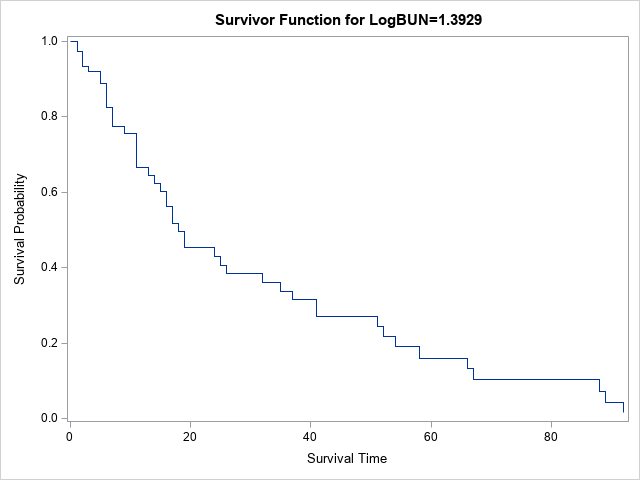
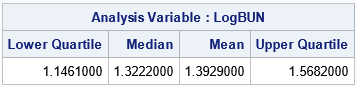
Notice the title of the plot specifies that the survivor function is evaluated for LogBUN=1.3929. Why this strange value? Because this program did not use the BASELINE statement to specify a COVARIATES= data set. Consequently, the average value for LogBUN is used in the survival plot. You can use PROC MEANS to confirm the mean value of the LogBUN variable and to output other statistics such as the sample quartiles:
proc means data=Myeloma Q1 Median Mean Q3; var LogBUN; run; |
The next section shows how to specify the quartiles as slicing values for LogBUN when you create a survival plot.
Specify slicing values for a survival plot
PROC PHREG has a special syntax for producing a sliced fit plot. On the BASELINE statement, use the COVARIATES= option to name a SAS data set in which you have specified values at which to slice the covariates. If you do not specify a data set, or if your data set does not list some of the variables in the model, then the model is evaluated at the mean values for the continuous variables and at the reference levels for the CLASS variables.
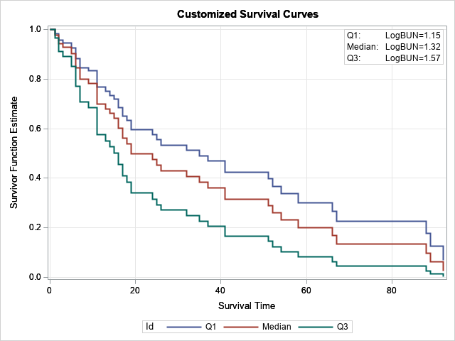
Suppose you want to use the PHREG model to compare the probability of survival for three hypothetical patients whose LogBUN values are 1.15, 1.32, and 1.57, respectively. These LogBUN values for these patients are the sample quartiles for the distribution of patients in the study. The following DATA step creates a SAS data set that contains the quartile values. If you add the BASELINE statement and the COVARIATES= option, then PROC PHREG automatically incorporates those values into the survival graph that it creates:
data InRisks; length Id $9; input Id LogBUN; datalines; Q1 1.15 Median 1.32 Q3 1.57 ; proc phreg data=Myeloma plots(overlay)=survival; /* use plots(overlay CL) to get confidence limits */ model Time*VStatus(0)=LogBUN; baseline covariates=Inrisks / rowid=Id; run; |
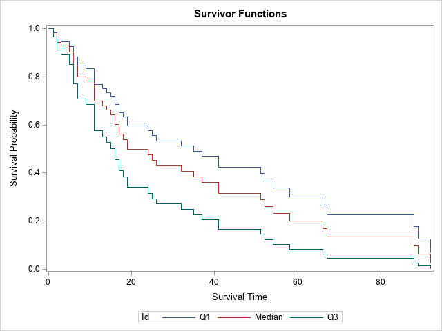
The survival graph now displays three curves, one for each specified value of the LogBUN variable. The curves are labeled by using the ROWID= option on the BASELINE statement. If you omit the option, the values of the LogBUN variable are displayed.
Create your own custom survival plot
This article was motivated by a SAS programmer who wanted to customize the survival plot. For simplicity, let's suppose that you want to modify the title, add a grid, increase the width of the lines, and add an inset. In that case, you can use the OUT= option to write the relevant predicted values to a SAS data set. The SURVIVAL= option specifies the name for the variable that contains the survival probabilities. However, if you use the keyword _ALL_, then the procedure outputs estimates, standard errors, and confidence limits, and provides default names. For the _ALL_ keyword, "Survival" is used for the name of the variable that contains the probability estimates. You can then use PROC SGPLOT to create a custom survival plot, as follows:
/* write output to a SAS data set */ proc phreg data=Myeloma noprint; model Time*VStatus(0)=LogBUN; baseline covariates=Inrisks out=PHOut survival=_all_ / rowid=Id; run; title "Customized Survival Curves"; proc sgplot data=PHOut; *band x=Time lower=LowerSurvival upper=UpperSurvival / group=Id transparency=0.75; step x=Time y=Survival / group=Id lineattrs=(thickness=2); inset ("Q1:"="LogBUN=1.15" "Median:"="LogBUN=1.32" "Q3:"="LogBUN=1.57") / border opaque; xaxis grid; yaxis grid; run; |
The graph is shown at the top of this article.
Including a classification variable
The Myeloma data contains a categorical variable (Frac) that indicates whether the patient had bone fractures at the time of diagnosis. If you want to include that variable in the analysis, you can do so. You can add that variable to the COVARIATES= data set to control which values are overlaid on the survival plot, as follows:
data InRisks2; length Id $9; input Id LogBUN Frac; datalines; Q1:0 1.15 0 Q1:1 1.15 1 Q3:0 1.57 0 Q3:1 1.57 1 ; proc phreg data=Myeloma plots(overlay)=survival; class Frac(ref='0'); model Time*VStatus(0)=LogBUN Frac; baseline covariates=Inrisks2 out=PHOut2 survival=_all_/rowid=Id; run; |
This process can be extended for other covariates in the model. When you add new variables to the model, you can also add them to the COVARIATES= data set, if you want.
Summary
PROC PHREG supports a convenient way to create a sliced survival plot. You can create a SAS data set that contains the names and values of covariates in the model. Variables that are not in the data set are assigned their mean values (if continuous) or their reference values (if categorical). The procedure evaluates the model at those values to create a survival plot for each hypothetical (or real!) patient who has those characteristics.
If you use the PLOTS= option on the PROC PHREG statement, the procedure will create graphs for you. Otherwise, you can use the OUT= option on the BASELINE statement to write the relevant variables to a SAS data set so that you can create your own graphs.

1 Comment
SAS user Jeff Meyers has published several papers and a popular SAS macro for Kaplan-Meier survival plots. Readers can find the description and source code for the macro on the SAS community site.