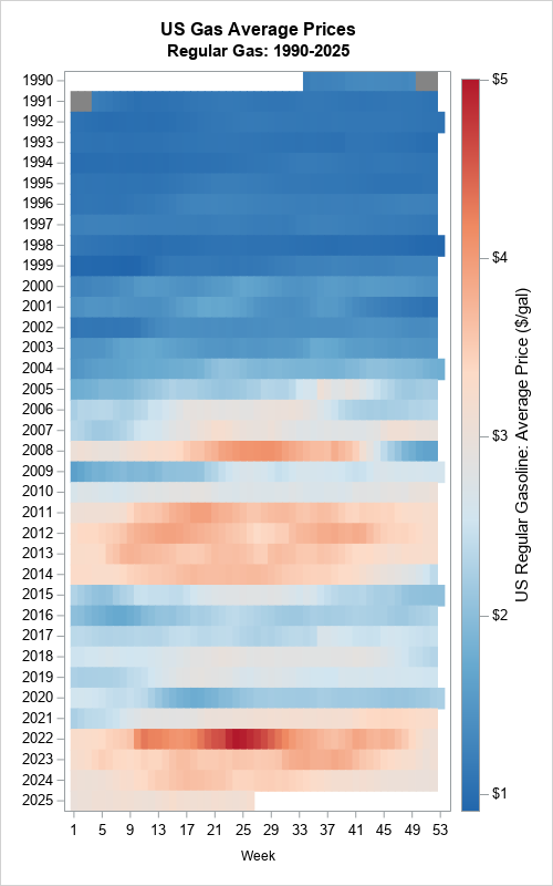
Tag: Statistical Graphics

Data Visualization | Learn SAS
Rick Wicklin 0
The path of zip codes

Toe bone connected to the foot bone, Foot bone connected to the leg bone, Leg bone connected to the knee bone,...              — American Spiritual, "Dem Bones" Last week I read an interesting article on Robert Kosara's data visualization blog. Kosara connected the geographic centers of the US zip codes in

Data Visualization
Rick Wicklin 0
Perceptions of probability

If a financial analyst says it is "likely" that a company will be profitable next year, what probability would you ascribe to that statement? If an intelligence report claims that there is "little chance" of a terrorist attack against an embassy, should the ambassador interpret this as a one-in-a-hundred chance,

Rick Wicklin 0
Append data to add markers to SAS graphs

Do you want to create customized SAS graphs by using PROC SGPLOT and the other ODS graphics procedures? An essential skill that you need to learn is how to merge, join, append, and concatenate SAS data sets that come from different sources. The SAS statistical graphics procedures (SG procedures) enable

Rick Wicklin 0
Highlight forecast regions in graphs

A SAS customer asked how to use background colors and a dashed line to emphasize the forecast region for a graph that shows a time series model. The task requires the following steps: Use the ATTRPRIORITY=NONE option on the ODS GRAPHICS statement to make sure that the current ODS style

Rick Wicklin 0
Visualize the ages of US presidents

Who was the oldest person elected president of the United States? How about the youngest? Who was the oldest when he left office? Let's look at some data. Wikipedia has a page that presents a table of the presidents of the US by age. It lists the dates for which

Rick Wicklin 0
Visualize a torus in SAS

This article uses graphical techniques to visualize one of my favorite geometric objects: the surface of a three-dimensional torus. Along the way, this article demonstrates techniques that are useful for visualizing more mundane 3-D point clouds that arise in statistical data analysis. Define points on a torus A torus is

Rick Wicklin 0
Rotation matrices and 3-D data

Rotation matrices are used in computer graphics and in statistical analyses. A rotation matrix is especially easy to implement in a matrix language such as the SAS Interactive Matrix Language (SAS/IML). This article shows how to implement three-dimensional rotation matrices and use them to rotate a 3-D point cloud. Define

Rick Wicklin 0
Let PROC FREQ create graphs of your two-way tables

The recent releases of SAS 9.4 have featured major enhancements to the ODS statistical graphics procedures such as PROC SGPLOT. In fact, PROC SGPLOT (and the underlying Graph Template Language (GTL)) are so versatile and powerful that you might forget to consider whether you can create a graph automatically by

Rick Wicklin 0
Overlay a curve on a bar chart in SAS

One of the strengths of the SGPLOT procedure in SAS is the ease with which you can overlay multiple plots on the same graph. For example, you can easily combine the SCATTER and SERIES statements to add a curve to a scatter plot. However, if you try to overlay incompatible

Rick Wicklin 0
Graph a step function in SAS

Last week I wrote about how to compute sample quantiles and weighted quantiles in SAS. As part of that article, I needed to draw some step functions. Recall that a step function is a piecewise constant function that jumps by a certain amount at a finite number of points. Graph

Rick Wicklin 0
Weighted percentiles

Many univariate descriptive statistics are intuitive. However, weighted statistic are less intuitive. A weight variable changes the computation of a statistic by giving more weight to some observations than to others. This article shows how to compute and visualize weighted percentiles, also known as a weighted quantiles, as computed by

Rick Wicklin 0
Female world leaders by year of election

This week Hillary Clinton became the first woman to be nominated for president of the US by a major political party. Although this is a first for the US, many other countries have already passed this milestone. In fact, 60 countries have already elected women as presidents and prime ministers.

Rick Wicklin 0
In praise of simple graphics

'Tis a gift to be simple. -- Shaker hymn In June 2015 I published a short article for Significance, a magazine that features statistical and data-related articles that are of general interest to a wide a range of scientists. The title of my article is "In Praise of Simple Graphics."

Rick Wicklin 0
Overlay plots on a box plot in SAS: Discrete X axis

Box plots summarize the distribution of a continuous variable. You can display multiple box plots in a single graph by specifying a categorical variable. The resulting graph shows the distribution of subpopulations, such as different experimental groups. In the SGPLOT procedure, you can use the CATEGORY= option on the VBOX

1 4 5 6 7 8 10