Do you want to create customized SAS graphs by using PROC SGPLOT and the other ODS graphics procedures? An essential skill that you need to learn is how to merge, join, append, and concatenate SAS data sets that come from different sources. The SAS statistical graphics procedures (SG procedures) enable you to overlay all kinds of customized curves, markers, and bars. However, the SG procedures expect all the data for a graph to be in a single SAS data set. Therefore it is often necessary to append two or more data sets before you can create a complex graph.
This article discusses two ways to combine data sets in order to create ODS graphics. An alternative is to use the SG annotation facility to add extra curves or markers to the graph. Personally, I prefer to use the techniques in this article for simple features, and reserve annotation for adding highly complex and non-standard features.
Overlay curves
In a previous article, I discussed how to structure a SAS data set so that you can overlay curves on a scatter plot.
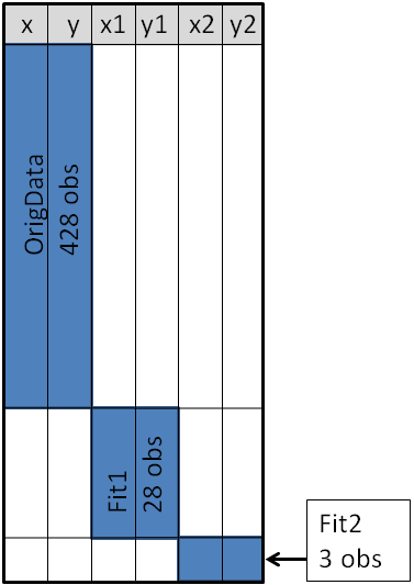
The diagram at the right shows the main idea of that article. The X and Y variables contain the original data, which are the coordinates for a scatter plot. Secondary information was appended to the end of the data. The X1 and Y1 variables contain the coordinates of a custom scatter plot smoother. The X2 and Y2 variables contain the coordinates of a different scatter plot smoother.This structure enables you to use the SGPLOT procedure to overlay two curves on the scatter plot. You use a SCATTER statement and two SERIES statements to create the graph. See the previous article for details.
Overlay markers: Wide form
In addition to overlaying curves, I sometimes want to add special markers to the scatter plot. In this article I will show how to add a marker that shows the location of the sample mean. This article shows how to use PROC MEANS to create an output data set that contains the coordinates of the sample mean, then append that data set to the original data.
Add special markers to a graph using PROC SGPLOT #SASTip Share on XThe following statements use PROC MEANS to compute the sample mean for four variables in the SasHelp.Iris data set, which contains the measurements for 150 iris flowers. To emphasize the general syntax of this computation, I use macro variables, but that is not necessary:
%let DSName = Sashelp.Iris; %let VarNames = PetalLength PetalWidth SepalLength SepalWidth; proc means data=&DSName noprint; var &VarNames; output out=Means(drop=_TYPE_ _FREQ_) mean= / autoname; run; |
The AUTONAME option on the OUTPUT statement tells PROC MEANS to append the name of the statistic to the variable names. Thus the output data set contains variables with names like PetalLength_Mean and SepalWidth_Mean. As shown in the diagram in the previous section, this enables you to append the new data to the end of the old data in "wide form" as follows:
data Wide; set &DSName Means; /* add four new variables; pad with missing values */ run; ods graphics / attrpriority=color subpixel; proc sgplot data=Wide; scatter x=SepalWidth y=PetalLength / legendlabel="Data"; ellipse x=SepalWidth y=PetalLength / type=mean; scatter x=SepalWidth_Mean y=PetalLength_Mean / legendlabel="Sample Mean" markerattrs=(symbol=X color=firebrick); run; |
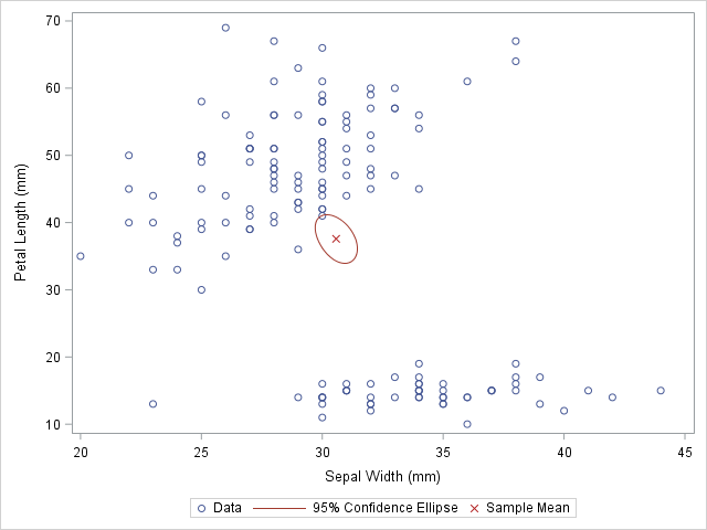
The first SCATTER statement and the ELLIPSE statement use the original data. Recall that the ELLIPSE statement draws an approximate confidence ellipse for the mean of the population. The second SCATTER statement uses the sample means, which are appended to the end of the original data. The second SCATTER statement draws a red marker at the location of the sample mean.
You can use this same method to plot other sample statistics (such as the median) or to highlight special values such as the origin of a coordinate system.
Overlay markers: Long form
In some situations it is more convenient to append the secondary data in "long form." In the long form, the secondary data set contains the same variable names as in the original data. You can use the SAS data step to create a variable that identifies the original and supplementary observations. This technique can be useful when you want to show multiple markers (sample mean, median, mode, ...) by using the GROUP= option on one SCATTER statement.
The following call to PROC MEANS does not use the AUTONAME option. Therefore the output data set contains variables that have the same name as the input data. You can use the IN= data set option to create an ID variable that identifies the data from the computed statistics:
/* Long form. New data has same name but different group ID */ proc means data=&DSName noprint; var &VarNames; output out=Means(drop=_TYPE_ _FREQ_) mean=; run; data Long; set &DSName Means(in=newdata); if newdata then GroupID = "Mean"; else GroupID = "Data"; run; |
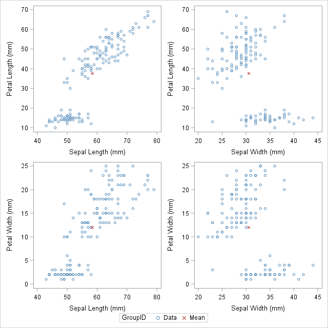
The DATA step created the GroupID variable, which has the values "Data" for the original observations and the value "Mean" for the appended observations. This data structure is useful for calling PROC SGSCATTER, which supports the GROUP= option, but does not support multiple PLOT statements, as follows:
ods graphics / attrpriority=none; proc sgscatter data=Long datacontrastcolors=(steelblue firebrick) datasymbols=(Circle X); plot (PetalLength PetalWidth)*(SepalLength SepalWidth) / group=groupID; run; |
In conclusion, this article demonstrates a useful technique for adding markers to a graph. The technique requires that you concatenate the original data with supplementary data. Appending and merging data is a technique that is used often when creating ODS statistical graphics in SAS. It is a great technique to add to your programming toolbox.
