I recently showed someone a trick to create a graph, and he was extremely pleased to learn it. The trick is well known to many SAS users, but I hope that this article will introduce it to even more SAS users.
At issue is how to use the SGPLOT procedure to overlay precomputed curves on a graph of the data. For example, how can you display a curve on a scatter plot when the curve is computed by a SAS/STAT procedure or is given by a formula? (Of course, the SGPLOT procedure supports the REG statement, the LOESS statement, and the PBSPLINE statement, which compute and overlay regression curves, but I am talking about curves that are computed outside of PROC SGPLOT.)
The trick is to create a SAS data set that contains all of the variables that need to be plotted, and that has a special structure. For example, suppose you have observations in a data set called OrigData. Suppose further that there are two other data sets, Fit1 and Fit2, that contain a series of (x,y) points on the curves that you want to overlay. In the following example, Fit1 contains points evaluated along on an exponential curve, whereas Fit2 contains points that define a piecewise linear curve:
data OrigData(keep=x y); /* the original data */ set Sashelp.Cars; rename weight=x mpg_city=y; /* scatter plot variables are X and Y */ run; data Fit1; /* exponential curve to overlay */ do x1 = 1800 to 7200 by 200; /* the variables for curve 1 are X1 and Y1 */ y1 = exp( -0.25*x1/1000 + 3.86 ); output; end; run; data Fit2; /* piecewise linear curve to overlay */ input x2 y2 @@; /* the variables for curve 2 are X2 and Y2 */ datalines; 1800 50 3700 18 7000 12 ; |
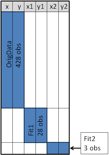
Notice that the data sets are different sizes: The original data set has 428 observations, the exponential curve is evaluated at 28 points, and the piecewise-linear curve contains only three points. Nevertheless, you can concatenate these data sets into a single SAS data set, as follow.
data PlotData; /* concatenate data */ set OrigData Fit1 Fit2; run; |
For this trick to work, it is important that the variable names for the precomputed curves be unique. In particular, the variable names must be different from any variable name in the original data set. If necessary, use the RENAME= option to make sure that there is no conflict between variable names. The unique names ensure that the PlotData data set has a block structure, as shown in the following figure. The blue block in the upper-left corner represents the original data. Variables that are not in the original data are assigned missing values, which are colored white in the figure. Similarly, the blue "middle block" represents (x,y) coordinates for the first curve, and the blue lower-right block represents (x,y) coordinates for the second curve.
When a data set has this block structure, you can plot the original data and overlay the precomputed curves with a single call to PROC SGPLOT. You use the SERIES statement to overlay the precomputed curves. You can even use the REG, LOESS, or PBSPLINE statements to compute additional smoothers, as follows:
proc sgplot data=PlotData noautolegend cycleattrs; scatter x=x y=y / markerattrs=(color=black) transparency=0.75; /* orig data */ reg x=x y=y / nomarkers CurveLabel="Linear"; /* compute curve */ series x=x1 y=y1 / CurveLabel="Exponential"; /* curve 1 */ series x=x2 y=y2 / CurveLabel="Piecewise"; /* curve 2 */ run; |
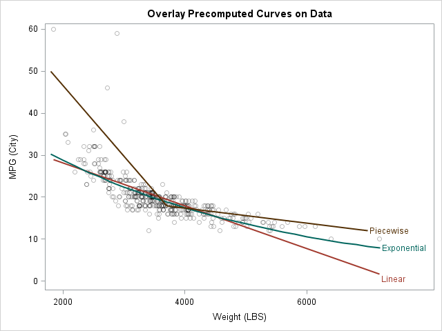
This example shows how to overlay precomputed curves on a scatter plot, but I have also used this technique to overlay a theoretical statistical distribution on a bar chart or on a histogram.
So there you have it. Remember this trick when you use a SAS procedure to compute a curve and you want to use PROC SGPLOT or PROC SGRENDER to overlay the curve on the data.
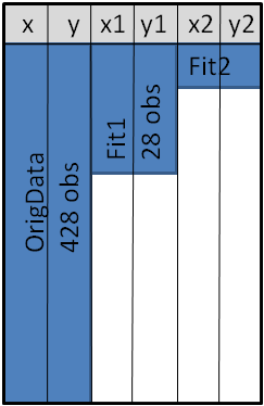
Note: A variation on this technique uses the MERGE statement, rather than the SET statement, to combine the curves and the data. The variation creates a data set (shown schematically below) that does not have a block structure, and therefore has fewer observations than for the concatenated data. However, some people object that the MERGE statement without a BY statement is confusing, and that a row in the merged data set is no longer a valid observation because a row of the X1, X2, Y1, and Y2 variables is unrelated to an observation in the original data. If you are bothered by such things, use the SET statement.

8 Comments
Pingback: How to overlay a custom density curve on a histogram in SAS - The DO Loop
Pingback: Overlay a curve on a bar chart in SAS - The DO Loop
Pingback: Append data to add markers to SAS graphs - The DO Loop
How do you kernel, exponential and normal in one histogram grap? Seems your proc sgplot only allows for 'normal' & 'kernel' densities as args, anyway around this??*
This article is about custom curves. You can fit about 20 different common parametric models by using PROC UNIVARIATE:
This is wonderful! I knew there had to be some kind of trick. I was having what seemed like unnecessary trouble. As always, Thanks, Rick!
Wow! This is fantastic.
THIS IS GOLD if you're GRAPHING in SGPLOT.
Side note: I've found that there are sometimes problems if you use MERGE instead of SET.
I use "SET".
I don't like problems.