The recent releases of SAS 9.4 have featured major enhancements to the ODS statistical graphics procedures such as PROC SGPLOT. In fact, PROC SGPLOT (and the underlying Graph Template Language (GTL)) are so versatile and powerful that you might forget to consider whether you can create a graph automatically by using a SAS statistical procedure. For example, when you turn on ODS graphics (ODS GRAPHICS ON), SAS procedures create the following graphs automatically:
- Many SAS regression procedures (and PROC PLM) create effect plots.
- PROC SURVEYREG creates a hexagonal bin plot.
- PROC REG creates heat maps when a scatter plot would suffer from overplotting.
- PROC LOGISTIC creates odds-ratio plots.
Let PROC FREQ visualize your two-way tables
Recently a SAS customer asked how to use PROC SGPLOT to produce a stacked bar chart. I showed him how to do it, but I also mentioned that the same graph could be produced with less effort by using PROC FREQ.
PROC FREQ is a workhorse procedure that can create dozens of graphs. For example, PROC FREQ can create a mosaic plot and a clustered bar chart to visualize frequencies and relative frequencies in a two-way table. Next time you use PROC FREQ, add the PLOTS=ALL option to the TABLES statement and see what you get!
One of my favorite plots for two-way categorical data is the stacked bar chart. As I told the SAS customer, it is simple to create a stacked bar chart in PROC FREQ. For example, the following statements create a horizontal bar chart that orders the categories by frequency:
proc freq data=sashelp.Heart order=freq; tables weight_status*smoking_status / plots=freqplot(twoway=stacked orient=horizontal); run; |
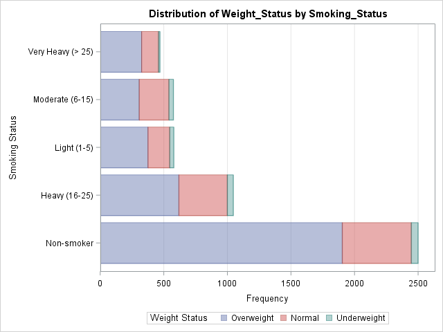
See the documentation for the PLOTS= option in the TABLES statement for a description of all the plots that PROC FREQ can create. PROC FREQ creates many plots that are associated with a particular analysis, such as the "deviation plot," which shows the relative deviations between the observed and expected counts when you request a chi-square analysis of a one-way table.
Do you need a highly customized graph?
The ODS graphics in SAS are designed to create many—but not all—of the visualizations that are relevant to an analysis. Some attributes of a graph (for example, the title and the legend placement) are determined by a stored template and can't be modified by using the procedure syntax. Advanced GTL gurus might want to learn how to edit the ODS templates. Less ambitious users might choose to use a statistical procedure to automatically create graphs during data exploration and modeling, but then use PROC SGPLOT to create the final graph for a report.
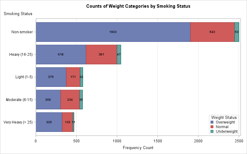
For example, the following call to PROC FREQ writes the two-way frequency counts to a SAS data set. From the data you can create graphs that are similar to the one that PROC FREQ creates, but you can change the order and colors of the bars, alter the placement of the legend, add text, and more. The following call to PROC SGPLOT shows one possibility. Click on the graph to see the full-size version.
proc freq data=sashelp.heart order=freq noprint; tables smoking_status*weight_status / out=FreqOut(where=(percent^=.)); run; ods graphics /height=500px width=800px; title "Counts of Weight Categories by Smoking Status"; proc sgplot data=FreqOut; hbarparm category=smoking_status response=count / group=weight_status seglabel seglabelfitpolicy=none seglabelattrs=(weight=bold); keylegend / opaque across=1 position=bottomright location=inside; xaxis grid; yaxis labelpos=top; run; |
Conclusions
If you want to create a stacked bar chart or some other visualization of a two-way table, you might be tempted to immediately start using PROC SGPLOT. The purpose of this article is to remind you that SAS statistical procedures, including PROC FREQ, often create graphs as part of their output. Even if a statistical procedure cannot provide all the bells and whistles of PROC SGPLOT, it often is a convenient way to visualize your data during the preliminary stages of an analysis. If you need a highly customized graph for a final report, the SAS procedure can output the data for the graph. You can then use PROC SGPLOT or the GTL to create a customized graph.

13 Comments
PROC FREQ has been a favorite of mine for a long time, though I've never used the PLOTS= option. Thanks for bringing that to our attention.
Great content Rick!
Nice presentation. I want to know if it is possible to change the orientation to vertical. I mean is it possible to include an 'orient=' option in the sgplot approach?
Sure. Use the VBARPARM statement:
hi Rick, my table is following: soil types are serpentine and not serpentine, leaves in these soils are pubescent and smooth. So, it's two variables with two categories each.
Soil Pubescent Smooth
Serpentine 12 22
Not Serpentine 16 50
I want to do it using input and proc sgplot so that I can get relative frequency of the leaves types in the two soils.
I am using the following code:
data ecology;
input soil $ leaf $ count; datalines;
serpentine pubescent 12
serpentine smooth 22
notserpentine pubescent 16
notserpentine smooth 50
; run;
proc sgplot data=ecology;
vbar soil / group=leaf stat=percent groupdisplay=cluster;
run;
But the bar graph is showing all the percentage same(24%). Can you please tell me what is the mistake I am doing? Thanks.
When you have questions about SAS programming, please post to one of the SAS Support Communities. You can post this question to the Graphics Community. Someone will very quickly answer your questions and tell you that you need to add FREQ=count to the VBAR statement.
Quick question, how were you able to not plot the "total" column of the Freq table?
Id assume your table is each weight status as a separate column followed by a last and total column
I used a WHERE clause to omit the observations that are associated with cumulative counts:
out=FreqOut(WHERE=(percent^=.));
ohh, that makes so much sense! I didn't know what the WHERE did. Thanks :) And thanks so much for the quick response
great blog thank you
I would like the bars to be ordered in descending order, highest frequency on top followed by lower frequencies. What option can be added to accomplish this in hbarparm statement?
The last example shows an answer to your question:
Pingback: Dice and the correctness of a simulation - The DO Loop