Has anyone noticed that the REG procedure in SAS/STAT 12.1 produces heat maps instead of scatter plots for fit plots and residual plots when the regression involves more than 5,000 observations? I wasn't aware of the change until a colleague informed me, although the change is discussed in the "Details" section of the PROC REG documentation for SAS/STAT 12.1.
Here is how the fit plot looks for fewer than 5,000 observations:
/* simulate data from a linear regression model */ data RegData; call streaminit(1); do i = 1 to 6000; x = rand("Uniform"); y = 1 + 2*x + 3*rand("Normal"); if i < 20 then y = y + 8*rand("Normal"); /* add a few outliers */ output; end; ods select FitPlot(persist); proc reg data=RegData(obs=4000) plots(only)=FitPlot; model y = x; quit; |
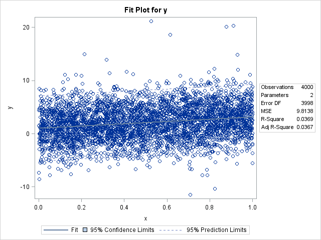
With fewer than 5,000 observations, I get the usual fit plot that consists of a scatter plot overlaid with a curve of predicted value, a band for the confidence interval for the mean, and dashed lines that indicate the confidence intervals for individual predictions. (The confidence limits are barely visible. Click the graph to enlarge it.) However, watch what happens when I use more than 5,000 observations:
proc reg data=RegData plots(only)=FitPlot; model y = x; quit; ods select all; |
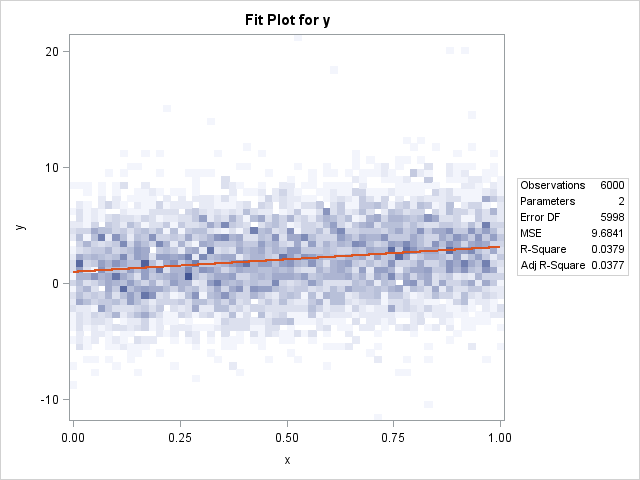
The scatter plot is gone, replaced by a heat map that shows the density of the data. The predicted values are still present, although the graphical style used to draw it is different, which results in a red line. The confidence intervals are gone.
Overall, this is a nice feature and I think that the change is a good idea. The reason for the change is easy to understand: scatter plots suffer from overplotting when there are many points, so it is more useful to visualize the density of the observations than the individual observations. Furthermore, although scatter plots are very fast to construct, when there are many points a heat map (which bins observations) is faster to compute and render than a scatter plot.
The plot does not currently include confidence intervals, but there is no reason why these can't be added in a future release. However, the confidence interval for the mean predictions will usually be tiny for large data sets—already it is barely visible in the plot of 4,000 points.
Controlling the appearance of the heat map
Prior to SAS/STAT 12.1, the REG procedure created a fit plot as a scatter plot for small data sets (less than 5,000 points). For larger sample sizes, the procedure suppressed the fit plot. The behavior was controlled by using MAXPOINTS= option on the PLOTS= option on the PROC REG statement.
In SAS/STAT 12.1, the MAXPOINTS= option accepts two arguments, and the default values are MAXPOINTS=5000 150000. The first argument specifies the data size for which heat maps are used instead of scatter plots. The documentation of the MAXPOINTS= option states that "when the number of points exceeds [the first number]but does not exceed [the second number]divided by the number of independent variables, heat maps are displayed instead of scatter plots for the fit and residual plots." In other words, if you have a regression with k explanatory variables, heat maps are used when the number of observations is between 5,000 and 150,000/k. Of course, you can use the MAXPOINTS= option to change either or both of those values.
Any comments on this new behavior in PROC REG?

4 Comments
Saw this functionality is available in SAS Visual Analytics but I didn't know it was in the REG procedure in SAS/STAT 12.1 as well. Great to know... thanks for sharing!
Rick - Great post! I was at a round table at USCOTS 2013 talking about incorporating 'Big Data' into the discussion in elementary stats courses and your example here is a great work-around for an issue that I have seen with scatterplots of huge datasets. Imagine you are plotting 10,000 datapoints and 9750 of them are the same few values while the other 250 are scattered in a way that makes a casual observer 'think' there is a trend. But if we shift over to this kind of visual we won't make the mistake of believing there is a trend based on a relatively small number of points.
Right. And the lesson goes beyond regression. Read this article on using transparency to overcome overplotting in a scatter plot. The same idea applies to density estimation.
Incidentally, this idea is not new. I first saw "replace scatter plot with a bin plot" in Carr et. al (1987) JASA, but that paper references ideas of Chambers, Cleveland, and McGill in the early '80s. And does anyone remember "Sunflower Plots" from the '80s? Michael Friendly implemented a SAS macro for sunflower plots around 1990.
Pingback: Let PROC FREQ create graphs of your two-way tables - The DO Loop