While I was working on my recent blog post about two-dimensional binning, a colleague asked whether I would be discussing "the new hexagonal binning method that was added to the SURVEYREG procedure in SAS/STAT 13.2." I was intrigued: I was not aware that hexagonal binning had been added to a SAS procedure!
Hexagonal binning is an alternate to the usual rectangular binning, which I blogged about last week. It has been promoted in the statistical community by Daniel Carr (JASA, 1987), who recommends it for visualizing the density of bivariate data in a scatter plot. Some research suggests that using hexagonal bins results in less visual bias than rectangular bins, especially for clouds of points that are roughly elliptical. A hexagonal bin plot is created by covering the data range with a regular array of hexagons and coloring each hexagon according to the number of observations it covers. As with all bin plots, the hex-binned plots are good for visualizing large data sets for which a scatter plot would suffer from overplotting. The bin counts estimate the density of the observations. (In SAS, you can also use PROC KDE to compute a kernel density estimate.)
When I looked at the documentation for the SURVEYREG procedure in SAS/STAT 13.2, I found the feature that my friend mentioned. The PLOTS= option on the PROC SURVEYREG statement supports creating a plot that overlays a regression line on a hex-binned heat map of two-dimensional data. Although there is no option in PROC SURVEYREG to remove the regression line, you can still use the procedure to output the counts in each hexagonal bin.
Creating a heat map of counts for hexagonal bins
You can obtain the counts and the vertices of the hexagonal bins by using a trick that I blogged about a few years ago: Use ODS to create a SAS data set that contains the data underlying the graph. You can then use the POLYGON statement in PROC SGPLOT to create a hex-binned plot of the counts.
Because I want to create several hexagonal heat maps, I will wrap these two steps into a single macro call:
/* Use hexagonal binning to estimate the bivariate density. Requires SAS/STAT 13.2 (SAS 9.4m2) */ %macro HexBin(dsName, xName, yName, nBins=20, colorramp=TwoColorRamp); ods select none; ods output fitplot=_HexMap; /* write graph data to a data set */ proc surveyreg data=&dsname plots(nbins=&nBins weight=heatmap)=fit(shape=hex); model &yName = &xName; run; ods select all; proc sgplot data=_HexMap; polygon x=XVar y=YVar ID=hID / colorresponse=WVar fill colormodel=&colorramp; run; %mend; |
The %HexBin macro calls PROC SURVEYREG to create the heat map with hexagonal binning. However, the graph is not displayed on the screen, but is redirected to a data set. The data set is in a format that can be directly rendered by using the POLYGON statement in PROC SGPLOT.
To run the macro, you have to specify a data set name, the name of an X variable, and the name of a Y variable. By default, the data are binned into approximately 20 bins in both directions. You can control the number of bins by using the NBINS= option. Unlike for rectangular bins, you don't get 400 hexagons when you specify NBINS=20. Instead, the procedure computes the size of the hexagons so that they "have approximately the same area as the same number of rectangular bins would have." However, as you would expect, a large value for the NBINS= option results in many small bins, whereas a small value results in a few large bins.
By default, a two-color color ramp is used to visualize the counts, but you can specify other color ramps by using the COLORRAMP= option. Inside the macro, I chose not to use the OUTLINE option on the POLYGON statement. If you prefer to see outlines for the hexagons, feel free to modify the macro (or just tack it to the end of the COLORRAMP= option).
The following statement calls the %HexBin macro to create a hexagonal bin plot of the birth weight of 50,000 babies versus the relative weight gain of their mothers for data in the Sashelp.bweight data set. My previous blog post shows a heat map of the same data by using rectangular bins.
title "Birth Weight vs. Mother's Weight gain"; %HexBin(sashelp.bweight, MomWtGain, Weight); |
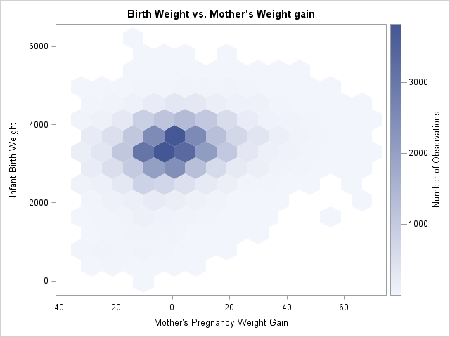
The hex-binned heat map reminds me of the effect of using transparency to overcome overplotting. You see a faint light-blue haze where the density of points is low. Dark colors indicate regions for which the density of points is high (more than 3,000 points per bin, for this example).
A fun set of data to visualize is the sashelp.Zipcode data because if you plot the longitude and latitude variables, the hexagons create a pixelated version of the US! Bins with high counts indicate regions for which there are many zip codes packed closely together, such as major metropolitan areas. Rather than use the default color ramp, the following example uses the PALETTE function in SAS/IML software to create a yellow-orange-red color ramp. Those colors are pasted into the COLORRAMP= option; be sure to use parentheses if you specify your own colors for a color ramp. I thought it would be appropriate to use hex values to specify the colors for the hexagons, but you can also define a color ramp by using color names such as colorramp=(lightblue white lightred red).
proc iml; c = palette("YLORRD", 5); print c; quit; data zips; set sashelp.Zipcode(where=(State<=56 & State^=2 & State^=15 & X<0)); run; title "Density of US Zip Codes"; %HexBin(zips, X, Y, nBins=51, colorramp=(CXFFFFB2 CXFECC5C CXFD8D3C CXF03B20 CXBD0026)); |
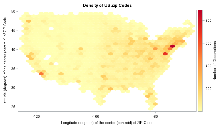
The heat map of hex-binned counts shows "hot spots" of density along the East Coast (Washington/Baltimore, Philadelphia, New York), along the West Coast (Los Angeles, the Bay Area, Seattle), and at various other major cities (Denver, Dallas, Chicago, ...). Chicago is also visible near (X,Y)=(-88, 42), although at this scale of binning Lake Michigan is not visible as a collection of empty hexagons, which makes it hard to locate midwest cities.
This hex-binned heat map can be a useful alternative to a scatter plot when the scatter plot suffers from overplotting or when you want to estimate the density of the observations. It requires SAS/STAT 13.2. Between hexagonal binning, the rectangular bin plot from my previous blog post, and PROC KDE, there are now multiple ways in SAS to visualize the density of bivariate data.

2 Comments
Pingback: Designing a quantile bin plot - The DO Loop
Pingback: How to choose colors for maps and heat maps - The DO Loop