A SAS customer asked how to use background colors and a dashed line to emphasize the forecast region for a graph that shows a time series model. The task requires the following steps:
- Use the ATTRPRIORITY=NONE option on the ODS GRAPHICS statement to make sure that the current ODS style will change line patterns, and use the STYLEATTRS statement to set the line patters for the plot.
- Add an indicator variable to the data set that indicates which times are in the "past" (the data region) and which times are in the "future" (the forecast region).
- Use the BLOCK statement in PROC SGPLOT to add a background color that differentiates the past and future regions.
- Use the SERIES statement to plot the model forecast and use the GROUP= option to visually differentiate the past predictions (solid line) from future predictions (dashed line).
A simple example
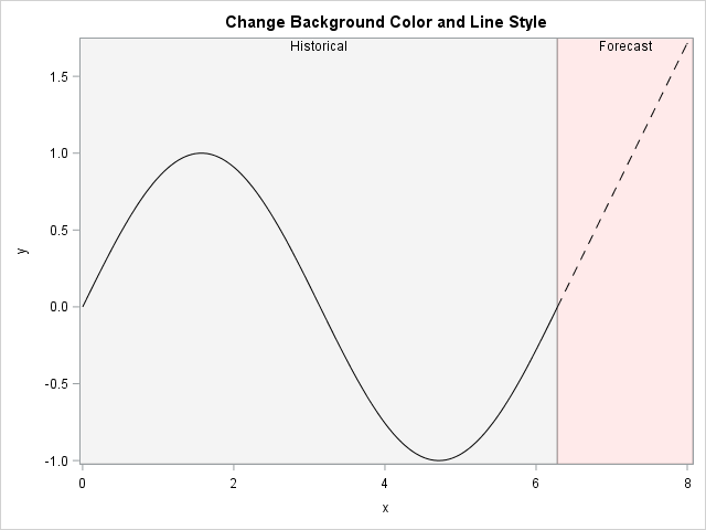
A simple "toy" example is the best way to show the essential features of the desired graph. The following DATA step creates a curve in two regions. For x ≤ 6.28, the curve is a sine curve. For x > 6.28, the curve is linear. These two domains correspond to the "Historical" and "Forecast" levels of the indicator variable BlockID. The graph is shown to the left.
data Example; pi = constant('pi'); BlockID = "Historical"; do x = 0 to 6.28 by 0.01; y = sin(x); output; end; BlockID = "Forecast"; do x = 6.28 to 8 by 0.01; y = x - 2*pi; output; end; run; ods graphics / attrpriority=none; title "Background Colors and Line Styles for Forecast"; proc sgplot data=Example noautolegend; styleattrs DATACOLORS=(verylightgrey verylightred) /* region */ DATALINEPATTERNS=(solid dash) /* line patterns */; block x=x block=BlockID / transparency=0.75; series x=x y=y / group=BlockID lineattrs=(color=black); run; |
The graph emphasizes the forecast region by using color and a line pattern. The ATTRPRIORITY=NONE option ensures that the line patterns alternate between groups. For details, see Sanjay Matange's article about the interactions between the ATTRPRIORITY= option and the STYLEATTRS statement. For rapidly oscillating models, you might want to use the DOT line pattern instead of the DASH line pattern.
I've previous written about how to use the BLOCK statement to emphasize different regions in the domain of a graph.
Of course, this example is very simplistic. The next section shows how you can apply the ideas to a more realistic example.
A time series example with forecast region highlighted
Many SAS procedures create suitable graphs when you enable ODS GRAPHICS. In particular, many SAS/ETS procedures (such as PROC ARIMA) can create graphs that look similar to this example. The following classic example is taken from the PROC ARIMA documentation. The data are the log-transformed number of passengers who flew on commercial airlines in the US between 1949 and 1961. Based on these data, the ARMIA model forecasts an additional 24 months of passenger traffic.
data seriesg; input x @@; xlog = log( x ); date = intnx( 'month', '31dec1948'd, _n_ ); format date monyy.; label xlog="log(passengers)"; datalines; 112 118 132 129 121 135 148 148 136 119 104 118 115 126 141 135 125 149 170 170 158 133 114 140 145 150 178 163 172 178 199 199 184 162 146 166 171 180 193 181 183 218 230 242 209 191 172 194 196 196 236 235 229 243 264 272 237 211 180 201 204 188 235 227 234 264 302 293 259 229 203 229 242 233 267 269 270 315 364 347 312 274 237 278 284 277 317 313 318 374 413 405 355 306 271 306 315 301 356 348 355 422 465 467 404 347 305 336 340 318 362 348 363 435 491 505 404 359 310 337 360 342 406 396 420 472 548 559 463 407 362 405 417 391 419 461 472 535 622 606 508 461 390 432 ; proc arima data=seriesg plots(only)=forecast(forecasts); identify var=xlog(1,12); estimate q=(1)(12) noint method=ml; forecast id=date interval=month out=forearima; run; |
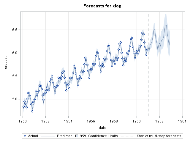
You can see that the ODS graph uses a dashed line to separate the historical (data) region from the forecast region. However, the graph uses a solid line to display all predicted values, even the forecast.
In the previous PROC ARIMA call, I used the OUT= option on the FORECAST statement to create a SAS data set that contains the predicted values and confidence region. The following DATA step adds an indicator variable to the data:
data forecast; set forearima; if date <= '01JAN1961'd then BlockID = "Historical"; else BlockID = "Forecast"; run; |
You can now create the modified graph by using the STYLEATTRS, BLOCK, and SERIES statements. In addition, a BAND statement adds the confidence limits for the predicted values. A SCATTER statement adds the data values. The XAXIS and YAXIS values overlay a grid on the graph.
ods graphics / attrpriority=none; title "ARIMA Model and Forecast"; proc sgplot data=forecast noautolegend; styleattrs DATACOLORS=(verylightgrey verylightred) /* region */ DATALINEPATTERNS=(solid dot) /* line patterns */; block x=date block=BlockID / transparency=0.75; band x=date lower=L95 upper=U95; scatter x=date y=xlog; series x=date y=Forecast / group=BlockID lineattrs=(color=black); xaxis grid display=(nolabel); yaxis grid; run; |
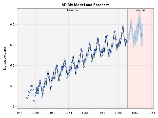
The final graph is a customized version of the default graph that is created by using PROC ARIMA. The presentation highlights the forecast region by using a different background color and a different line style.
If you are content with this one-time modification, then you are done. If you want to create this graph every time that you run PROC ARIMA, read the SAS/STAT chapter "ODS Graphics Template Modification" or read Warren Kuhfeld's paper about how to modify the underlying template to customize the graph every time that the procedure runs.
