One of the strengths of the SGPLOT procedure in SAS is the ease with which you can overlay multiple plots on the same graph. For example, you can easily combine the SCATTER and SERIES statements to add a curve to a scatter plot.
However, if you try to overlay incompatible plot types, you will get an error message that says
ERROR: Attempting to overlay incompatible plot or chart types.
For example, a histogram and a series plots are not compatible in PROC SGPLOT, so you need to use the Graphics Template Language (GTL) to overlay a custom density estimate on a histogram.
A similar limitation exists for bar charts in PROC SGPLOT: you cannot specify the VBAR and SERIES statements in a single call. However, in SAS 9.3 and beyond you can use the VBARPARM statement in SAS 9.3 to overlay a curve and a bar chart.
In SAS 9.4m3 there is yet another VBAR-like statement that enables you to combine bar charts with one or more other plots. The new the VBARBASIC and the HBARBASIC statements create a bar chart that is compatible with basic plots such as scatter plots, series plots, and box plots. These statements can summarize raw data like the VBAR statement can. In other words, if you use the VBARBASIC and HBARBASIC statements on raw data, the counts will be automatically computed. However, you can also use the statements on pre-summarized data: specify the height of the bars by using the RESPONSE= option.
Overlay a curve on a bar chart in SAS
In most situations it doesn't make sense to overlay a continuous curve on a discrete bar chart, which is why the SG routines have the concept of compatible plot types. However, there is a canonical example in elementary statistics that combines continuous and discrete data: the normal approximation to the binomial distribution.
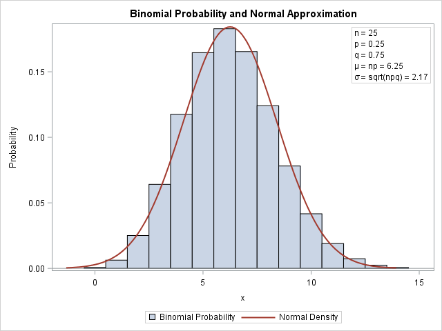
Recall that if X is the number of successes in n independent trials for which the probability of success is p, then X is binomially distributed: X ~ Binom(n, p). A well-known rule says that if np > 5 and n(1-p) > 5, then the binomial distribution is approximated by a normal distribution with mean np and standard deviation sqrt(np(1-p)).
This rule is often illustrated by overlaying the continuous normal PDF on a bar chart that shows the binomial distribution, as shown to the left. To create this plot, I used the VBARBASIC statement to create the bar chart. Because the VBARBASIC statement creates a "basic plot," you can combine it with another basic plot, such as the line plot created by using a SERIES statement. For fun, I used an INSET statement to overlay a box of parameter values for the graph. The graph shows that the binomial probability at j is approximated by the area under the normal density curve on the interval [j-0.5, j+0.5].
The following SAS statements use the PDF function to evaluate the binomial probabilities and the normal density for the graph. The values for μ and σ are stored in macro variables for later use.
%let p = 0.25; /* probability of success */ %let n = 25; /* number of trials */ data Binom; n = &n; p = &p; q = 1 - p; mu = n*p; sigma = sqrt(n*p*q); /* parameters for the normal approximation */ Lower = mu-3.5*sigma; /* evaluate normal density on [Lower, Upper] */ Upper = mu+3.5*sigma; /* PDF of normal distribution */ do t = Lower to Upper by sigma/20; Normal = pdf("normal", t, mu, sigma); output; end; /* PMF of binomial distribution */ t = .; Normal = .; /* these variables are not used for the bar chart */ do j = max(0, floor(Lower)) to ceil(Upper); Binomial = pdf("Binomial", j, &p, &n); output; end; call symput("mu", strip(mu)); /* store mu and sigma in macro variables */ call symput("sigma", strip(round(sigma,0.01))); label Binomial="Binomial Probability" Normal="Normal Density"; keep t Normal j Binomial; run; |
The preceding DATA step evaluates the Binom(15, 0.25) probability for the integers j=0, 1, ..., 14. It evaluates the N(6.25, 2.17) PDF on the interval [-1.3, 13.8]. The following call to PROC SGPLOT uses the VBARBASIC statement to overlay the bar chart and the density curve:
title "Binomial Probability and Normal Approximation"; proc sgplot data=Binom; vbarbasic j / response=Binomial barwidth=1; /* requires SAS 9.4M3 */ series x=t y=Normal / lineattrs=GraphData2(thickness=2); inset "n = &n" "p = &p" "q = %sysevalf(1-&p)" "(*ESC*){unicode mu} = np = &mu" /* use Greek letters */ "(*ESC*){unicode sigma} = sqrt(npq) = &sigma" / position=topright border; yaxis label="Probability"; xaxis label="x" integer type=linear; /* force TYPE=LINEAR */ run; |
The TYPE=LINEAR option on the XAXIS statement tells the horizontal axis to use interval tick marks. The BARWIDTH=1 option on the VBARBASIC statement makes the bar chart look more like a histogram by eliminating the gaps between bars. The graph is shown at the top of this section.
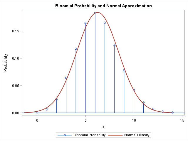
Alternative visualization: The needle plot
If you are content to show only the height of the binomial probability mass function (PMF), you can use an alternative visualization. The following graph shows a needle plot (the binomial PMF) overlaid with a normal PDF. This visualization does not require 9.4M3. The SGPLOT statements are the same as before, except the binomial probabilities are represented by using the NEEDLE statement: needle x=j y=Binomial / markers;

2 Comments
VBARPARM also can do that.
Pingback: The normal approximation and random samples of the binomial distribution - The DO Loop