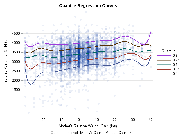
This article shows how to score (evaluate) a quantile regression model on new data. SAS supports several procedures for quantile regression, including the QUANTREG, QUANTSELECT, and HPQUANTSELECT procedures. The first two procedures do not support any of the modern methods for scoring regression models, so you must use the "missing value trick" to score the model. (HPQUANTSELECT supports the CODE statement for scoring.) You can use this technique to construct a "sliced fit plot" that visualizes the model, as shown to the right. (Click to enlarge.)
The easy way to create a fit plot
The following DATA step creates the example data as a subset of the Sashelp.BWeight data set, which contains information about the weights of live births in the US in 1997 and information about the mother during pregnancy. The following call to PROC QUANTREG models the conditional quantiles of the baby's weight as a function of the mother's weight gain. The weight gain is centered according to the formula MomWtGain = "Actual Gain" – 30 pounds. Because the quantiles might depend nonlinearly on the mother's weight gain, the EFFECT statement generates a spline basis for the independent variable. The resulting model can flexibly fit a wide range of shapes.
Although this article shows how to create a fit plot, you can also get a fit plot directly from PROC QUANTREG. As shown below, the PLOT=FITPLOT option creates a fit plot when the model contains one continuous independent variable.
data Orig; /* restrict to 5000 births; exclude extreme weight gains */ set Sashelp.BWeight(obs=5000 where=(MomWtGain<=40)); run; proc quantreg data=Orig algorithm=IPM /* use IPM algorithm for splines and binned data */ ci=none plot(maxpoints=none)=fitplot; /* or fitplot(nodata) */ effect MomWtSpline = spline( MomWtGain / knotmethod = equal(9) ); /* 9 knots, equally spaced */ model Weight = MomWtSpline / quantile = 0.1 0.25 0.5 0.75 0.90; run; |
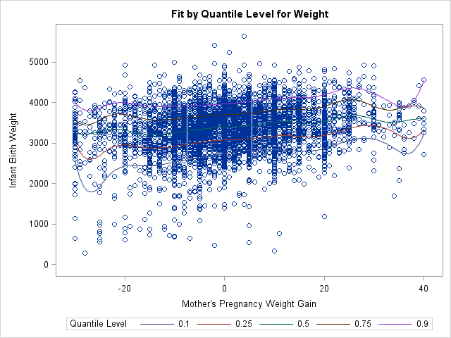
The graph enables you to visualize curves that predict the 10th, 25th, 50th, 75th, and 90th percentiles of the baby's weight based on the mother's weight gain during pregnancy. Because the data contains 5,000 observations, the fit plot suffers from overplotting and the curves are hard to see. You can use the PLOT=FITPLOT(NODATA) option to exclude the data from the plot, thus showing the quantile curves more clearly.
Score a SAS procedure by using the missing value trick
Although PROC QUANTREG can produce a fit plot when there is one continuous regressor, it does not support the EFFECTPLOT statement so you have to create more complicated graphs manually. To create a graph that shows the predicted values, you need to score the model on a new set of independent values. To use the missing value trick, do the following:
- Create a SAS data set (the scoring data) that contains the values of the independent variables at which you want to evaluate the model. Set the response variable to missing for each observation.
- Append the scoring data to the original data that are used to fit the model. Include a binary indicator variable that has the value 0 for the original data and the value 1 for the scoring data.
- Run the regression procedure on the combined data set. Use the OUTPUT statement to output the predicted values for the scoring data. Of course, you can also output residuals and other observation-wise statistics, if necessary.
This general technique is implemented by using the following SAS statements. The scoring data consists of evenly spaced values of the MomWtGain variable. The binary indicator variable is named ScoreData. The result of these computations is a data set named QRegOut that contains a variable named Pred that contains the predicted values for each observation in the scoring data.
/* 1. Create score data set */ data Score; /* Optionally define additional covariates here. See the example "Create a sliced fit plot manually by using the missing value trick" https://blogs.sas.com/content/iml/2017/12/20/create-sliced-fit-plot-sas.html */ Weight = .; /* set response (Y) variable to missing */ do MomWtGain = -30 to 40; /* uniform spacing in the independent (X) variable */ output; end; run; /* 2. Append the score data to the original data. Use a binary variable to indicate which observations are the scoring data */ data Combined; set Orig /* original data */ Score(in=_ScoreData); /* scoring data */ ScoreData = _ScoreData; /* binary indicator variable. ScoreData=1 for scoring data */ run; /* 3. Run the procedure on the combined (original + scoring) data */ ods select ModelInfo NObs; proc quantreg data=Combined algorithm=IPM ci=none; effect MomWtSpline = spline( MomWtGain / knotmethod = equal(9) ); model Weight = MomWtSpline / quantile = 0.1 0.25 0.5 0.75 0.90; output out=QRegOut(where=(ScoreData=1)) /* output predicted values for the scoring data */ P=Pred / columnwise; /* COLUMWISE option supports multiple quantiles */ run; |
This technique can be used for any SAS regression procedure. In this case, the COLUMNWISE option specifies that the output data set should be written in "long form": A QUANTILE variable specifies the quantile and the variable PRED contains the predicted values for each quantile. If you omit the COLUMNWISE option, the output data is in "wide form": The predicted values for the five quantiles are contained in the variables Pred1, Pred2, ..., Pred5.
Using predicted values to create a sliced fit plot
You can use the predicted values of the scoring data to construct a fit plot. You merely need to sort the data by any categorical variables and by the X variable (in this case, MomWtGain). You can then plot the predicted curves. If desired, you can also append the original data and the predicted values and create a graph that overlays the data and predicted curves. You can use transparency to address the overplotting issue and also modify other features of the fit plot, such as the title, axes labels, tick positions, and so forth:
/* 4. If you want a fit plot, sort by the independent variable for each curve. Put QUANTILE and other covariates first, then the X variable. */ proc sort data=QRegOut out=ScoreData; by Quantile MomWtGain; run; /* 5. (optional) If you want to overlay the plots, it's easiest to define separate variables for original data and scoring data */ data All; set Orig /* original data */ ScoreData(rename=(MomWtGain=X Pred=Y)); /* scoring data */ run; title "Quantile Regression Curves"; footnote J=C "Gain is centered: MomWtGain = Actual_Gain - 30"; proc sgplot data=All; scatter x=MomWtGain y=Weight / markerattrs=(symbol=CircleFilled) transparency=0.92; series x=X y=Y / group=Quantile lineattrs=(thickness=2) nomissinggroup name="p"; keylegend "p" / position=right sortorder=reverseauto title="Quantile"; xaxis values=(-20 to 40 by 10) valueshint grid label="Mother's Relative Weight Gain (lbs)";; yaxis values=(1500 to 4500 by 500) valueshint grid label="Predicted Weight of Child (g)"; run; |
The fit plot is shown at the top of this article.
In summary, this article shows how to use the missing value trick to evaluate a regression model in SAS. You can use this technique for any regression procedure, although newer procedures often support syntax that makes it easier to score a model.
As shown in this example, if you score the model on an equally spaced set of points for one of the continuous variables in the model, you can create a sliced fit plot. For a more complicated example, see the article "How to create a sliced fit plot in SAS."
