Data Visualization

Get the right information, with visual impact, to the people who need it
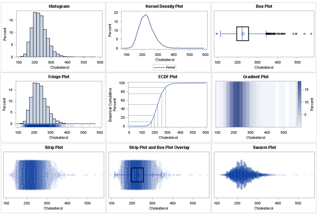
Advanced Analytics | Artificial Intelligence | Data Visualization | Machine Learning
Jessica Curtis 0
How to cultivate trust in analytical models and improve forecast adoption

Often the biggest challenge when implementing a successful forecasting process has nothing to do with the analytics. Forecast adoption – incorporating forecasts into decision-making – is just as high a hurdle to overcome as the models themselves. Forecasting is more than analytical models Developing a forecasting process typically begins with

Advanced Analytics | Analytics | Cloud | Data Visualization | Machine Learning
Carlos Hernández 0
SAS Viya, transformar los datos en insights para tomar mejores decisiones

Las organizaciones están bastante conscientes de que las cosas pueden cambiar radicalmente en cuestión de semanas. La experiencia de los dos últimos años les ha hecho reconocer la necesidad de tener la capacidad de tomar decisiones inteligentes a partir de datos confiables que puedan llevar a resultados positivos.   En este

Advanced Analytics | Analytics | Data Management | Data Visualization
Ernesto Cantu 0
Acelerando un futuro analítico para manufactura en América Latina

A medida que nos acercamos a un nuevo año, los temas de productividad y optimización para operar en un  contexto volátil e incierto seguirán siendo una prioridad para los ejecutivos de todos los sectores de la industria, y manufactura no es la excepción. Los datos son un aliado importante para garantizar la resiliencia

Analytics | Customer Intelligence | Data Visualization | Marketing
Charlie Chase 0
How CDP technologies offer sales and marketing teams powerful insights

In today's environment, data is exceedingly important but also increasingly harder to get and manage. A reliable customer data platform (CDP) can provide significant value to retail and consumer packaged goods (CPG) companies. Customer data platforms are used to consolidate and integrate customer and consumer data into a single data source. CDP

Analytics | Artificial Intelligence | Data for Good | Data Visualization
Caslee Sims 0
Taking a swing at data literacy: an inside look at The SAS Batting Lab

The SAS Batting Lab is a six-week program designed to help improve kids’ understanding of data while also helping them improve their baseball and softball swings. Using analytics in an interactive, AI-powered batting cage, kids can compare their swings to batting stars. During the program, the participants also became more

Analytics | Data for Good | Data Visualization | Internet of Things | Learn SAS
0
サステナビリティ経営へのアナリティクス (2)

はじめに 今回は、地球環境に関する喫緊の課題であるカーボンニュートラル対策およびグリーン成長戦略におけるSASの取組みをご紹介します。 カーボンニュートラルに向けた動向 159か国・地域をカバーしたパリ協定*1に締結した日本は、2050年までにGHG(温室効果ガス)排出を全体としてゼロにする(GHGの排出量と吸収量を均衡させる)カーボンニュートラルを目指すことを宣言しています。すべてのインダストリーで多くの企業はこれをカバーするグリーンビジネス戦略の施策を展開し、マテリアリティの中核に置いたカーボンニュートラルに向けた事業を推進しています。すでにヨーロッパを中心に35の国(2021年9月時点)で炭素税が導入され、GHG排出量に応じた課税がされています。日本では地球温暖化対策税だけですが、今後より厳しい税率の炭素税の導入が検討されています。 グリーン成長戦略 温暖化への対応を成長の機会ととらえたグリーン成長戦略*2は、14の重点分野が設定されており、グローバル市場や世界の巨大なESG投資意識し国際連携を推進したゲームチェンジが始まっています。これらの重点分野での目標は、高いハードルによりイノベーションが必要と考えられています。企業はESGに係る情報開示を求められ、統合報告書やサスティナビリティレポートなどでESG情報を開示しており、カーボンニュートラルの取組みはその中核をなしています。SASにおいても長年にわたり推進しています。 サステナビリティのリーダーとしてのSAS SASは、企業のサステナビリティのリーダー*3として、従業員、サプライヤー、および顧客と緊密に連携し、省エネ、排出管理、汚染軽減、節水、グリーンビルディング、およびその他のプログラムに焦点を当てたプログラムで環境フットプリントを削減しています。スマートキャンパスプロジェクトを通じて運用を改善するためのデータのストリーミングから、ソーラーファームからのクリーンエネルギーでオフィスビルに電力を供給するまで、SAS Visual Analyticsを使用して、環境パフォーマンスを収集、管理、計算、および報告をしています。 SASの環境プログラムの成果 SASの2020年の環境プログラムの主な成果は次のとおりです。   カーボンニュートラルの取組み SASは、パリ協定の目標に引き続きコミットし、2050年のカーボンニュートラルな目標を設定しています。それによりサイエンスに基づく目標の達成に取組む最初の1,000社の1つとして認められました。 SASの主要なエネルギーおよびGHG排出削減イニシアチブには、積極的なエネルギーおよびGHG排出削減目標の設定、LEED® (建築や都市の環境性能評価システム) ガイドラインに準拠した施設の建設と維持、電気自動車充電ステーションの設置、再生可能エネルギーへの投資、オフィスビルおよびデータセンター向けのスマートなエネルギー効率の高い技術の追求、電話会議の奨励が含まれています。SASは、自社の独自のソフトウエアを使用して、世界中の施設のエネルギーと排出量の要件を収集、理解、管理するプロセスを改善し、消費傾向を報告して積極的に影響を与える能力を高めています。環境プログラムは、SASソフトウエアを使用して削減戦略を策定し、対策間の関係を分析して最大の効果を持つ施特定、決定パフォーマンス指標の開発および監視を実行しています。 次に代表的なイニシアチブを紹介します。 クリーンエネルギーシフト SDGs目標7「エネルギーをみんなにそしてクリーンに」とSDGs目標13「気候変動対策を支援するために」への施策 SASは再生可能エネルギーの導入とクリーンエネルギーの経済的および環境的利益を積極的に提唱しています。 SASは、ノースカロナイナ州ケリーにある広大なグローバル本部キャンパスに自らのSASソーラーファームを構築、グリーンエネルギー自社の電力、移動に利用するEVへの電源供給を実現しています。SASソーラーファームがノースカロライナ州知事ロイ・クーパーにクリーンエネルギー経済とパリ協定の支援のための執行命令に署名する場所として選ばれた後、SASはクリーンエネルギーと炭素政策の設計を支援するために州のクリーンエネルギー計画で推奨されているように利害関係者会議に継続的に参加ました。 スマートシティー SDGs目標11「住み続けられるまちづくりを」への施策 SASはSmart Cities Council*4、Envision America*5、Research Triangle Cleantech Cluster(RTCC)*6などの組織とも提携し、接続されたデバイス、ソーシャルメディア、モノのインターネット(IoT)から供給されるデータの爆発的な増加を利用して、自治体のスマート化(スマートシティー)を支援しています。人工知能(AI)、ブロードバンドワイヤレス、クラウドコンピューティング、IoTネットワークなどの相互依存テクノロジーの理解を深めることで、効率の向上、コストの削減、機会の特定、気候変動の影響の緩和を支援します。 スコープ別の世界のGHG排出量 サプライチェーン排出量(スコープ1からスコープ3に分類される*7)の全体像を把握し、効果的な削減対象を特定して長期的な環境負荷削減戦略や事業戦略策定のインサイトを抽出することが重要と考えています。 SASは自社ソフトウエアによりデータ収集、分析、可視化、予測を行っています。これにより現状を迅速かつ正確に把握し、統計モデルやAIモデルにより予測・最適化しゴールへの軌道や実現性を描いています。アナリティクスによる意思決定により確実な目標達成を実践しています。 *SAS Visual Analyticsによる環境ダイナミックレポート グラフ1: スコープ別GHG排出量   *SAS Visual Analyticsによる環境ダイナミックレポート グラフ2: スコープ1とスコープ2のGHG排出量トレンド その他の環境への取組み 環境におけるその他の分野でも次のように多くの取組みをSASのアナリティクスにより実施しています。詳細は割愛しますのでご興味がある方はCSRレポート*8をご覧ください。 廃棄物の転換(SDGs⽬標12)、紙の消費削減·リサイクル(SDGs⽬標12、15)、節水(SGD目標 6)、排水管理(SGD目標

Advanced Analytics | Analytics | Data Visualization
Carlos Pinheiro 0
Vehicle Routing Problem - A beer distribution example in Asheville

The Vehicle Routing Problem (VRP) algorithm aims to find optimal routes for one or multiple vehicles visiting a set of locations and delivering a specific amount of goods demanded by these locations. Problems related to the distribution of goods, normally between warehouses and customers or stores, are generally considered vehicle routing problems. For this article's example, let’s consider a real (and awesome) brewery that needs to deliver beer kegs to different bars and restaurants throughout multiple locations.

Data Visualization
Dan Heath 0
The Power of Stacking

Amazing things can be created when you start with small pieces and stack them together. Just ask Bryan Berg. He is the current world record holder for the tallest house of cards. This same principle can be applied to the SGPLOT and SGPANEL procedures. You can take the individual plot

Data Visualization
Dan Heath 0
Area Bar Charts using SGPLOT

The SGPLOT procedure supports a wide variety of plot types that you can use directly or combine together to create more complex graphs. Even with this flexibility, there might be times you run across a graph that you cannot create using one of the standard plot types. An "area" bar

Advanced Analytics | Analytics | Data Management | Data Visualization
Charlie Chase 0
Misnomers regarding outliers and their usefulness in statistical modeling

Outliers provide much-needed insights into the actual relationships that influence the demand for products in the marketplace. They are particularly useful when modeling consumer behavior where abnormalities are common occurrences or unforeseen disruptions that impact consumer demand. But why do demand planners cleanse out outliers, when many are not really

Data Visualization
Dan Heath 0
Optimizing bar label placement

When creating bar charts, it is very common to display labels with the bars to make it easier to determine the bar values or to provide additional information in the chart. However, these labels can take away valuable data space, particularly if you generate a smaller-sized graph. As you see

Data Visualization
Diana Maris 0
Successful citizen data scientists need to know these three trends

Data visualization is a critical way for anyone to turn endless rows of data into easy-to-understand results through dynamic and understandable visuals. Whether your favorite visualization is a pie chart, a geographic map or relies on natural language, showing the insights that empower you to make more informed decisions is a better way to do data-driven business. Analyst firms say that SAS has market-leading data visualization. This helps users across the globe find insights in their data using new and exciting trends in data visualization.

Advanced Analytics | Analytics | Data Visualization
Noura Ayache 0
Prise de décision partagée et transformation personnelle sur le parcours de la Business Value de l'analytique

On s'accorde de plus en plus à dire que presque toutes les entreprises devront recourir davantage à l'analyse. L'utilisation des données n'est plus un luxe, mais une méthode de travail essentielle. C'est un facteur d'efficience, d'efficacité et de centrage sur le client. Pour ceux d'entre nous qui travaillent dans le

Analytics | Data Visualization | Learn SAS | Students & Educators
0
SASのオンライン学習コース「Skill Builder for Students」の紹介(3)Visual Analytics and Visual Statistics編

前回の記事では、学生であれば無料で利用可能なオンライン学習コース「Skill Builder for Students」のProgrammingコースについての概要を紹介しました。今回は引き続きまして、Visual Analytics and Visual Statisticsコースについて紹介していきます。 データアナリティクスへの興味・関心は近年急激に増加しています。ただ特に学習を始めた学生では、データアナリティクスと聞くと、どうしても複雑なモデルを組むことや機械学習を実施することだけに意識が向いている印象を受けます。しかしデータアナリティクスの本質はそこではありません。根幹にあるのは意思決定や業績の改善にどれほど貢献できるかです。データの可視化、見える化は学生ですとしばしば軽視されがちな部分ではありますが、意思決定や現状の把握においては非常に有用な有用な方法の一つです。 今回紹介するコースではSAS Viyaプラットフォーム上でSAS Visual AnalyticsとSAS Visual Statisticsを使用し、様々な可視化方法、予測モデルについて学習を行います。これらを学習することによってデータに潜む傾向やパターンを把握し、そしていかにその後のリスク管理や傾向の予測などへとつなげていくかといった実践的なデータアナリティクスを学ぶことが可能です。またSAS ViyaはSASによるプログラミング以外にもRやPythonといった他のプログラミング言語をサポートしているため、SASのコーディングができない方であっても不自由なく利用することが可能となっています。 Visual Analytics and Visual Statisticsコースへのアクセスは以下の手順です。 Skill Builder for Studentsへログイン 「Learn SAS」というタブをクリック 画面中央の「Start Learning」をクリック 「Visual Analytics and Visual Statistics」をクリック 展開される各種e-learningコースをクリック 画面下部にある「enroll」をクリック     Visual Analytics and Visual Statisticsコースの概要 本コースは SAS Visual Analytics 1 for SAS

1 2 3 4 5 60

Back to Top