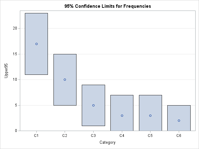
In SAS, the easiest way to draw random sampling from data is to use PROC SURVEYSELECT or the SAMPLE function in SAS IML software. I have previously written about how to implement four common sampling schemes by using PROC SURVEYSELECT and the SAMPLE function. The DATA step in SAS is
Author
This article shows how to simulate data from a Poisson regression model, including how to account for an offset variable. If you are not familiar with how to run a Poisson regression in SAS, see the article "Poisson regression in SAS." A Poisson regression model is a specific type of
This article demonstrates how to use PROC GENMOD to perform a Poisson regression in SAS. There are different examples in the SAS documentation and in conference papers, but I chose this example because it uses two categorical explanatory variables. Therefore, the Poisson regression can be visualized by using a contingency
An article published in Nature has the intriguing title, "AI models collapse when trained on recursively generated data." (Shumailov, et al., 2024). The article is quite readable, but I also recommend a less technical overview of the result: "AI models fed AI-generated data quickly spew nonsense" (Gibney, 2024). The Gibney
A previous article shows that you can run a simple (one-variable) isotonic regression by using a quadratic programming (QP) formulation. While I was reading a book about computational geometry, I learned that there is a connection between isotonic regression and the convex hull of a certain set of points. Whaaaaat?
Since the pandemic began in 2020, the SAS IML developers have added about 50 new functions and enhancements to the SAS IML language in SAS Viya. Among these functions are new modern methods for optimization that have a simplified syntax as compared to the older 'NLP' functions that are available
Just like the SAS DATA step, the SAS IML language supports both functions and subroutines. A function returns a value, so the calling syntax is familiar: y = func(x1, x2); /* the function returns one value, y */ In this syntax, the input arguments are x1 and x2. The
Isotonic regression (also called monotonic regression) is a type of regression model that assumes that the response variable is a monotonic function of the explanatory variable(s). The model can be nondecreasing or nonincreasing. Certain physical and biological processes can be analyzed by using an isotonic regression model. For example, a
A previous article discusses the fact that there are often multiple ways in SAS to obtain the same result. This fact results in many vigorous discussions on online programming forums as people propose different (but equivalent) methods for solving someone's problem then argue why their preferred method is better than
As announced and demonstrated at SAS Innovate 2024, SAS plans to include a generative AI assistant called SAS Viya Copilot in the forthcoming SAS Viya Workbench. You can submit a text prompt (by putting it in a comment string) and the Copilot will generate SAS code for you. My colleagues
While reviewing a book on numerical analysis, I was reminded of a classic interpolation problem. Suppose you have n pairs of points in the plane: (x1,y1), (x2,y2), ..., (xn,yn), where the first coordinates are distinct. Then you can construct a unique polynomial of degree (at most) n-1 that passes through
One of the most exciting features of SAS Viya Workbench is that the code editor includes a generative AI component called SAS Viya Copilot. This feature was announced and demonstrated at SAS Innovate 2024. With the Copilot, you can specify a text prompt that generates SAS code. For example, you
This article discusses how to scale a probability density curve so that it fits appropriately on a histogram, as shown in the graph to the right. By definition, a probability density curve is scaled so that the area under the curve equals 1. However, a histogram might show counts or
A previous article discusses a formula for a confidence interval for R-square in a linear regression model (Olkin and Finn (1995) "Correlations redux", Psychological Bulletin) The formula is useful for large data sets, but should be used with caution for small samples. At the end of the previous article, I
A SAS analyst ran a linear regression model and obtained an R-square statistic for the fit. However, he wanted a confidence interval, so he posted a question to a discussion forum asking how to obtain a confidence interval for the R-square parameter. Someone suggested a formula from a textbook (Cohen,
A SAS analyst read my previous article about visualizing the predicted values for a regression model that uses spline effects. Because the original explanatory variable does not appear in the model, the analyst had several questions: How do you score the model on new data? The previous example has only
Sometimes labels for variables get "dropped" during data preparation and cleaning. One example is when data are transposed from "wide form" to "long form." For example, suppose a data set has three variables, X, Y, and Z, each with labels. If you transpose the data to long form, the new
A SAS programmer wanted to visualize density estimate for some univariate data. The data had several groups, so he wanted to create a panel of density estimate, which you can easily do by using PROC SGPANEL in SAS. However, the programmer's boss wanted to see filled density estimates, such as
After writing a program that simulates data, it is important to check that the statistical properties of the simulated (synthetic) data match the properties of the model. As a first step, you can generate a large random sample from the model distribution and compare the sample statistics to the expected
A SAS programmer was trying to implement an algorithm in PROC IML in SAS based on some R code he had seen on the internet. The R code used the rank() and order() functions. This led the programmer to ask, "What is the different between the rank and the order?
A SAS statistical programmer recently asked a theoretical question about statistics. "I've read that 'p-values are uniformly distributed under the null hypothesis,'" he began, "but what does that mean in practice? Is it important?" I think data simulation is a great way to discuss the conditions for which p-values are
At a recent conference in Las Vegas, a presenter simulated the sum of two dice and used it to simulate the game of craps. I write a lot of simulations, so I'd like to discuss two related topics: How to simulate the sum of two dice in SAS. This is
Years ago, I wrote an article that showed how to visualize patterns of missing data. During a recent data visualization talk, I discussed the program, which used a small number of SAS IML statements. An audience member asked whether it is possible to construct the same visualization by using only
A SAS programmer wanted to estimate a proportion and a confidence interval (CI), but didn't know which SAS procedure to call. He knows a formula for the CI from an elementary statistics textbook. If x is the observed count of events in a random sample of size n, then the
In a recent article, I graphed the PDF of a few Beta distributions that had a variety of skewness and kurtosis values. I thought that I had chosen the parameter values to represent a wide variety of Beta shapes. However, I was surprised to see that the distributions were all
The moment-ratio diagram is a tool that is useful when choosing a distribution that models a sample of univariate data. As I show in my book (Simulating Data with SAS, Wicklin, 2013), you first plot the skewness and kurtosis of the sample on the moment-ratio diagram to see what common
A SAS programmer wanted to simulate samples from a family of Beta(a,b) distributions for a simulation study. (Recall that a Beta random variable is bounded with values in the range [0,1].) She wanted to choose the parameters such that the skewness and kurtosis of the distributions varied over range of
A dot plot is a standard statistical graphic that displays a statistic (often a mean) and the uncertainty of the statistic for one or more groups. Statisticians and data scientists use it in the analysis of group data. In late 2023, I started noticing headlines about "dot plots" in the
Recently, I saw a scatter plot that displayed the ticks, values, and labels for a vertical axis on the right side of a graph. In the SGPLOT procedure in SAS, you can use the Y2AXIS option to move an axis on the right side of a graph. Similarly, you can
A recent article describes how to estimate coefficients in a simple linear regression model by using maximum likelihood estimation (MLE). One of the nice properties of an MLE formulation is that you can compare a large model with a nested submodel in a natural way. For example, if you can