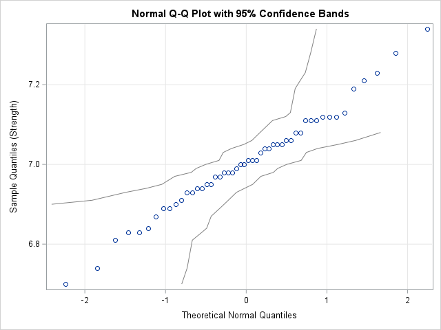
Create a confidence band for a normal Q-Q plot

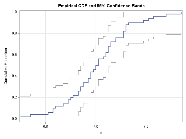
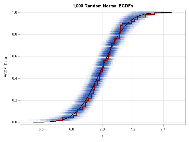
This article shows how to compute a confidence band for a Q-Q plot in SAS. A previous article shows how to construct confidence bands for the CDF of continuous univariate data. The bands can be added to a plot of the empirical CDF (ECDF) for the data. One of the