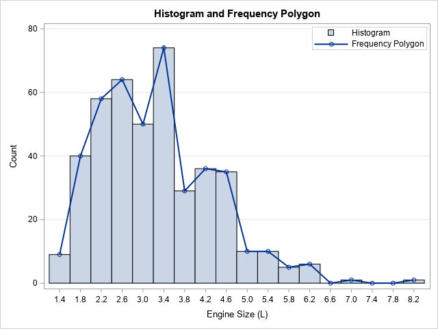
I was recently asked how to create a frequency polygon in SAS. A frequency polygon is an alternative to a histogram that shows similar information about the distribution of univariate data. It is the piecewise linear curve formed by connecting the midpoints of the tops of the bins. The graph to the right shows a histogram and a frequency polygon for the same data. This article shows how to create a frequency polygon in SAS.
In practice, frequency polygons are not used as often as histograms are, but they are useful pedagogical tools for teaching the fundamentals of density estimation. The histogram is an estimate of the density of univariate data, but it is a bar chart. Accordingly, it looks different from density estimate curves, such as parametric densities and kernel density estimates. The frequency polygon shows the same information as a histogram but displays the information as a line plot. Therefore, you can more easily compare the frequency polygon curve and other density estimate curves.
A frequency polygon is also a good way to introduce the ideas behind a cumulative distribution. An ogive is a graph of the cumulative sum of the vertical coordinates of the frequency polygon. The ogive approximates the cumulative distribution in the same way that the frequency polygon approximates the density.
Create a frequency polygon in SAS
You can use the UNIVARIATE procedure in SAS to generate the points for a frequency polygon. You can use the OUTHIST= option to specify a data set that contains the counts for each bar in the histogram. The midpoints of the histogram bins are contained in the _MIDPT_ variable. The count in each bin is contained in the _COUNT_ variable.
If you do not like the default width of the histogram bins, you can use the MIDPOINTS= option to specify your own set of midpoints. For example, the following statements create a histogram for the EngineSize variable in the Sashelp.Cars data set. You can use the SERIES statement in PROC SGPLOT to create a line plot that displays the vertical height of each histogram bar, as follows:
proc univariate data=sashelp.cars(keep=EngineSize); var EngineSize; histogram / outhist=OutHist grid vscale=count midpoints=(1.4 to 8.4 by 0.4); /* use midpoints= option to specify midpoints */ run; /* optionally, print the OutHist data */ /* proc print data=OutHist; run; */ title "Frequency Polygon"; proc sgplot data=OutHist; series x=_MIDPT_ y=_COUNT_ / markers; yaxis grid values=(0 to 80 by 20) label="Count" offsetmin=0; xaxis grid values=(1.4 to 8.4 by 0.4) label="Engine Size (L)"; run; |
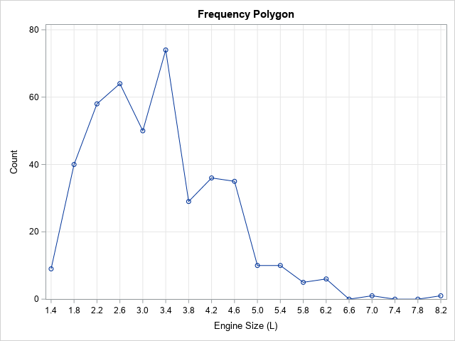
The frequency polygon is shown. Like a histogram, the shape of the frequency polygon depends on the bin width and anchor position. You can change those values by using the MIDPOINTS= option.
Overlay a frequency polygon and a kernel density estimate
As I mentioned earlier, an advantage of the frequency polygon is that it is a curve, not a bar chart. As such, it is easier to compare to other density estimates curves. In PROC UNIVARIATE, you can use the KERNEL option to overlay a kernel density curve on a histogram. You can use the OUTKERNEL= option to write the kernel density estimate to a data set. You can then overlay and compare the frequency curve (a crude histogram-based estimate) and the kernel density estimate, as follows:
proc univariate data=sashelp.cars(keep=EngineSize); var EngineSize; histogram / outhist=OutHist grid vscale=count kernel outkernel=OutKer midpoints=(1.4 to 8.4 by 0.4); /* use midpoints= option to specify midpoints */ ods select Moments Histogram; run; data Density; /* combine the estimates */ set OutHist OutKer(rename=(_Count_=KerCount)); run; title "Frequency Polygon and Kernel Density Estimate"; proc sgplot data=Density; series x=_MIDPT_ y=_COUNT_ / legendlabel="Frequency Polygon"; series x=_VALUE_ y=KerCount / legendlabel="Kernel Density Estimate"; yaxis offsetmin=0 grid values=(0 to 80 by 20) label="Estimated Count"; xaxis label="Engine Size (L)"; run; |
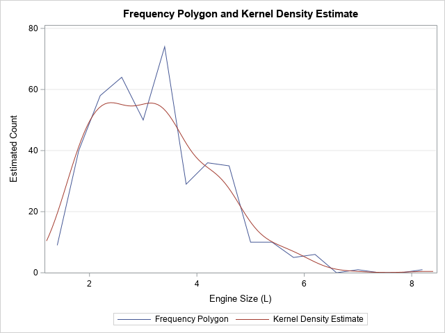
As shown in the graph, a kernel density estimate is a smoother version of the frequency polygon.
Summary
This article shows how to create a graph of the frequency polygon in SAS. A frequency polygon is a piecewise linear curve formed by connecting the midpoints of the tops of the bars in a histogram. The frequency polygon is a curve, so it is easier to compare it with other parametric or nonparametric density estimates.
One final remark: I don't like the name "frequency polygon." A polygon is a closed planar region formed by connecting a set of points and then connecting the first and last points. The density estimate in this article is not closed. I would prefer a term such as "frequency polyline" or "frequency curve," but "polygon" seems to be the standard term that appears in introductory statistics textbooks.

2 Comments
What you have shown in the first diagram is a bar chart, not a histogram. The y-axis for a histogram is frequency density, not "count" (or frequency)
Thank you for your opinion. The vertical axis of a histogram is proportional to the frequency. You can choose to scale the axis so that it represents a frequency (count), a percentage (value in [0,100]), a proportion (value in [0,1]), or a density. All are valid, and each is useful for various purposes.
The main difference between a bar chart and a histogram is that the bar chart represents counts (or percents, or proportions, or densities) of a discrete variable whereas a histogram represents binning a continuous variable. Because the first figure is formed by binning a continuous variable and counting the frequencies in each min, it is a histogram.