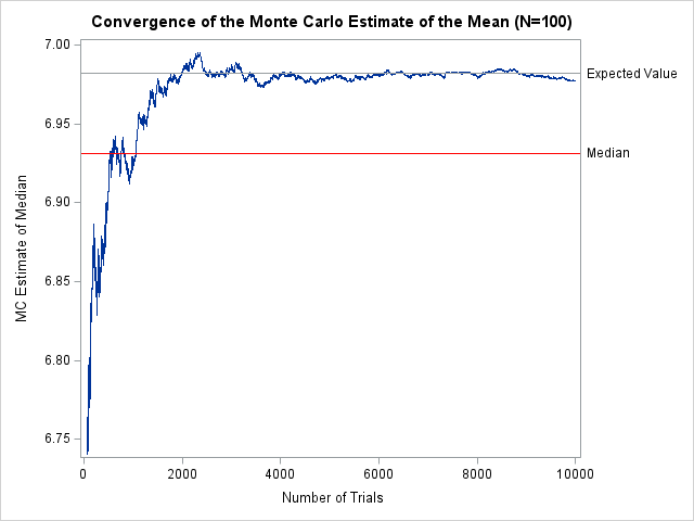
I recently showed how to compute within-group multivariate statistics by using the SAS/IML language. However, a principal of good software design is to encapsulate functionality and write self-contained functions that compute and return the results. What is the best way to return multiple statistics from a SAS/IML module? A convenient
Tag: Data Analysis
A previous article discusses the pooled variance for two or groups of univariate data. The pooled variance is often used during a t test of two independent samples. For multivariate data, the analogous concept is the pooled covariance matrix, which is an average of the sample covariance matrices of the
The first time I saw a formula for the pooled variance, I was quite confused. It looked like Frankenstein's monster, assembled from bits and pieces of other quantities and brought to life by a madman. However, the pooled variance does not have to be a confusing monstrosity. The verb "to
A SAS customer asked how to specify interaction effects between a classification variable and a spline effect in a SAS regression procedure. There are at least two ways to do this. If the SAS procedure supports the EFFECT statement, you can build the interaction term in the MODEL statement. For
I recently read an article that describes ways to compute confidence intervals for the difference in a percentile between two groups. In Eaton, Moore, and MacKenzie (2019), the authors describe a problem in hydrology. The data are the sizes of pebbles (grains) in rivers at two different sites. The authors
The Kullback–Leibler divergence is a measure of dissimilarity between two probability distributions. An application in machine learning is to measure how distributions in a parametric family differ from a data distribution. This article shows that if you minimize the Kullback–Leibler divergence over a set of parameters, you can find a
During this coronavirus pandemic, there are many COVID-related graphs and curves in the news and on social media. The public, politicians, and pundits scrutinize each day's graphs to determine which communities are winning the fight against coronavirus. Interspersed among these many graphs is the oft-repeated mantra, "Flatten the curve!" As
SAS programmers sometimes ask about ways to perform one-dimensional linear interpolation in SAS. This article shows three ways to perform linear interpolation in SAS: PROC IML (in SAS/IML software), PROC EXPAND (in SAS/ETS software), and PROC TRANSREG (in SAS/STAT software). Of these, PROC IML Is the simplest to use and
A previous article describes the funnel plot (Spiegelhalter, 2005), which can identify samples that have rates or proportions that are much different than expected. The funnel plot is a scatter plot that plots the sample proportion of some quantity against the size of the sample. The variance of the sample
Death is always a difficult topic to discuss, and death has been in the news a lot during this tragic coronavirus pandemic. Many news stories focus on states, counties, or cities that have the most cases or the most deaths. A related statistic is the case fatality rate, which is
A cumulative curve shows the total amount of some quantity at multiple points in time. Examples include: Total sales of songs, movies, or books, beginning when the item is released. Total views of blog posts, beginning when the post is published. Total cases of a disease for different countries, beginning
In a previous article, I discussed the binormal model for a binary classification problem. This model assumes a set of scores that are normally distributed for each population, and the mean of the scores for the Negative population is less than the mean of scores for the Positive population. I
A colleague recently posted an article about how to use SAS Visual Analytics to create a circular graph that displays a year's worth of temperature data. Specifically, the graph shows the air temperature for each day in a year relative to some baseline temperature, such as 65F (18C). Days warmer
A previous article shows how to interpret the collinearity diagnostics that are produced by PROC REG in SAS. The process involves scanning down numbers in a table in order to find extreme values. This can be a tedious and error-prone process. Friendly and Kwan (2009) compare this task to a
The Johnson system (Johnson, 1949) contains a family of four distributions: the normal distribution, the lognormal distribution, the SB distribution, and the SU distribution. Previous articles explain why the Johnson system is useful and show how to use PROC UNIVARIATE in SAS to estimate parameters for the Johnson SB distribution
Recently someone on social media asked, "how can I compute the required sample size for a binomial test?" I assume from the question that the researcher was designing an experiment to test the proportions between two groups, such as a control group and a treatment/intervention group. They wanted to know
In a previous article, I showed how to perform collinearity diagnostics in SAS by using the COLLIN option in the MODEL statement in PROC REG. For models that contain an intercept term, I noted that there has been considerable debate about whether the data vectors should be mean-centered prior to
The Johnson system (Johnson, 1949) contains a family of four distributions: the normal distribution, the lognormal distribution, the SB distribution (which models bounded distributions), and the SU distribution (which models unbounded distributions). Note that 'B' stands for 'bounded' and 'U' stands for 'unbounded.' A previous article explains the purpose of
From the early days of probability and statistics, researchers have tried to organize and categorize parametric probability distributions. For example, Pearson (1895, 1901, and 1916) developed a system of seven distributions, which was later called the Pearson system. The main idea behind a "system" of distributions is that for each
Did you add "learn something new" to your list of New Year's resolutions? Last week, I wrote about the most popular articles from The DO Loop in 2019. The most popular articles are about elementary topics in SAS programming or univariate statistics because those topics have broad appeal. Advanced topics
Last year, I wrote more than 100 posts for The DO Loop blog. The most popular articles were about SAS programming tips for data analysis, statistical analysis, and data visualization. Here are the most popular articles from 2019 in each category. SAS programming tips Create training, testing, and validation data
A 2-D "bin plot" counts the number of observations in each cell in a regular 2-D grid. The 2-D bin plot is essentially a 2-D version of a histogram: it provides an estimate for the density of a 2-D distribution. As I discuss in the article, "The essential guide to
Binary matrices are used for many purposes. I have previously written about how to use binary matrices to visualize missing values in a data matrix. They are also used to indicate the co-occurrence of two events. In ecology, binary matrices are used to indicate which species of an animal are
This is a second article about analyzing longitudinal data, which features measurements that are repeatedly taken on subjects at several points in time. The previous article discusses a response-profile analysis, which uses an ANOVA method to determine differences between the means of an experimental group and a placebo group. The
Longitudinal data are used in many health-related studies in which individuals are measured at multiple points in time to monitor changes in a response variable, such as weight, cholesterol, or blood pressure. There are many excellent articles and books that describe the advantages of a mixed model for analyzing longitudinal
In a linear regression model, the predicted values are on the same scale as the response variable. You can plot the observed and predicted responses to visualize how well the model agrees with the data, However, for generalized linear models, there is a potential source of confusion. Recall that a
Biplots are two-dimensional plots that help to visualize relationships in high dimensional data. A previous article discusses how to interpret biplots for continuous variables. The biplot projects observations and variables onto the span of the first two principal components. The observations are plotted as markers; the variables are plotted as
In grade school, students learn how to round numbers to the nearest integer. In later years, students learn variations, such as rounding up and rounding down by using the greatest integer function and least integer function, respectively. My sister, who is an engineer, learned a rounding method that rounds half-integers
Principal component analysis (PCA) is an important tool for understanding relationships in continuous multivariate data. When the first two principal components (PCs) explain a significant portion of the variance in the data, you can visualize the data by projecting the observations onto the span of the first two PCs. In
Understanding multivariate statistics requires mastery of high-dimensional geometry and concepts in linear algebra such as matrix factorizations, basis vectors, and linear subspaces. Graphs can help to summarize what a multivariate analysis is telling us about the data. This article looks at four graphs that are often part of a principal