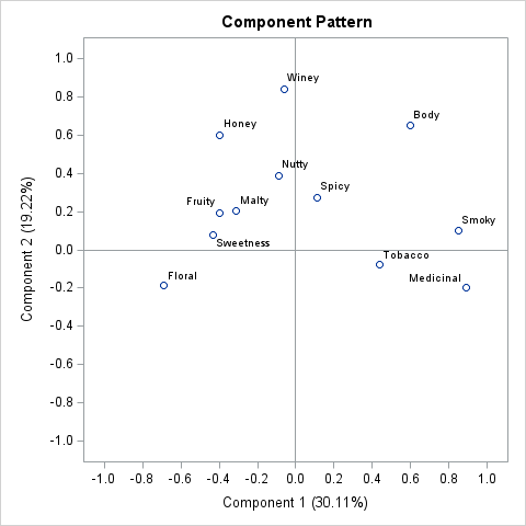
A previous article shows how to use a scatter plot to visualize the average SAT scores for all high schools in North Carolina. The schools are grouped by school districts and ranked according to the median value of the schools in the district. For the school districts that have many
Tag: Data Analysis
Standardized tests like the SAT and ACT can cause stress for both high school students and their parents, but according to a Wall Street Journal article, the SAT and ACT "provide an invaluable measure of how students are likely to perform in college and beyond." Naturally, students wonder how their
Last year I published a series of blogs posts about how to create a calibration plot in SAS. A calibration plot is a way to assess the goodness of fit for a logistic model. It is a diagnostic graph that enables you to qualitatively compare a model's predicted probability of
Maybe if we think and wish and hope and pray It might come true. Oh, wouldn't it be nice? The Beach Boys Months ago, I wrote about how to use the EFFECT statement in SAS to perform regression with restricted cubic splines. This is the modern way to use splines
Have you ever run a regression model in SAS but later realize that you forgot to specify an important option or run some statistical test? Or maybe you intended to generate a graph that visualizes the model, but you forgot? Years ago, your only option was to modify your program
In machine learning and other model building techniques, it is common to partition a large data set into three segments: training, validation, and testing. Training data is used to fit each model. Validation data is a random sample that is used for model selection. These data are used to select
A quantile-quantile plot (Q-Q plot) is a graphical tool that compares a data distribution and a specified probability distribution. If the points in a Q-Q plot appear to fall on a straight line, that is evidence that the data can be approximately modeled by the target distribution. Although it is
When you overlay two series in PROC SGPLOT, you can either plot both series on the same axis or you can assign one series to the main axis (Y) and another to a secondary axis (Y2). If you use the Y and Y2 axes, they are scaled independently by default,
Numbers don't lie, but sometimes they don't reveal the full story. Last week I wrote about the most popular articles from The DO Loop in 2018. The popular articles are inevitably about elementary topics in SAS programming or statistics because those topics have broad appeal. However, I also write about
Deming regression (also called errors-in-variables regression) is a total regression method that fits a regression line when the measurements of both the explanatory variable (X) and the response variable (Y) are assumed to be subject to normally distributed errors. Recall that in ordinary least squares regression, the explanatory variable (X)
Last year, I wrote more than 100 posts for The DO Loop blog. Of these, the most popular articles were about data visualization, SAS programming tips, and statistical data analysis. Here are the most popular articles from 2018 in each category. Data Visualization Visualize repetition in song lyrics: In one
I regularly see questions on a SAS discussion forum about how to visualize the predicted values for a mixed model that has at least one continuous variable, a categorical variable, and possibly an interaction term. SAS procedures such as GLM, GENMOD, and LOGISTIC can automatically produce plots of the predicted
Many data analysts use a quantile-quantile plot (Q-Q plot) to graphically assess whether data can be modeled by a probability distribution such as the normal, lognormal, or gamma distribution. You can use the QQPLOT statement in PROC UNIVARIATE to create a Q-Q plot for about a dozen common distributions. However,
Recently a SAS programmer wanted to obtain a table of counts that was based on a histogram. I showed him how you can use the OUTHIST= option on the HISTOGRAM statement in PROC UNIVARIATE to obtain that information. For example, the following call to PROC UNIVARIATE creates a histogram for
I remember the first time I used PROC GLM in SAS to include a classification effect in a regression model. I thought I had done something wrong because the parameter estimates table was followed by a scary-looking note: Note: The X'X matrix has been found to be singular, and a
Last week my colleague, Robert Allison, visualized data regarding immunization rates for kindergarten classes in North Carolina. One of his graphs was a scatter plot that displayed the proportion of unimmunized students versus the size of the class for 1,885 kindergarten classes in NC. This scatter plot is the basis
A data analyst asked how to compute parameter estimates in a linear regression model when the underlying data matrix is rank deficient. This situation can occur if one of the variables in the regression is a linear combination of other variables. It also occurs when you use the GLM parameterization
An ROC curve graphically summarizes the tradeoff between true positives and true negatives for a rule or model that predicts a binary response variable. An ROC curve is a parametric curve that is constructed by varying the cutpoint value at which estimated probabilities are considered to predict the binary event.
Will the real Pareto distribution please stand up? SAS supports three different distributions that are named "Pareto." The Wikipedia page for the Pareto distribution lists five different "Pareto" distributions, including the three that SAS supports. This article shows how to fit the two-parameter Pareto distribution in SAS and discusses the
In a recent article about nonlinear least squares, I wrote, "you can often fit one model and use the ESTIMATE statement to estimate the parameters in a different parameterization." This article expands on that statement. It shows how to fit a model for one set of parameters and use the
There are several ways to use SAS to get the unique values for a data variable. In Base SAS, you can use the TABLES statement in PROC FREQ to generate a table of unique values (and the counts). You can also use the DISTINCT function in PROC SQL to get
This article shows how to use SAS to fit a growth curve to data. Growth curves model the evolution of a quantity over time. Examples include population growth, the height of a child, and the growth of a tumor cell. This article focuses on using PROC NLIN to estimate the
Programmers on a SAS discussion forum recently asked about the chi-square test for proportions as implemented in PROC FREQ in SAS. One person asked the basic question, "how do I test the null hypothesis that the observed proportions are equal to a set of known proportions?" Another person said that
Have you ever tried to type a movie title by using a TV remote control? Both Netflix and Amazon Video provide an interface (a virtual keyboard) that enables you to use the four arrow keys of a standard remote control to type letters. The letters are arranged in a regular
A frequent topic on SAS discussion forums is how to check the assumptions of an ordinary least squares linear regression model. Some posts indicate misconceptions about the assumptions of linear regression. In particular, I see incorrect statements such as the following: Help! A histogram of my variables shows that they
My colleague, Robert Allison, recently published an interesting visualization of the relationship between chess ratings and age. His post was inspired by the article "Age vs Elo — Your battle against time," which was published on the chess.com website. ("Elo" is one of the rating systems in chess.) Robert Allison's
This article shows how to score (evaluate) a quantile regression model on new data. SAS supports several procedures for quantile regression, including the QUANTREG, QUANTSELECT, and HPQUANTSELECT procedures. The first two procedures do not support any of the modern methods for scoring regression models, so you must use the "missing
When you use a regression procedure in SAS that supports variable selection (GLMSELECT or QUANTSELECT), did you know that the procedures automatically produce a macro variable that contains the names of the selected variables? This article provides examples and details. A previous article provides an overview of the 'SELECT' procedures
A programmer recently asked a question on a SAS discussion forum about design matrices for categorical variables. He had generated a design matrix by using PROC GLMMOD and wanted to use the design columns in a subsequent procedure. However, the columns were named COL1, COL2, COL3,..., so he couldn't tell
Back in SAS 9.3M2 (SAS/STAT 12.1), PROC FREQ introduced mosaic plots to visualize the joint frequencies in a contingency table. By default, the cells in a mosaic plot are colored according to levels of one of the categorical variables in the analysis. However, in 2013 I showed how you can