SAS procedures automatically generate many graphs when you turn on ODS graphics. For example, I have written about how to interpret the graphs that are produced automatically when you use PROC PRINCOMP to perform a principal component analysis (PCA). The built-in graphs are well-designed and informative, but this article discusses two additional graphs that can help you to visualize a PCA. Both use a heat map. The first uses a heat map to visualize the relationship between the principal components (PCs) and the original variables. The second uses a heat map to visualize the principal component scores, which are obtained by projecting the original (centered) data onto the most important PCs. As part of these visualizations, I show how to use SAS to construct a symmetric range for a gradient color palette.
The data and the PCA
This article uses the Scotch whisky data set. I previously showed how to use PROC PRINCOMP in SAS to perform a classical PCA on the Whisky data. The previous article includes the following call to PROC PRINCOMP. After performing the PCA, the procedure saves the table of the top eigenvectors to a SAS data set named 'PCs'. It also saves the principal component scores to a data set named 'PC_COV_Scores'. Notice that I use a covariance-based analysis for these data because all original variables are measured on the same scale and have the same units. If you are analyzing data that have different scales or units (for example, lengths and weights), you should omit the COV option so that the correlation matrix is analyzed.
/* PCA from PROC PRINCOMP. The Whisky data are defined in https://blogs.sas.com/content/iml/2026/02/23/whisky-pca.html */ %let varNames = Tobacco Medicinal Smoky Body Spicy Winey Nutty Honey Malty Fruity Sweetness Floral; proc princomp data=Whisky N=4 cov plots=all out=PC_COV_Scores; /* 'scores' = projections onto first PCs */ var &VarNames; ID ID; ods select Eigenvectors ScoreMatrixPlot '2 by 1' '4 by 3'; ods output Eigenvectors = PCs; run; |
Visualize the PCs: The quick way
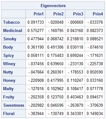
The output from PROC PRINCOMP includes a table that shows the most important eigenvectors. The table for the whisky data is shown to the right. The eigenvectors are linear combination of the original variables. The components of the eigenvectors are weights: values that have large magnitudes indicate that the principal component is strongly correlated with that original variable. Consequently, researchers often use the eigenvector table to assign meaning to the principal components. For example, in the previous article, I made the following interpretations of the PCs:
- The first column shows how the first (and most important) PC relates to the original variables. The first PC represents high values of Body, Smoky, Medicinal, and Tobacco flavors and low values of Honey, Fruity, Sweetness, and Floral. Thus, the first PC dimension contrasts harsh "masculine" flavors from sweeter "feminine" flavors.
- The second column represents whiskies that have many taste characteristics. The second PC is associated with Body, Winey, and Honey flavors. Because most of the values in the column are positive, this component also represents a general blend of flavors.
To interpret the PCs from the table requires scanning the column and mentally noting the numbers that are largest in magnitude. This is tedious and susceptible to error. A simpler approach is to color-code the table as a heat map. Color the heat map so that cells with high values are in one color and cells with low values are in another color. You can use PROC SGPLOT to create such a heat map for the table of eigenvectors, which was written to the 'PCs' data set. The following call to PROC TRANSPOSE converts the data from wide form to long form. You can then call the HEATMAPPARM statement in PROC SGPLOT to create a heat map, as follows:
/* Use a heatmap to visualize the PCs. First, transform from wide format to long format. See https://blogs.sas.com/content/iml/2011/01/31/reshaping-data-from-wide-to-long-format.html */ proc transpose data=PCs out=LongPC(rename=(Col1=Value)) name=PC; by Variable notsorted; /* for each row */ var Prin1-Prin4; /* make a row for these variables */ run; title "Principal Components"; title2 "Unsymmetric Range for Gradient Legend"; ods graphics / width=360px height=480px; proc sgplot data=LongPC; heatmapparm x=PC y=Variable colorresponse=Value / colormodel=AltTwoColor outline; yaxis reverse; label PC="Principal Components" Variable="Flavor Characteristics"; run; |
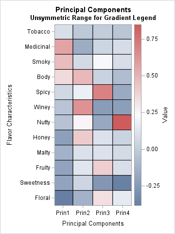
This visualization uses red for high values and blue for low values.
- The first column shows that the largest (positive) contributions for the first PC come from the Medicinal, Smoky, and Body variables. Those cells are in red. The first PC has "negative" amounts of Honey, Fruity, Sweetness, and Floral. Those cells are in blue.
- The second column shows that the second PC is formed by using positive contributions from the Winey, Body, and Honey variables, and "negative" amounts of the Medicinal and Floral variables.
- The third PC has a large contribution from the Spicy variable. The fourth PC that has a large contribution from the Nutty variable.
This graph is sufficient for many PCA analyses, but it has a problem. I do not like the fact that the range of the color scale is not symmetric about the value 0. In this heat map, there are blue cells that represent positive values. The darkest red corresponds to the value +0.85, whereas the darkest blue corresponds to -0.38.
I think the graph would be improved and more accurate if the neutral color (white) corresponded to 0, and the positive and negative ranges were equal in length. Then you could unequivocally say, "red cells are positive, and blue cells are negative." The code in the next section shows how to accomplish this modification. The resulting heat map follows:
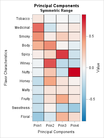
This second heat map is easier to read because now red represents positive contributions, white represents zero, and blue represents negative contributions. For each column, you can use the pattern of dark reds and blues to interpret how the PC is formed as a linear combination of the original variables.
A symmetric range attribute map for diverging color ramps
A two-color ramp that passes through a third "neutral" color is called a diverging color palette. They are most informative when the neutral color corresponds to a meaningful value. Sometimes the neutral color corresponds to a baseline value or an average value. In this case, I want the neutral color corresponds to 0. I also want the range of colors to correspond to a symmetric interval about 0 so that dark shades or red and blue represent the same magnitudes but different signs.
For the heat map in the previous section, the maximum value in the table is about 0.85, and the minimum value is about -0.38. Thus, the middle value (0.235) is used for the neutral color. Instead, I want to define the color range to be the symmetric interval [-0.85, 0.85] so that the midpoint (0) is used for the neutral color.
In SAS, you can accomplish this by using a range attribute map. A range attribute map is a data set that assigns the range and colors for a color ramp. When you define a range attribute map for a variable that has both positive and negative values, you can use two special values to ensure that the range is symmetric about 0:
- Use the keyword _NEGMAXABS_ for the minimum value. This keyword is equivalent to the expression –max(abs(MIN), abs(MAX)).
- Use the keyword _MAXABS_ for the maximum value. This keyword is equivalent to the expression max(abs(MIN), abs(MAX)).
The following SAS DATA step creates the range attribute map. It uses a red-blue diverging palette of colors from the ColorBrewer system.
/* create a range attribute data set so that the value range is symmetric, such as [-0.85, 0.85] with 0 in the middle. There is a trick to doing this: Use "_NEGMAXABS_" = –max(abs(MIN), abs(MAX)) for the MIN variable and use "_MAXABS_" = max(abs(MIN), abs(MAX)) for the MAX variable. Use a 5-color diverging blue-white-red palette from the ColorBrewer system: CX0571B0 CX92C5DE CXF7F7F7 CXF4A582 CXCA0020 */ data SymRangeAttrs; retain ID "SymRange"; length min max $12 color altcolor colormodel1-colormodel5 $15; input min max color altcolor colormodel1-colormodel5; datalines; _NEGMAXABS_ _MAXABS_ . . CX0571B0 CX92C5DE CXF7F7F7 CXF4A582 CXCA0020 ; title "Principal Components"; title2 "Symmetric Range"; ods graphics / width=360px height=480px; proc sgplot data=LongPC RATTRMAP=SymRangeAttrs; /* <== DEFINE ATTR MAP DATA SET HERE */ heatmap x=PC y=Variable / colorresponse=Value outline RATTRID=SymRange; /* <== NAME MAP HERE */ yaxis reverse; label PC="Principal Components" Variable="Flavor Characteristics"; run; |
The resulting heat map is shown in the previous section.
Visualize the principal component scores
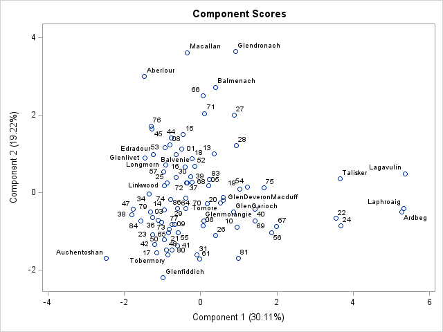
In addition to visualizing the principal components themselves, you can construct a heatmap that visualizes the PC scores for each observation. Normally, scatter plots are used to visualize the PC scores. For example, the scatter plot to the right shows a scatter plot that shows the scores for the first two PCs for the 86 whiskies in the data. (Click to enlarge.)
The scatter plot shows you which observations (whiskies) have high or low values when projected onto the principal components. Typically, you would look at multiple scatter plots to fully understand how each observations relates to the PC factors. However, if you do not have too many observations, you can summarize that information in a single heat map. With a single heat map, you can see the PC scores for each observation simply by scanning across a row. You can find the high and low values for each PC simply by scanning down each column. You could sort the data by the scores onto the first PC, but I have not done that here.
Because the heat map shows one row for each observation, this visualization is not appropriate when there are many observations. However, the heat map can be useful for visualizing a subset of the data. The following statements visualize a subset of 20 whiskies. PROC TRANSPOSE converts the scores from wide (four columns) to long format. The value for each dimension is shown by using the symmetric range attribute map, as explained in the previous section:
/* Now use a heatmap to visualize the projection of centered data onto dominant PCs. */ proc transpose data=PC_COV_Scores(keep=Distillery RowID Selected Prin1-Prin4) out=LongScore(rename=(Col1=Value)) name=PC; where selected=1; /* only display a subset of the data */ by Distillery notsorted; /* for each row */ var Prin1-Prin4; /* make a row for these variables */ run; ods graphics / width=480px height=640px ; title "Principal Component Scores for 20 Whiskies"; proc sgplot data=LongScore RATTRMAP=SymRangeAttrs; /* <== DEFINE ATTR MAP DATA SET HERE */ heatmap x=PC y=Distillery / colorresponse=Value outline RATTRID=SymRange; /* <== NAME MAP HERE */ yaxis reverse; label PC="Principal Components"; run; |
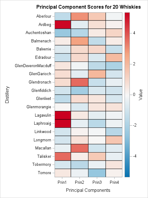
With this heat map, you can find the whiskies whose flavor profiles are positively or negatively correlated with each PC. If you like whiskies that are full-bodied, medicinal, and smoky (the primary attributes captured by the first PC), then scan down the first column and find all the dark red whiskies. Examples include Laphroaig, Lagavulin, and Ardbeg.
The "opposite" flavor profile for the first PC is floral, sweet, and fruity. To find whiskies with those flavors, scan down the first column and find all the dark blue whiskies. The deepest blue is found for Auchentoshan, GlenMoray, Glengoyne.
Repeat this process for other flavor characteristics that are captured by a principal component: Red for whiskies that have a positive correlation and blue for whiskies that are negatively correlated.
Notice that each row of this heat map enables you to visualize the four-dimensional scores for each whisky. This is an advantage of scatter plots, which show two coordinates at a time. You would need six scatter plots to show all pairwise combinations of PC scores for this analysis, but this one heat map contains the same information. Of course, the human eye cannot distinguish shades very well, so this display is best for providing qualitative information. The scatter plots are better at showing small differences in the PC scores.
Summary
Statistical procedures in SAS provide many graphs to help you visualize your analyses. The PRINCOMP procedure can produce a large number of informative graphs. However, this article shows that it is helpful to use a heat map to visualize the table of eigenvectors. The heat map is most useful when it uses a range attribute map that is symmetric about 0. You can use a similar heat map to visualize the scores of a subset of the data. This provides a single graph that reveals qualitative differences between whiskies.

2 Comments
The blue-white-red ColorBrewer scale makes it easy to clearly see the negative-positive correlations. Thanks for visualization idea.
Pingback: An NMF analysis of Scotch whiskies - The DO Loop